interesting but I am not sure this makes the case as to whether or not ALL of the storybook photos are production photos or film stills .One thought I had about print media is that everything that is reproduced on the page to make multiple copies requires printers ink and after multiple copies are made , the saturation of the ink may become less , or in older books , there may be an issue or error with the printing plates . I am guessing they have quality control control for these things but would imagine with a high volume print run , some would slip through the cracks .The second youtube screenshot you posted looks a lot like the Gout ( 2006 Bonus dvd disc of the original film ) to me .Other than desaturated color, I see no difference between the two images , and why does the youtube clip say Luke leaving Dagobah ? Is he flying backwards ? I see the lights of four engines which are on the back of the ship . He is flying towards the planet , not away from it 😃 and after re reading your post , it does seem that you do see some value in images in pre digital print media as a valid guide to being used as color reference for editors
To Be honest I think really the only thing you can take away from that story Book is that Green might be a bit out on all media.
Vader’s Chest plate and Hexagon Lights are not as green as they appear in the Film.
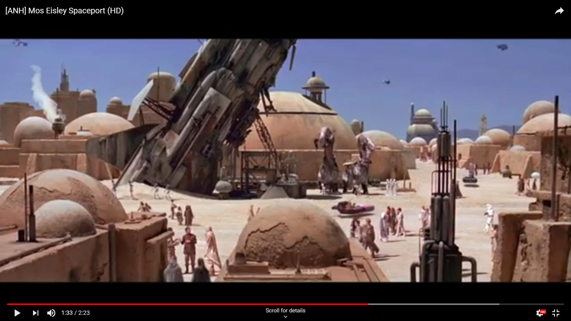
I found looking at Star Wars Special Edition the Illustrated script interesting more so… But at the end of the day Look at the cover of A New Hope… Mos Eisley is meant to look like this,

That is exported straight from A PC it’s pink and overly red on film. This is how I judge that it is not looking correct once on film.
But it seems to be with Lucusfilm and you can’t say all films change like this well I don’t think so.
I looked at this today… I think this is the most accurate shot for this scene.
So what if the Special Edition looked more Like that?
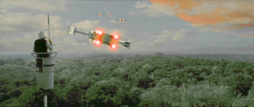
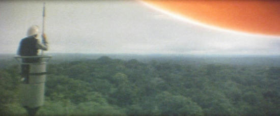
This was only rough but I find Yavin is more Orange than Red in Space at leaset I don’t agree with the Pink and the trees are the Wrong Shade of Green it is Guatamala Jungle not a forest. I feel like I can feel the mist rising a bit off the Jungle now also.

Looks Wrong?