
- Time
- Post link
Is it possible to make it so Padmé dies from Darth Sidious force draining her life force away?
Is it possible to make it so Padmé dies from Darth Sidious force draining her life force away?

I don’t think with the footage available you could even imply that.

https://youtu.be/gPQd1iPQuRE?t=85
It’s played constantly and it sounds so bored with itself.
That’s not even a theme. It’s just musical noise, an apt description for the entire soundtrack of that film (not that there aren’t a few standouts).
I much prefer the music that plays during Dooku’s entrance in ROTS (though it was mixed so low it was practically nonexistent):
https://www.youtube.com/watch?v=kCLPAU_n2uA
That’s no better.
Do not DM me for edits. Whatever you’re looking for I don’t have it.
I don’t think with the footage available you could even imply that.
One could use the chanting from the Clone Wars with the fotage of Sidious putting his hand on Vader’s forehead and have one of the nurse droids say “Due to reasons unknown her life force is fading, there is nothing we can do.”
If you had the answer, then why did you ask?
Do not DM me for edits. Whatever you’re looking for I don’t have it.

Original plans for Revenge of the Sith involved an opening montage showing all the battles of the clone wars. So, I did just that:
This also works as a seamless transition from Ep 2-3.

I kinda like that, though it could be a bit better, and would of course facilitate a modified plot to work.
It’s for a radical edit I’m working on, wanted to share it as a stand alone first.


“Get over violence, madness and death? What else is there?”
Also known as Mr. Liquid Jungle.
I’m really digging that Geonosis grade. 👌😥😥😥😤😤

I like it !
EP2 looks much better with a more film like color palette.
It helps to make the CGI blend in.
Perhaps some gentle blurring will also help to remove the digital camera feeling …
Original plans for Revenge of the Sith involved an opening montage showing all the battles of the clone wars. So, I did just that:
This also works as a seamless transition from Ep 2-3.
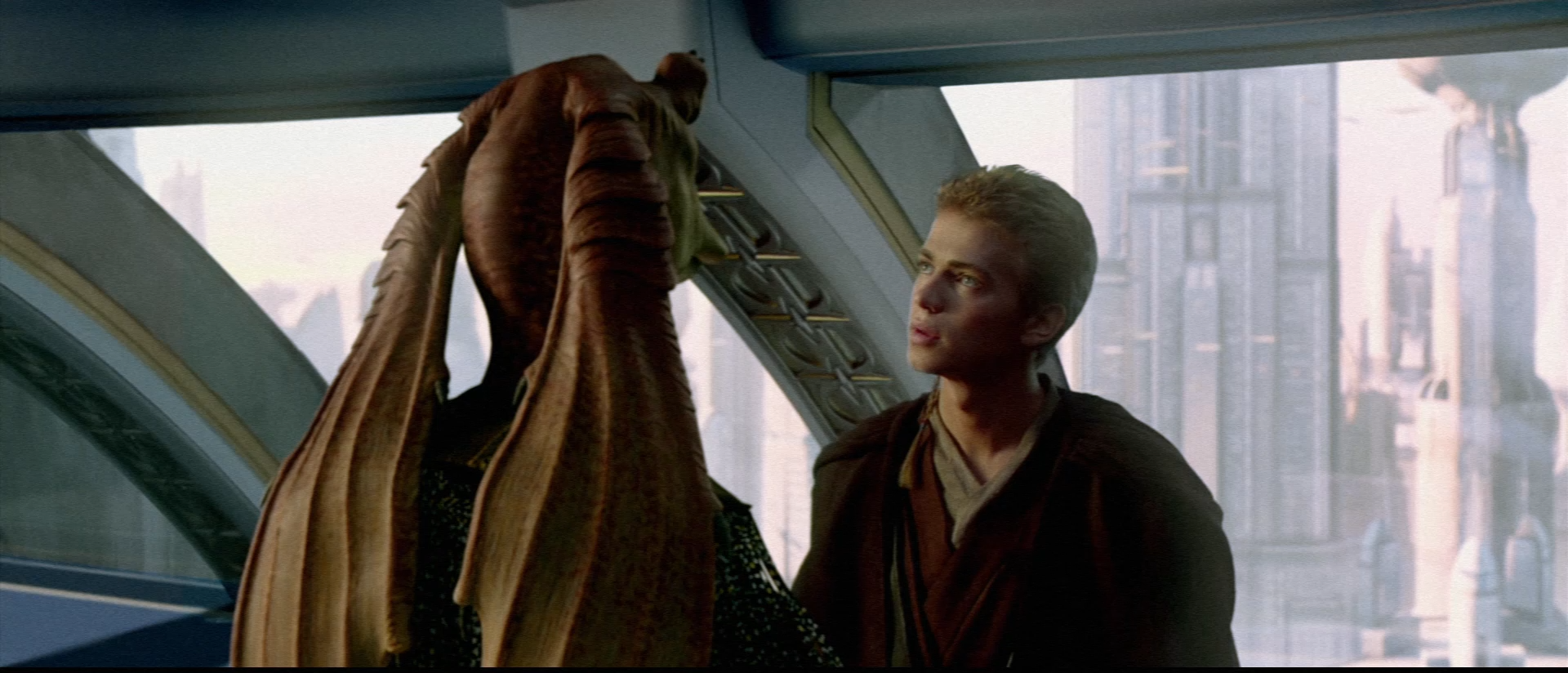
Remove the Gungians and we can be friends. 😉

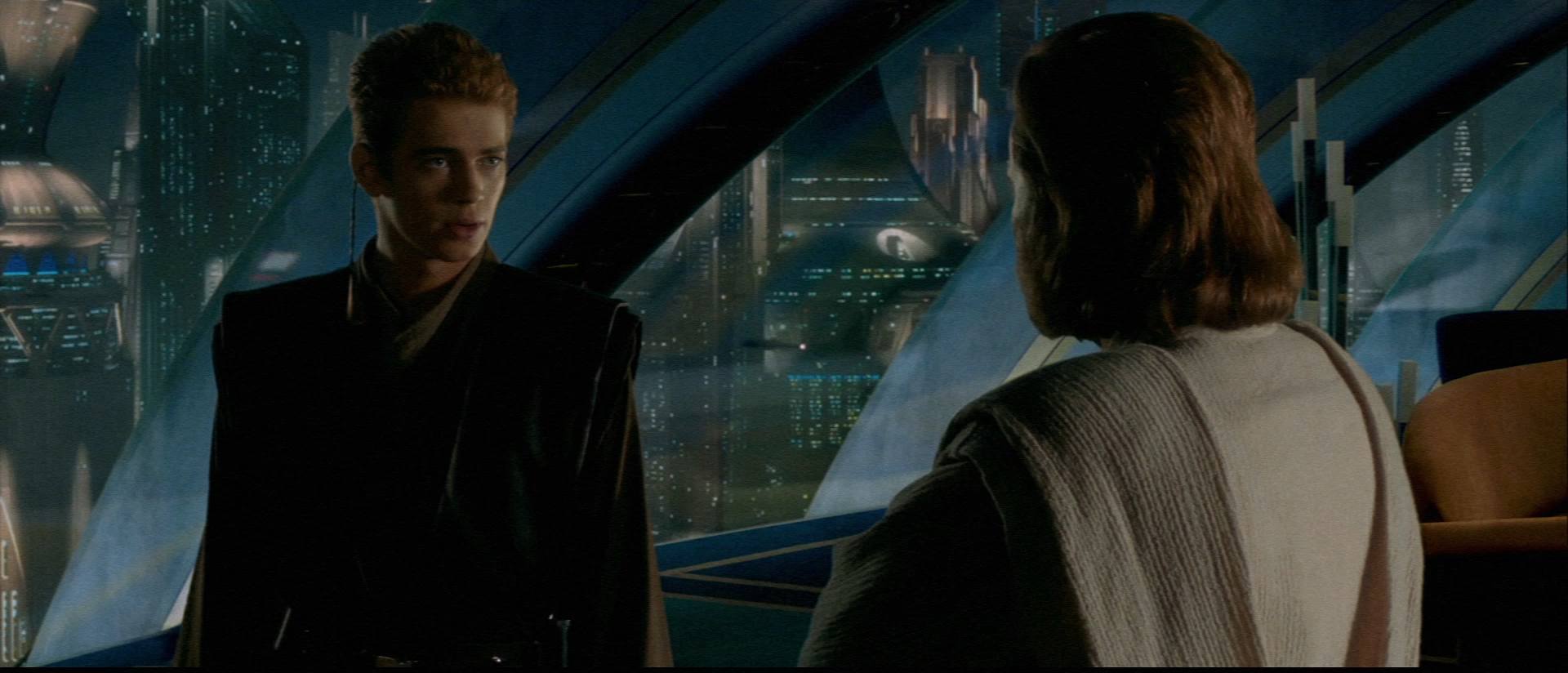
I think that making Dooku’s saber purple and Windu’s saber green would enhance the ambiguity of Dooku’s character.
Perhaps some gentle blurring will also help to remove the digital camera feeling …
Will do!
“Get over violence, madness and death? What else is there?”
Also known as Mr. Liquid Jungle.
Here’s some more.


“Get over violence, madness and death? What else is there?”
Also known as Mr. Liquid Jungle.
Nice, thanks for sharing 😃
Good to see that PM shot with a neutral tone (no blue)!
For my personal regrade I went for the 4K77 look, with added noise and subdued colors.

Also did the same to the deleted scenes and they look much better:

For those of you playing with the colors of the prequel films, I stumbled across this video comparing Attack of the Clones with various pieces of its concept art, and what stands out to me is while the framing is occasionally almost identical to various concept pieces, the colors in the art pop so much more than the colors do in the final film, especially when compared side-by-side like this.
https://www.youtube.com/watch?v=FlEdb9YSL1I
A few things I noticed, in the art, the earlier Coruscant scenes seem a lot bluer, the Coruscant night scenes seem to have a lot more contrast, and Geonosis really leans into the orange-red color. The the way the concept art uses colors seems a lot more visually appealing to me. I know a lot might have to do with lighting as well, and it seems recent posts are going in the opposite direction with the colors. Maybe having more color makes it feels less real and more cartoony, but I would be interested to see attempts at going in the opposite direction with the colors and try to make them pop more.
Also did the same to the deleted scenes and they look much better:
What’s this? A Prequel scene with an actual set?
Maybe having more color makes it feels less real and more cartoony, but I would be interested to see attempts at going >in the opposite direction with the colors and try to make them pop more.
That’s an interesting direction to go in for TPM and AOTC. I don’t know if it’s feasible (you don’t want to over-saturate the skin tones and they share colors with Geonosis sand) but interesting. But ROTS builds itself up as a “tragedy”, which in general warrants less color.
RogueLeader said:
going in the opposite direction with the colors and try to make them pop more.
Nice video! The concept art is using colors to create contrasts and framing.
The film uses almost uniform colors for each scene, with little contrast.
I think it’s way it was lit, perhaps because of green screen.
What you suggest would require manual correction /painting of individual areas on each take… That’s time consuming!
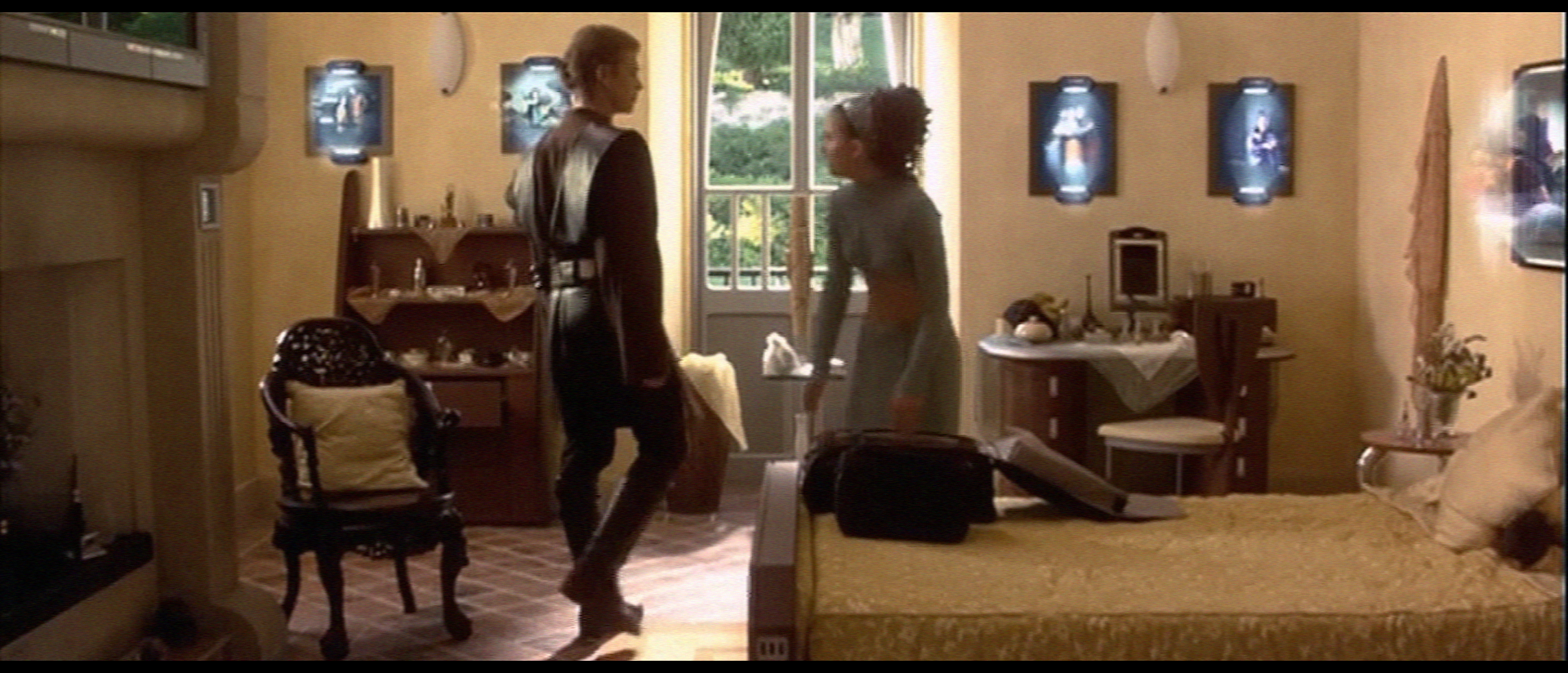
What’s this? A Prequel scene with an actual set?
Indeed, and the acting there feels much more natural than on the CGI sets.
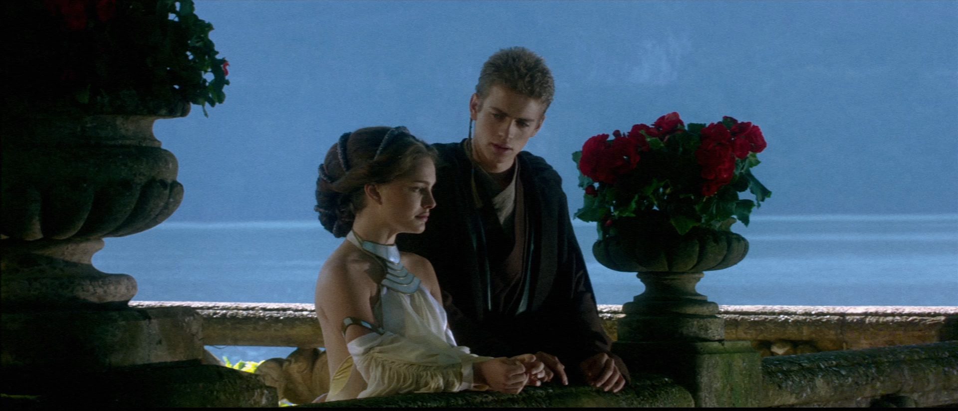
On my personal edit of AOTC I decided to focus on Padme.
So I cut most of the Coruscant apartment scenes because of Anakin’s creepy dialog and went with the Naboo stuff.
The romance works much better that way, with Padme taking the lead, because she’s older and more mature.
What’s this? A Prequel scene
with an actual setshot on location?
FTFY
Even though they made heavy use of bluescreens, the Prequels used plenty of sets. In fact, isn’t a bluescreen room technically a set, since it’s built indoors temporarily for the sole purpose making a film?
Btw, while I appreciate shooting on location, this one doesn’t feel Star Warsy enough. It looks to much like a real-world home. The holographic frames are a painfully bad attempt to remedy this.
Do not DM me for edits. Whatever you’re looking for I don’t have it.

I mean, yeah, a green screen room is technically a set, but it’s not the same set you’ll see in the movie and really shouldn’t count.
What’s this? A Prequel scene
with an actual setshot on location?Btw, while I appreciate shooting on location, this one doesn’t feel Star Warsy enough. It looks to much like a real-world home. The holographic frames are a painfully bad attempt to remedy this.
I have a big problem with the Prequel’s interior set design, and it goes beyond just the props. Everything is absurdly large, clean, and flat. There’s no texture. For example:
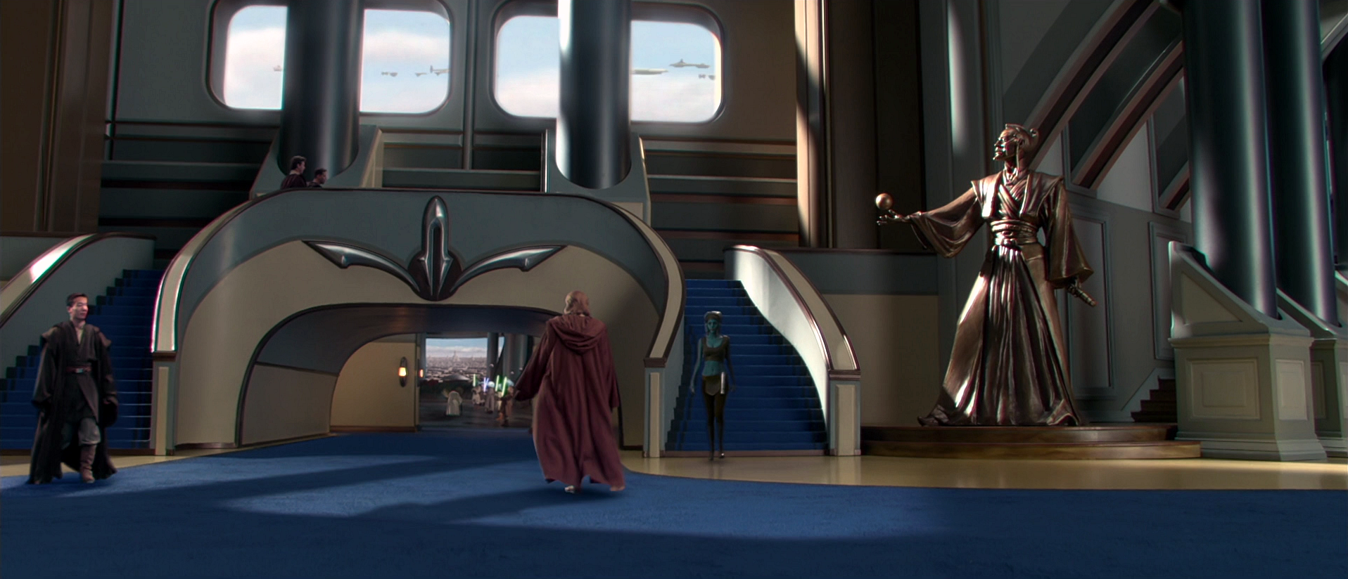
I don’t think it’s just the CG that makes it look bad (though it magnifies it). Rather all pre-vis and animation did was the giant cool stuff or the necessary stuff. That’s why so many scenes feel empty. Looking at the image above, what if there was a bench or a garbage near the door? What if instead a blank blue wall, there was a mural? What if the scene took place at sunset, to give it some variation in light?
Yes, it might look like an Amish retreat but at least there’s something. There’s a chair is in background, some paintings. If it was CGI, everything would have been neatly organized containing a bed, lamp, flat wall with window, and maybe a table. Lucas loves his pre-vis department, but all pre-vis did is make cool things, with little thought towards the little things that make a set feel real.
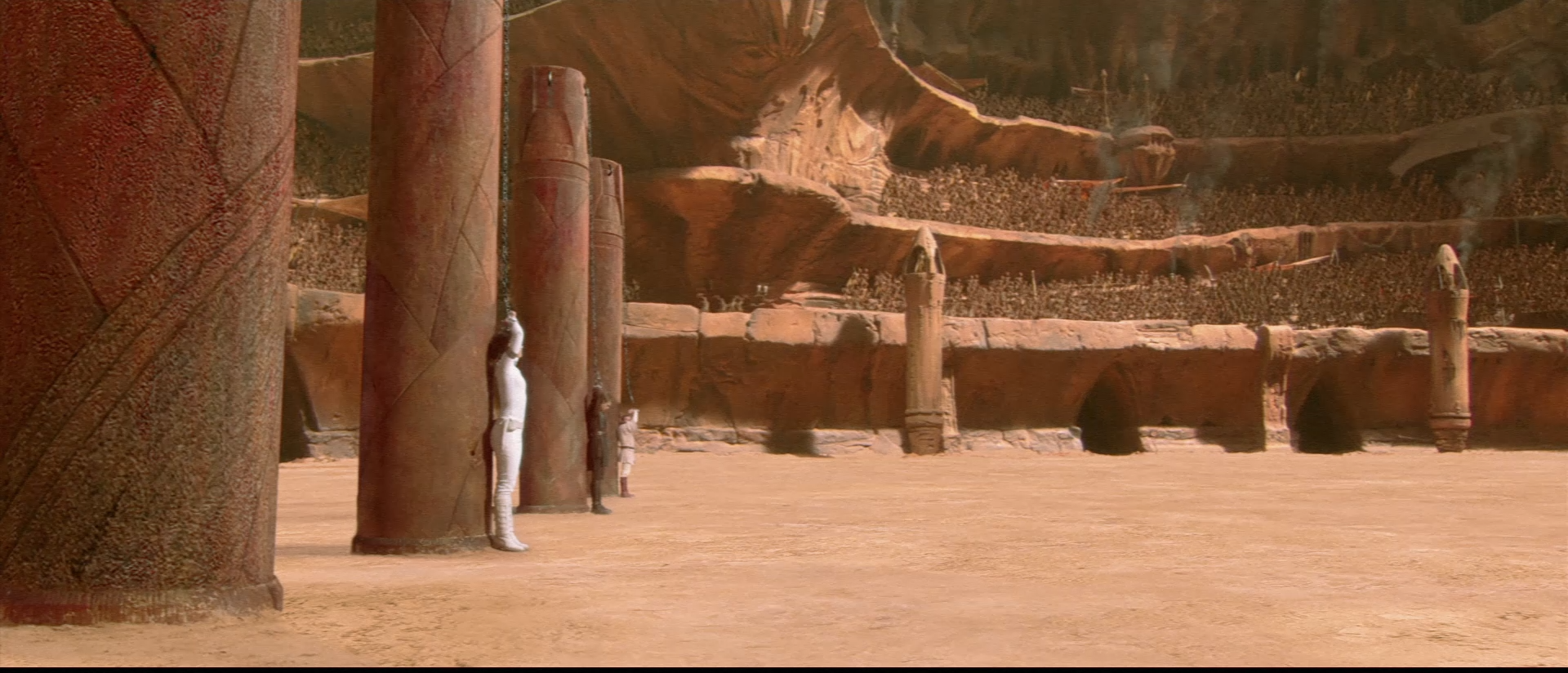
The ‘Skyline additions’ to the Tunisia sets in Phantom Menace look like crap and date the movie heavily. Here are some adjustments I made:


Huh, I don’t think I ever noticed that before. Nice work! Though I wonder if something like a ship flying by or some of the poles could be retained so it wouldn’t feel completely empty. To me it risks feeling like a set with nothing behind of everything is completely removed. Might be wrong though.
Also think it would be interesting to see this scene with a sunset-look to it, especially since their shadows are already getting long.
And not necessarily related, but I think it would be interesting if this were the last scene of Destroy All Jedi.