logo Sign In

Info: Star Wars - What is wrong and what is right... Goodbye Magenta — Page 6

Author
Time
 (Edited)

Have you tried putting your screenshots on a thumb drive and taking them to another computer, perhaps at work or a friends house to see how they look there? Or even on your TV? Or just looking at this thread on a computer at the library?

That wouldn’t cost you anything, and then you’d at least know if your monitor is bad.

TheStarWarsTrilogy.com.
The007Dossier.com.
Donations always welcome: Paypal | Bitcoin: bc1qzr9ejyfpzm9ea2dglfegxzt59tys3uwmj26ytj

Author
Time

Ronster said:

I don’t really want to spend £100 or more for the calibration device and what I was hoping was that if I do just some rough versions people would pick up on the general sense of direction.

I do understand though what is being said but I was really hoping that it would be a bit simpler in interpreting roughly i was trying to communicate.

At work at the moment waiting to do something but If i get one I will try to get a cheap one because I really don’t see too much worth in roughly looking at something and trying to communicate where I feel the faults may be for £100.

Can you see my point on that?

I kind of feel that budget to communicate with some still images is fairly high priced when I would also still not be saying this is exactly how it should look but trying to find guiding principles or patterns.

i get you don’t want to spend money on it, but the flip side is that we don’t want pages after pages of your un-calibrated images. it is just noise on this forum.

Author
Time

Ronster, are you trolling? (I’m just asking)

Author
Time
 (Edited)

ZigZig said:

Ronster, are you trolling? (I’m just asking)

No not at all, I honestly like the older transfers better and I do also think that the special effects are screwing up the film color but there is also smaller problems with the footage in general.

when I worked with enter the dragon, I started learning color correction with a nightmare scenario. Star Wars i consider another nightmare scenario but perhaps both worse ( Special effects) but better (normal film footage).

So this is my opinion perhaps I am wrong to like the way the old transfers looked. I would like to see an improved version of the old transfer with Special effects color better.

Yotsuya I will try that later when I find time. Thanks, I have used that before but not with my new screen.

Author
Time

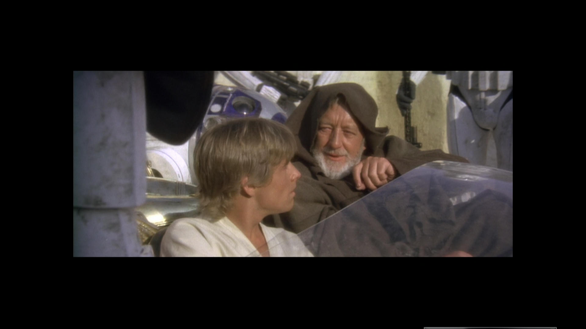
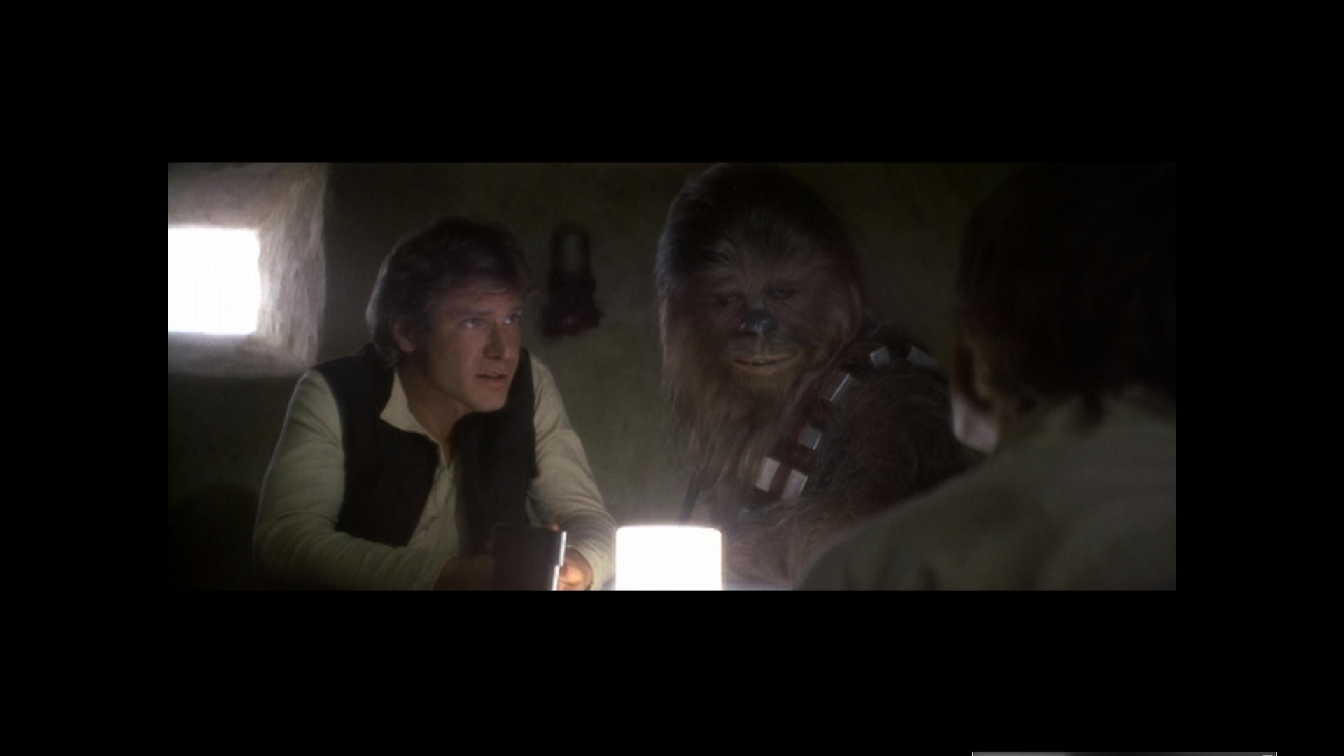
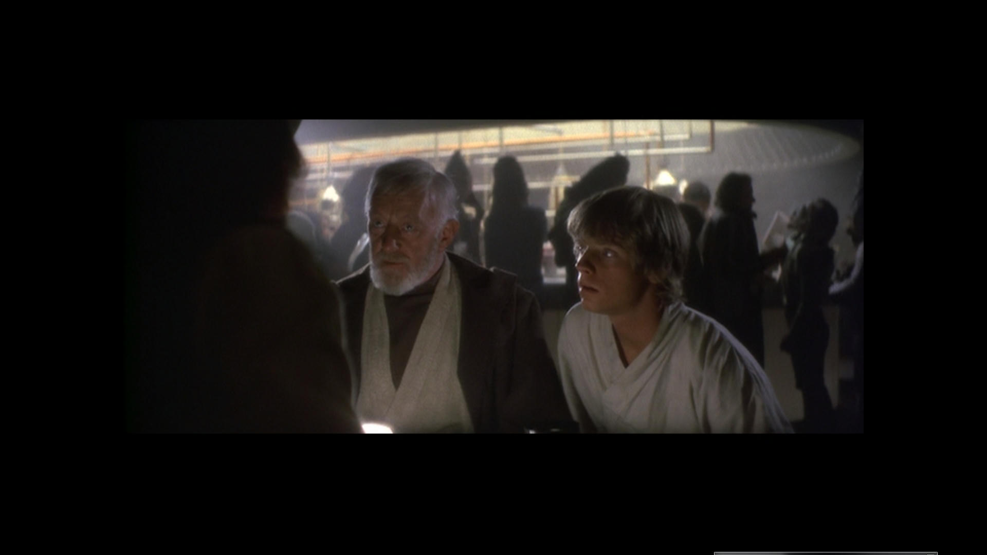
The special effects shots will look different because they are composited. The goal of most of us is to get the entire film to look as good as it can while staying true to the original look. That includes the flaws in the special effects shots. Unless the shots have been recomposited to a better standard, we are stuck with the original and SE composites. The shot in question of Luke does not appear to have been touched since the May 1977 release so we are dealing with 1977 compositing done on Vistavision film (60 mm on its side) and then transferred to 35 mm negative to splice into the O-neg. This clip appears to be in much better shape and the colors on the blu-ray are very close to what all the other sources have so it really isn’t in that bad a shape, but it does suffer from reduced yellow like most of ANH on blu-ray does. But the clip as it appears in the Technicolor print scan shows higher contrast than most of the other sources. Between the sources, there is no evidence for a color shift.

Author
Time
 (Edited)

I just saw a comparison clip on youtube of going in to mos eisley of JSC and I think it was blu ray.

Although people say it is the wrong color the JSC and I think it probably is actually on a lot of scenes if looks very good sometimes where other versions fail and seems to throw a solution again and again for odd looking shots. It’s very likeable and kind on the eye. And it does not have people generally with bright pink faces.

It’s not a monstrosity at all. Anyway time to sleep now.

We should look at wether we can recover more color from the special effects. You need to be more open minded it is a nice thing to do not nasty.

Author
Time

the jsc always looked very red/pink to me

Author
Time
 (Edited)

well perhaps i got confused with which one was which then…

Basically I just want a version that is kind on the eye and if you take for instance enter the dragon what it looked like and what it looks like now it is a vast improvement. This has never really happened for star wars though and there should be a version that does sort the way it looks out.

Well it has in a way but it still has a way to go.

https://youtu.be/tqVk9LB-LZo

No i did not… R2 looks a bit Cyan but othetwise I reallh like the JSC.

Author
Time
 (Edited)

Gout Hue Shifting Correction Reveals the true look of the Gout. It’s actually a doddle to fix this film using the GOUT. This was Loaded in VLC Media PLayer > Tools > Effects and Filters > Image Adjust.

This Yielded Better results than Loading it in to an non linear editor for MPEG decoding issues. Possibly womble DVD editor is probably the best thing to use to fix this and export for reference (free 30 day trial)
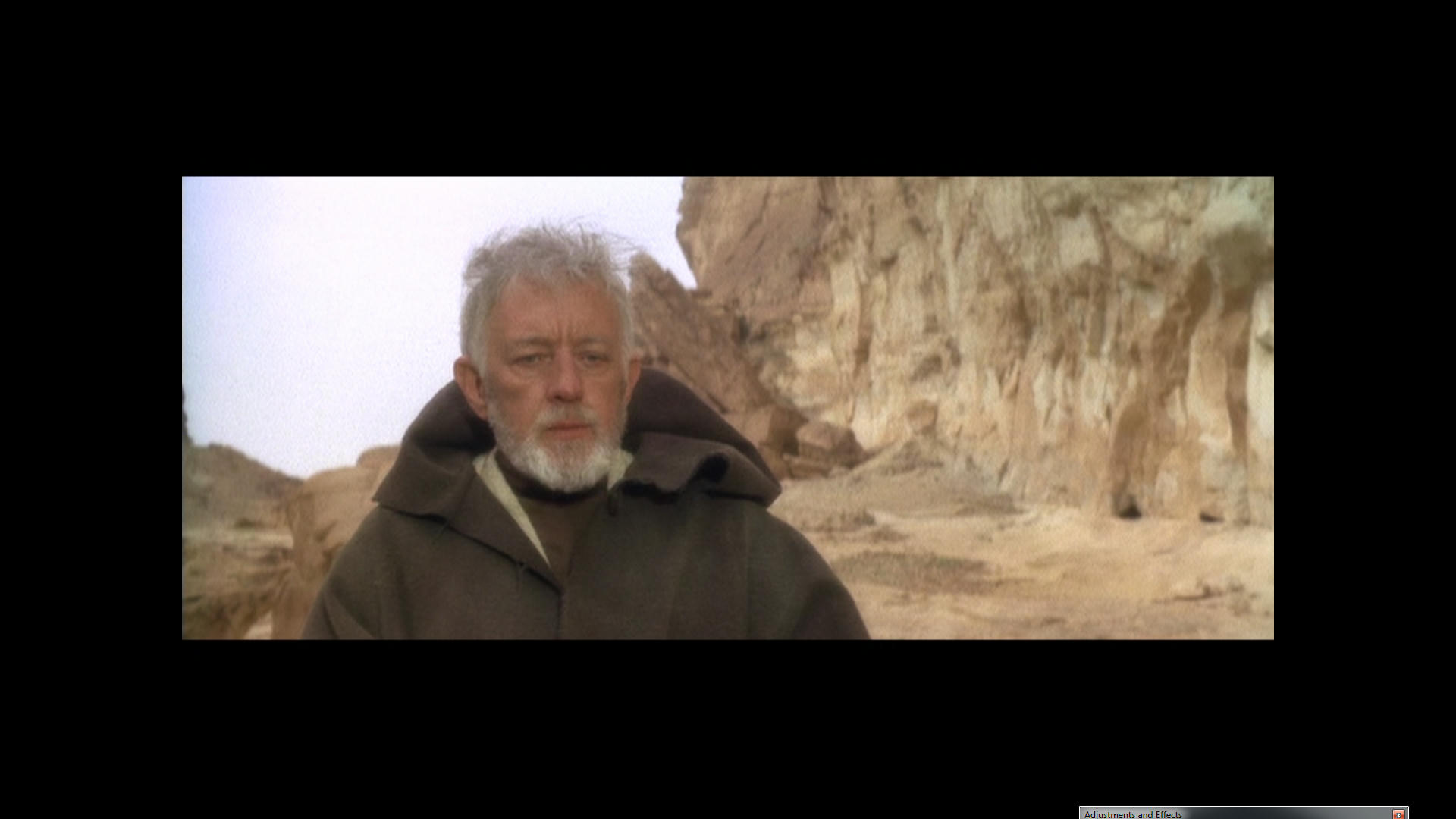
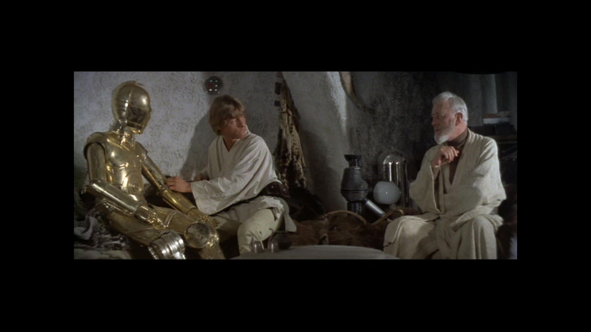
Perhaps still a bit pink on Tarkin.

The amount of Shift Changed

I think this is a fairly conclusive experiment and I now feel like I can see what the film is supposed to look like. I think it looks really really nice like this and it’s so simple and easy to get it where it needs to be.

To me it’s perfect like this… So to create a reference from a hue shifted GOUT would be the way to go, this could then be easily color matched to say the Blu-Ray and fix that pile of crap.

This is the best solution I feel to what is happening and the confusion over what the film should look like. Some sequences have shots that require different amounts of Shift but eventually after going through it piece by piece you will get to a conclusive answer on the Normal film footage.

The Special Effects as I said requires different Handling.

The reason I suggest using Womble is because it will handle the MPEG without having to decipher it as when I put this in NLE the results were slightly different and not as good. You xould also just use VLC for snapshots Like I have done and Color match.

This won’t give good reference for absolutely everything but I reckon about 80% some parts require no shift at all like R2 and 3P0 on the sandcrawler for instance. It only needs to shift when you see red face and so on.

I would probably trust the brightness and levels of the JSC to get a slightly brighter and less dark but overall I think I have found a good soloution.

Go and see what it is meant to look like 😃 It looks lovely…

The Gout has unfaded Highlights and the Door flash should look like this, Although I think there is a bit of a question over the light on the right hand side of the door is either Blue or Purple? I think it is Blue and we have an issue there. Not sure about the deep Blue that suddenly appear either before the explosion. Also note Soldier with purple shirt. It is all obvious evidence of Hue Shifting and the whole lot is swinging about like a windsock in a hurricane here.

The color is right but just shifting Hues so it needs to be conformed so that it maintains the correct Hue or the same Hue.

https://www.youtube.com/watch?v=T4sV3lqzKqQ

Author
Time

Looking good IMO ! GOUT is pretty easily recolourable with a single correction for the hole film (as Dr Dre showed with his technicolor-graded version).

Author
Time
 (Edited)

Ronster said:

Gout Hue Shifting Correction Reveals the true look of the Gout. It’s actually a doddle to fix this film using the GOUT. This was Loaded in VLC Media PLayer > Tools > Effects and Filters > Image Adjust.

This Yielded Better results than Loading it in to an non linear editor for MPEG decoding issues. Possibly womble DVD editor is probably the best thing to use to fix this and export for reference (free 30 day trial)
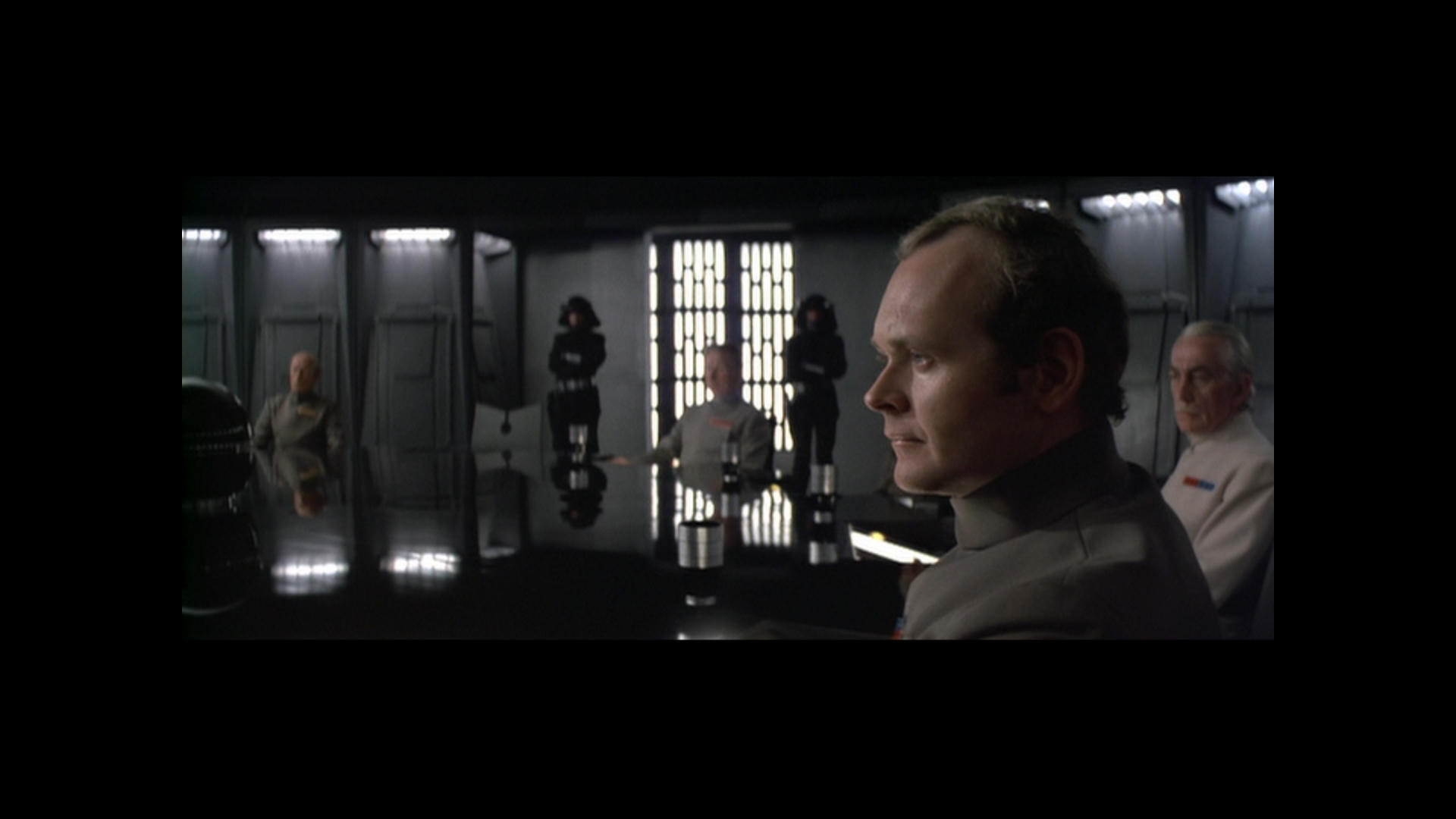
Perhaps still a bit pink on Tarkin.
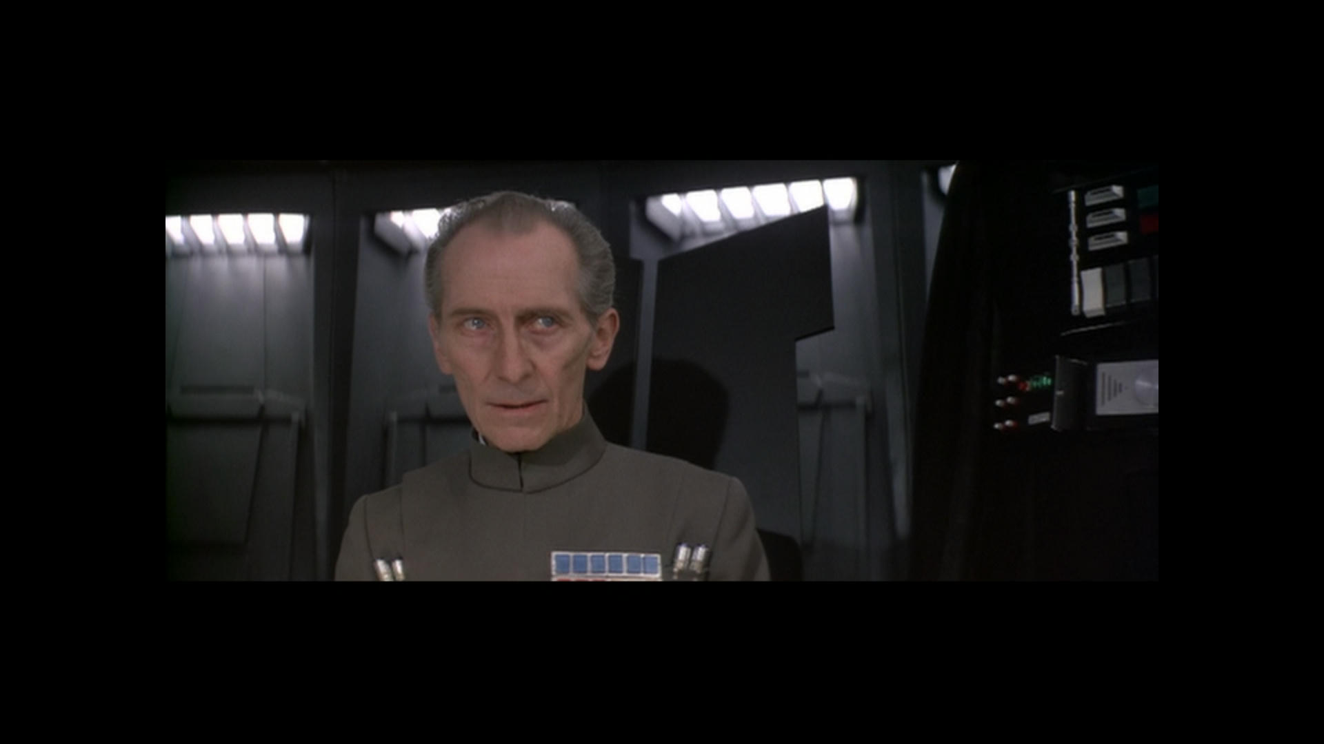
The amount of Shift Changed
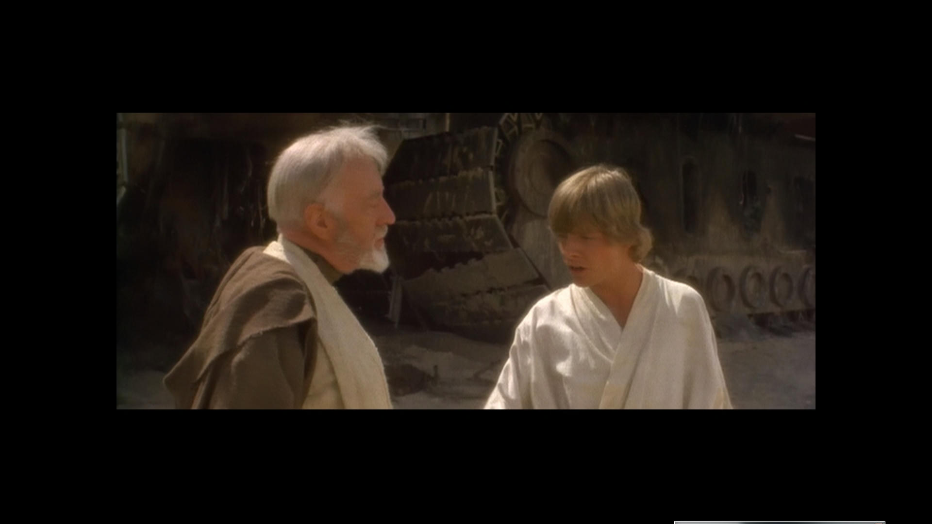
I think this is a fairly conclusive experiment and I now feel like I can see what the film is supposed to look like. I think it looks really really nice like this and it’s so simple and easy to get it where it needs to be.

To me it’s perfect like this… So to create a reference from a hue shifted GOUT would be the way to go, this could then be easily color matched to say the Blu-Ray and fix that pile of crap.

This is the best solution I feel to what is happening and the confusion over what the film should look like. Some sequences have shots that require different amounts of Shift but eventually after going through it piece by piece you will get to a conclusive answer on the Normal film footage.

The Special Effects as I said requires different Handling.

The reason I suggest using Womble is because it will handle the MPEG without having to decipher it as when I put this in NLE the results were slightly different and not as good. You xould also just use VLC for snapshots Like I have done and Color match.

This won’t give good reference for absolutely everything but I reckon about 80% some parts require no shift at all like R2 and 3P0 on the sandcrawler for instance. It only needs to shift when you see red face and so on.

I would probably trust the brightness and levels of the JSC to get a slightly brighter and less dark but overall I think I have found a good soloution.

Go and see what it is meant to look like 😃 It looks lovely…

The Gout has unfaded Highlights and the Door flash should look like this, Although I think there is a bit of a question over the light on the right hand side of the door is either Blue or Purple? I think it is Blue and we have an issue there. Not sure about the deep Blue that suddenly appear either before the explosion. Also note Soldier with purple shirt. It is all obvious evidence of Hue Shifting and the whole lot is swinging about like a windsock in a hurricane here.

The color is right but just shifting Hues so it needs to be conformed so that it maintains the correct Hue or the same Hue.

https://www.youtube.com/watch?v=T4sV3lqzKqQ

While most of these look good, I think you should avoid phrases like “the true look” of the GOUT or “the color is right” unless you use some sort of reliable reference to define what such a statement is worth. Any other method involves a great level of subjectivity and personal preference.

Author
Time
 (Edited)

DrDre said:

Ronster said:

Gout Hue Shifting Correction Reveals the true look of the Gout. It’s actually a doddle to fix this film using the GOUT. This was Loaded in VLC Media PLayer > Tools > Effects and Filters > Image Adjust.

This Yielded Better results than Loading it in to an non linear editor for MPEG decoding issues. Possibly womble DVD editor is probably the best thing to use to fix this and export for reference (free 30 day trial)

Perhaps still a bit pink on Tarkin.

The amount of Shift Changed
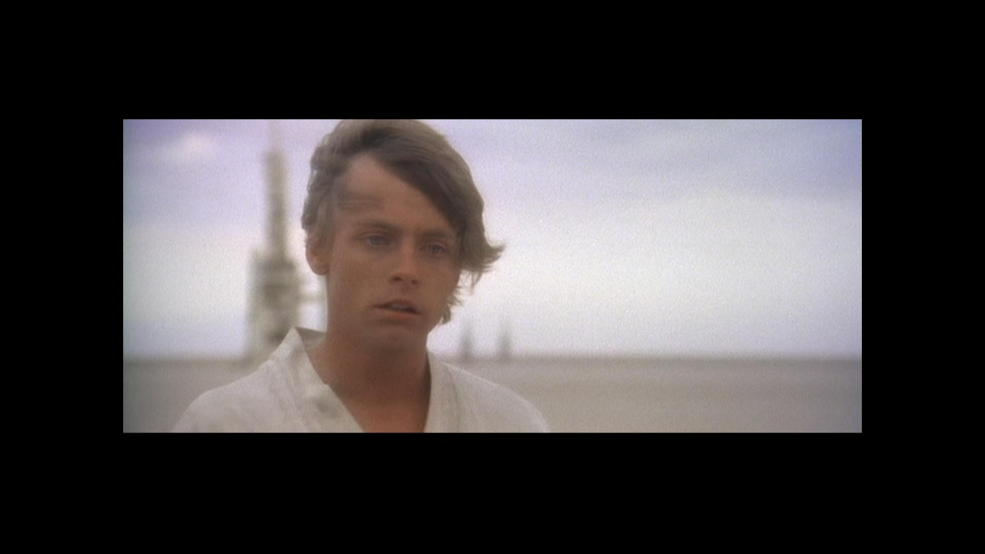
I think this is a fairly conclusive experiment and I now feel like I can see what the film is supposed to look like. I think it looks really really nice like this and it’s so simple and easy to get it where it needs to be.

To me it’s perfect like this… So to create a reference from a hue shifted GOUT would be the way to go, this could then be easily color matched to say the Blu-Ray and fix that pile of crap.

This is the best solution I feel to what is happening and the confusion over what the film should look like. Some sequences have shots that require different amounts of Shift but eventually after going through it piece by piece you will get to a conclusive answer on the Normal film footage.

The Special Effects as I said requires different Handling.

The reason I suggest using Womble is because it will handle the MPEG without having to decipher it as when I put this in NLE the results were slightly different and not as good. You xould also just use VLC for snapshots Like I have done and Color match.

This won’t give good reference for absolutely everything but I reckon about 80% some parts require no shift at all like R2 and 3P0 on the sandcrawler for instance. It only needs to shift when you see red face and so on.

I would probably trust the brightness and levels of the JSC to get a slightly brighter and less dark but overall I think I have found a good soloution.

Go and see what it is meant to look like 😃 It looks lovely…

The Gout has unfaded Highlights and the Door flash should look like this, Although I think there is a bit of a question over the light on the right hand side of the door is either Blue or Purple? I think it is Blue and we have an issue there. Not sure about the deep Blue that suddenly appear either before the explosion. Also note Soldier with purple shirt. It is all obvious evidence of Hue Shifting and the whole lot is swinging about like a windsock in a hurricane here.

The color is right but just shifting Hues so it needs to be conformed so that it maintains the correct Hue or the same Hue.

https://www.youtube.com/watch?v=T4sV3lqzKqQ

While most of these look good, I think you should avoid phrases like “the true look” of the GOUT unless you use some sort of reliable reference to define what such a definition entails. Any other method involves a great level of subjectivity and personal preference.

Ronster Remembers…Your Prints might be a bit different but this is how it used to look or very close with what I grew up with I am sure of it. The Hues are shifting that is about it. Like I said won’t get same result in NLE has to be done direct to mpeg.

https://www.youtube.com/watch?v=1k8craCGpgs

Author
Time
 (Edited)

adywan said:

Ronster said:

Go and see what it is meant to look like 😃 It looks lovely…

This is why you NEED to calibrate your monitor. If you think that looks lovely then your monitor is not showing you that gif is WAY too shifted towards green. It looks terrible.

Yep that is what happens in a NLE. And that was exported from. Really it needs to be done in Womble probably will then miss out the mpeg decoding issues.

The result is not true unless you apply it directly to the mpeg.

It crash and corrupt the file NLE file again and again. So you have to treat the raw mpeg after proper de-coding not in NLE for true result as it screws up the color once converted or Ripped. I think Womble or do it like I have in a player and capture the result.

Author
Time

Ronster said:

DrDre said:

Ronster said:

Gout Hue Shifting Correction Reveals the true look of the Gout. It’s actually a doddle to fix this film using the GOUT. This was Loaded in VLC Media PLayer > Tools > Effects and Filters > Image Adjust.

This Yielded Better results than Loading it in to an non linear editor for MPEG decoding issues. Possibly womble DVD editor is probably the best thing to use to fix this and export for reference (free 30 day trial)

Perhaps still a bit pink on Tarkin.

The amount of Shift Changed
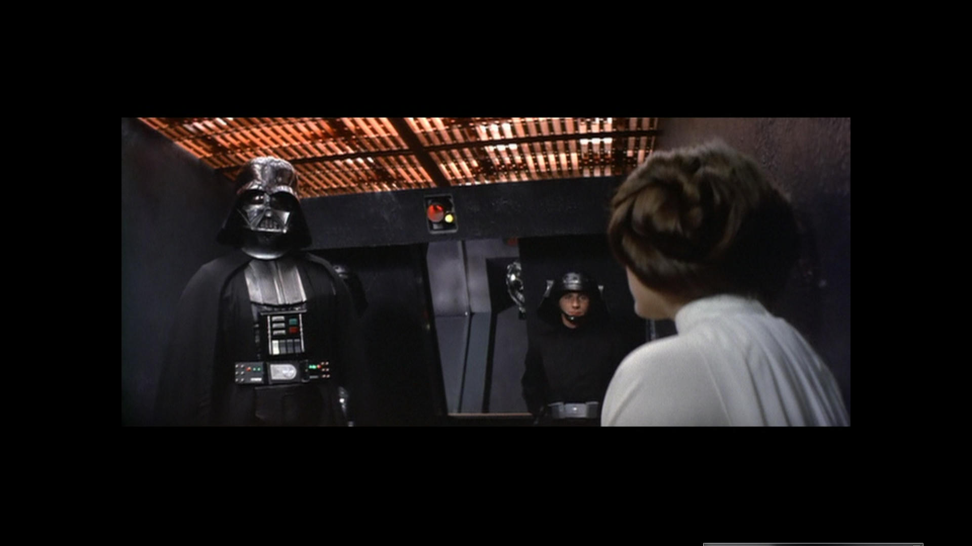
I think this is a fairly conclusive experiment and I now feel like I can see what the film is supposed to look like. I think it looks really really nice like this and it’s so simple and easy to get it where it needs to be.

To me it’s perfect like this… So to create a reference from a hue shifted GOUT would be the way to go, this could then be easily color matched to say the Blu-Ray and fix that pile of crap.

This is the best solution I feel to what is happening and the confusion over what the film should look like. Some sequences have shots that require different amounts of Shift but eventually after going through it piece by piece you will get to a conclusive answer on the Normal film footage.

The Special Effects as I said requires different Handling.

The reason I suggest using Womble is because it will handle the MPEG without having to decipher it as when I put this in NLE the results were slightly different and not as good. You xould also just use VLC for snapshots Like I have done and Color match.

This won’t give good reference for absolutely everything but I reckon about 80% some parts require no shift at all like R2 and 3P0 on the sandcrawler for instance. It only needs to shift when you see red face and so on.

I would probably trust the brightness and levels of the JSC to get a slightly brighter and less dark but overall I think I have found a good soloution.
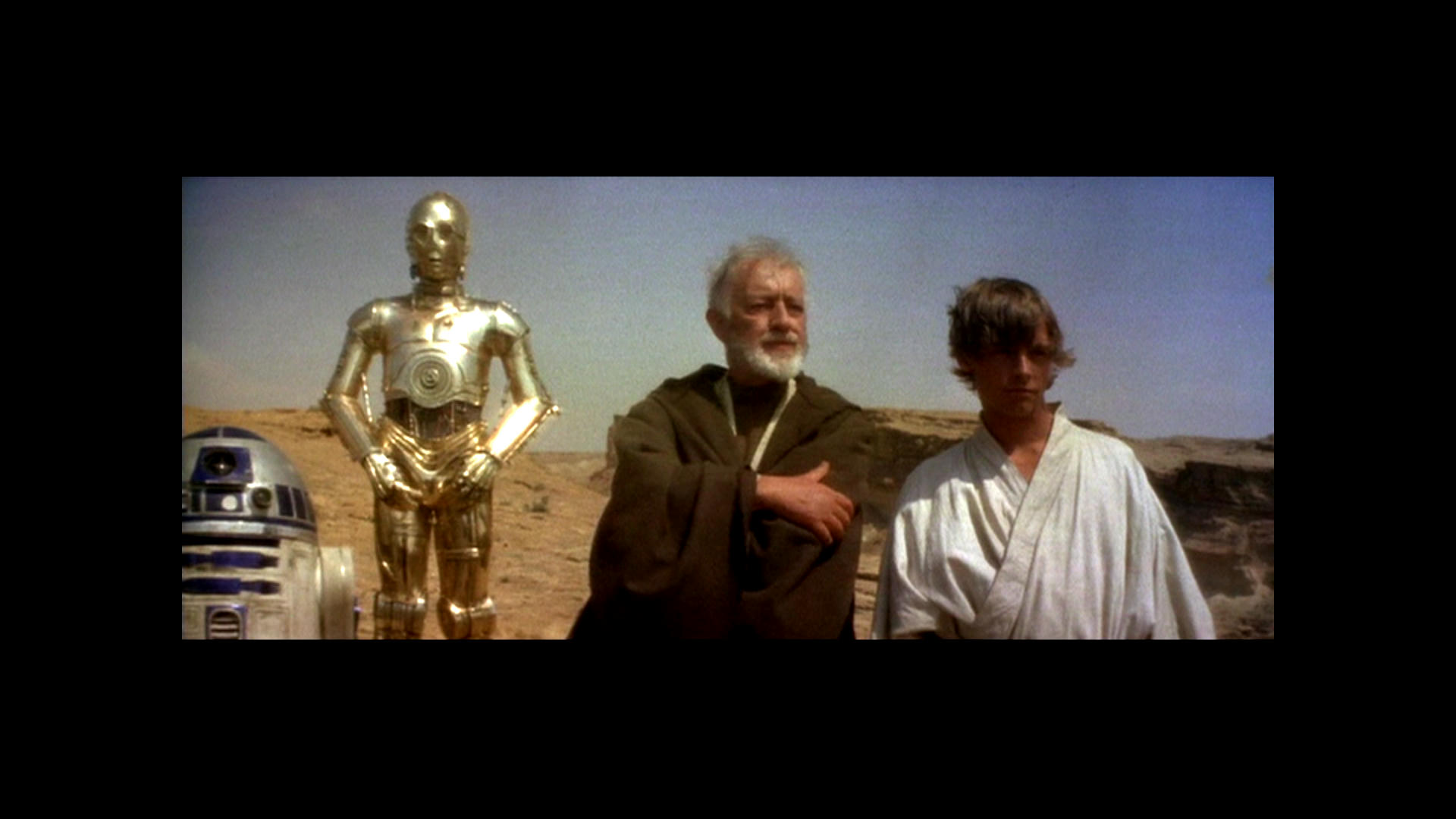
Go and see what it is meant to look like 😃 It looks lovely…
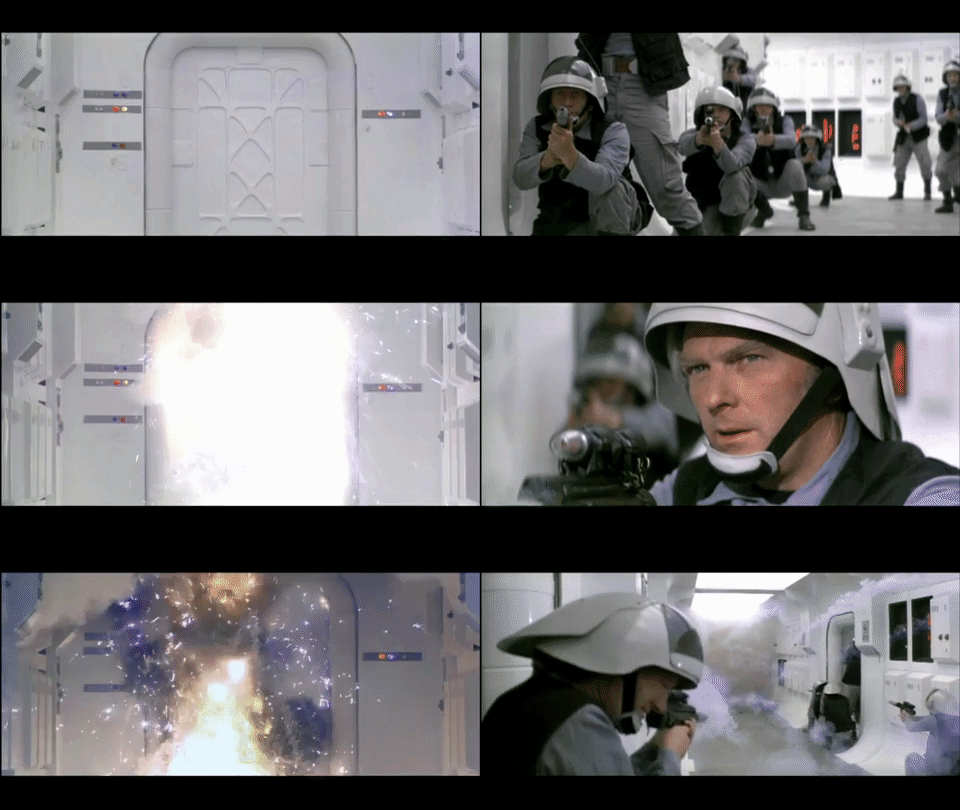
The Gout has unfaded Highlights and the Door flash should look like this, Although I think there is a bit of a question over the light on the right hand side of the door is either Blue or Purple? I think it is Blue and we have an issue there. Not sure about the deep Blue that suddenly appear either before the explosion. Also note Soldier with purple shirt. It is all obvious evidence of Hue Shifting and the whole lot is swinging about like a windsock in a hurricane here.

The color is right but just shifting Hues so it needs to be conformed so that it maintains the correct Hue or the same Hue.

https://www.youtube.com/watch?v=T4sV3lqzKqQ

While most of these look good, I think you should avoid phrases like “the true look” of the GOUT unless you use some sort of reliable reference to define what such a definition entails. Any other method involves a great level of subjectivity and personal preference.

Ronster Remembers…Your Prints might be a bit different but this is how it used to look or very close with what I grew up with I am sure of it. The Hues are shifting that is about it. Like I said won’t get same result in NLE has to be done direct to mpeg.

https://www.youtube.com/watch?v=1k8craCGpgs

Sorry if I’m a bit skeptical, but memory is a very unreliable reference source especially after four decades. Then there’s the fact that the prints you believe you remember also had their own hue shifts and inconsistencies, which were just part of the color grading process of that time.

Author
Time
 (Edited)

Ronster said:

adywan said:

Ronster said:

Go and see what it is meant to look like 😃 It looks lovely…

This is why you NEED to calibrate your monitor. If you think that looks lovely then your monitor is not showing you that gif is WAY too shifted towards green. It looks terrible.

Yep that is what happens in a NLE. And that was exported from. Really it needs to be done in Womble probably will then miss out the mpeg decoding issues.

The result is not true unless you apply it directly to the mpeg.

It crash and corrupt the file NLE file again and again. So you have to treat the raw mpeg after proper de-coding not in NLE for true result as it screws up the color once converted or Ripped. I think Womble or do it like I have in a player and capture the result.

So you now blame the editing programs you are using for the bad grading just so you can ignore yet another person telling you that YOU NEED TO CALIBRATE YOUR MONITOR!. And why originally say " this is what it is meant to look like. it looks lovely" and then say, when i tell you how bad it looks, that “oh its the way the editing program is exporting it (when its not)”? Why say it looks good to you in the first place? IT’S YOUR MONITOR. Spend the time calibrating it.

So what NLE program are you using thats exporting and creating all these colour issues?

People are offering you advice, telling you what you are doing wrong, and yet you chose to ignore them, get snarky towards them and carry on doing it the same wrong way and blame everything apart from your monitor.

ANH:REVISITED
ESB:REVISITED

DONATIONS TOWARDS MATERIALS FOR THE REVISITED SAGA

Author
Time
 (Edited)

adywan said:

And why originally say " this is what it is meant to look like. it looks lovely" and then say, when i tell you how bad it looks, that “oh its the way the editing program is exporting it (when its not)”? Why say it looks good to you in the first place? IT’S YOUR MONITOR. Spend the time calibrating it.

Well, you know, this thread is called “Goodbye Magenta”. Then Ronster turned to “Goodbye Purple”, then “Goodbye Blue”, then “More Magenta please”, and now “Too much Green”.

I’m really sorry to say that, but it looks like trolling to me.

Author
Time
 (Edited)

sorry just finish work… Using Lightworks NLE but it no longer supports mpeg as of new version but still the result is different.

VLC is doing exactly what i want put this in NLE or even convert file it acts different the control is different and creates issues. Going to try womble.

Edit:

Effects might be in different colorspace is possibly the issue.

perhaps YPbPr or YCbCr is color space needed for effect to work correctly? Not in RGB anyway.

Author
Time

ronster, crystal clear now: why not calibrate your monitor? the shot adywan quoted looks awful indeed.

Author
Time

Can we just say goodbye to this thread? It clearly holds zero value, there are actual projects going on.

And in the time of greatest despair, there shall come a savior, and he shall be known as the Son of the Suns.

Author
Time
 (Edited)

It’s not my fault the software i was using is not handling the colorspace correctly and does nog handle mpeg formats anymore.

I don’t have a lot of time on my hands to do a project at this time you are right.

But it is important to figure out how to go about doing something to get the best result. What I wanted to do was simple but the software lacked the capability.

I use professional hardware most of the time that is very good. I don’t claim to be some video editing genius but I am both identifying a problem and finding a solution of how to handle none of which anyone has any input in apart from calibrate your monitor guff when it comes down to actually going to the mpeg direct and using filters that will work in the right colorspace. Which my software did not… That was why I was using image program because I knew something was not right.

Things have clicked in to place now. A road forward has been at least found for myself and identified of a possible way forward on conforming the hues of the gout in the correct working colorspace.

I thought I did quite well to identify the problem and give a manual solution and a possible editing solution for reference that (should) work.

Unfortunately it took a while to get there. I knew the problem just trouble finding the solution and how things were going wrong.

Lightworks used to support progressive scanned Vob file but after mandatory update it is now gone.