I have used those calibration sensors before, but only when I have had to put up a video walls to make all the screen match up as say 9 screens (3x3) make a whole image and it is important that every screen match. If you say have dual projection it is again important you have matching images (especially if you are blending which I don’t really get involved in but I might put the projectors in) I understand you are trying to tell me that calibrating my monitor may change things slightly about my screen but that it is not that important unless you have the same screen as me as different screens will display an image differently. Even if I Calibrate my display it will still look different on yours to mine unless you have a very similar panel.
There is a bit of a futility to such things as my monitor is not part of your image nor is your monitor part of my image.
It’s not particularly important for this exercise because for some of the special effects and the highlights are quite a way off where they should be anyway, so It’s more important that it goes in the right general direction more than anything else, as it’s way off anyway.
This is an effort that know is good in a way but I don’t feel it’s really all the way there yet. I think it is overdone but I was trying to pull as much out so this would be scaled back. Degraded Highlights very bad here.
Quick test of dusk sky… This is again not too great I feel. But Possibly again degraded highlights.
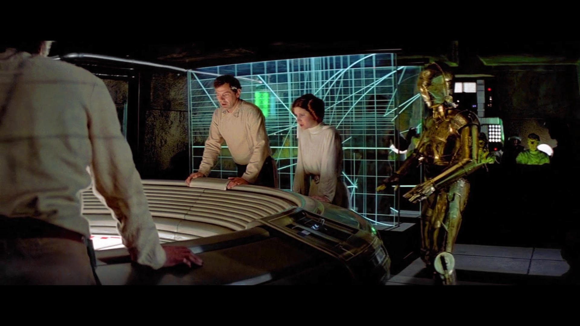
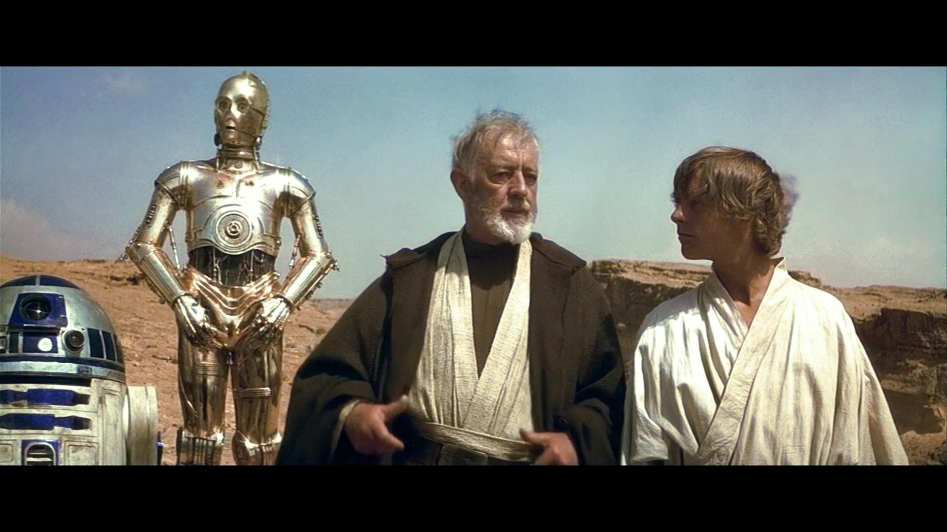
This is a fairly good reference for the Command center though.
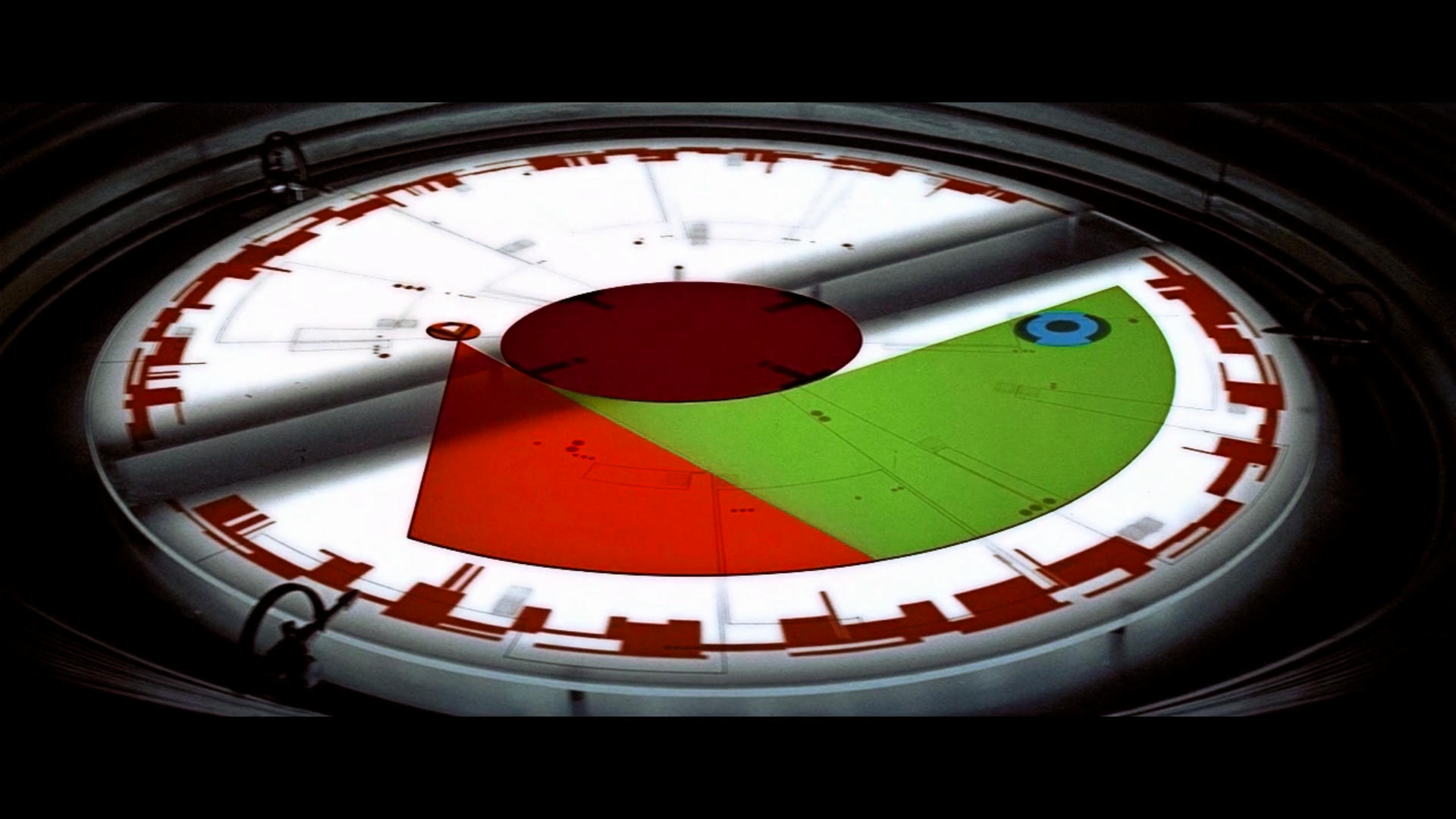
Rebel Clock - Just realised that the rim should be Yellow not Blue it’s missing a lot of red and yellow in the shadow. I hued the green for the reference but adjusting the color in the shadow will bring the green patch to that color so it’s a mistake on my part. Again obvious animation color error I suppose.

Should be like this one not the cyan color one…
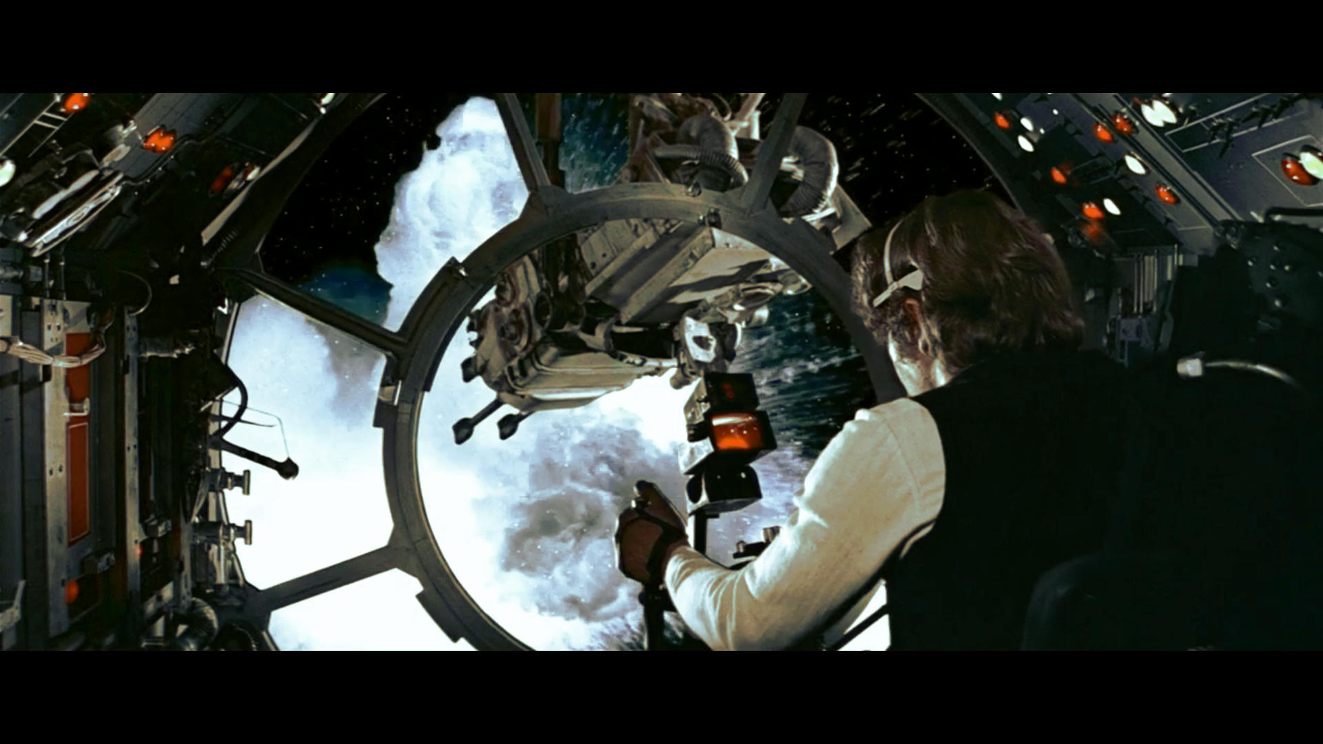
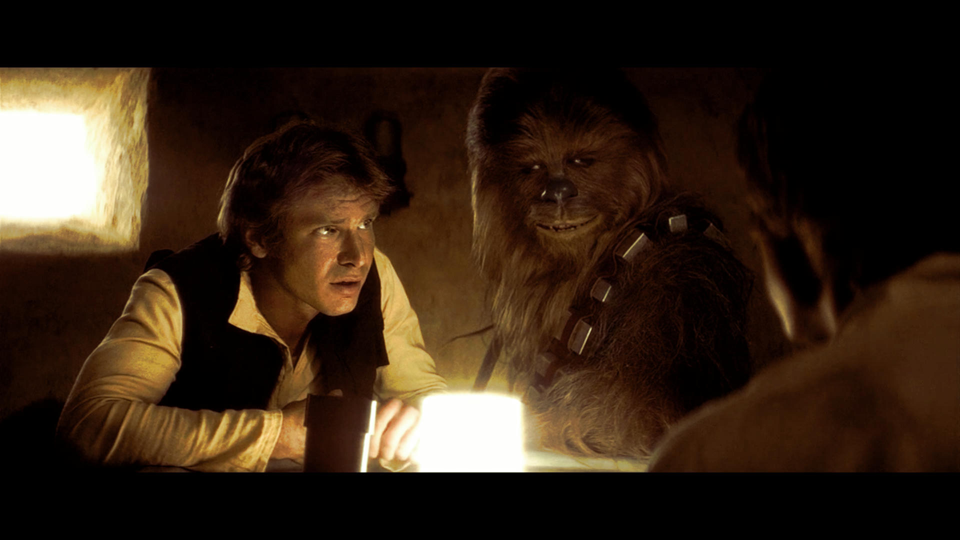
A look at the Highlights vs trying to bring more yellow in to Han’s shirt. Special Effects probably removing far too much color from image. Hard to get anything from this but the hues were more conformed on the explosion. Looked at correct shade of Red also.
Did this tonight the others on Sunday but just trying to figure out how hard to push it. It needs a harder push in general but I think this is about the limit. I would use Bias saturation decrease on this slightly perhaps decrease by about 2-3% just to thin out R2 cyan dome and pink clouds. Good Brightness and saturation.