logo Sign In

Info: Star Wars - What is wrong and what is right... Goodbye Magenta — Page 4

Author
Time

It’s a little inaccurate to say hue shift though.

When it comes to digital video or films grading . We don’t work in Hue we work in mostly in RGB values, contrast and saturation. It’s very rare to even touch the hue knob as it pushes everything to the right or left. Not helpful at all. (Yes there are ways to specifically alter and shift specific hues but neither the film nor the bluray likely used these techniques)

When it comes to badly regarded films it’s a case of RGB curves and saturation that makes them look so much bluer or greener or redder or magenta. Film prints don’t degrade by shifting hues, but by the RGB particles degrading at different rates.

The Death Star shot you posted. Nothing to do with hue shifts and everything to do with RGB and saturation.

Author
Time

Ronster said:

ChainsawAsh said:

If you can’t calibrate your monitor, you shouldn’t be doing any color work or commenting on anyone else’s.

I have followed these instructions, and It would seem that my panel is very Bright compared to my old TV for HDR content. So I have adjusted this now.

https://www.rtings.com/tv/reviews/samsung/mu6100/settings

I have copied the white balance in this but I can not change hardly anything because it’s running a PC and this will not allow you to have Movie mode because it only allows Standard or Dynamic modes.

This is something you should take up with Samsung to be honest.

Grab a calibration probe, and calibrate your screen.
Any colour discussion really is completely pointless if you are viewing on a non-calibrated setup.

If you are feeding it with a PC, the PC will handle the calibration.
Even something like the colormunki smile would do, but an X-rite I1 Display Pro would be a good place to start.

Donations welcome: paypal.me/poit
bitcoin:13QDjXjt7w7BFiQc4Q7wpRGPtYKYchnm8x
Help get The Original Trilogy preserved!

Author
Time
 (Edited)

Chewielewis said:

It’s a little inaccurate to say hue shift though.

When it comes to digital video or films grading . We don’t work in Hue we work in mostly in RGB values, contrast and saturation. It’s very rare to even touch the hue knob as it pushes everything to the right or left. Not helpful at all. (Yes there are ways to specifically alter and shift specific hues but neither the film nor the bluray likely used these techniques)

When it comes to badly regarded films it’s a case of RGB curves and saturation that makes them look so much bluer or greener or redder or magenta. Film prints don’t degrade by shifting hues, but by the RGB particles degrading at different rates.

The Death Star shot you posted. Nothing to do with hue shifts and everything to do with RGB and saturation.

yeah, I just did that quickly and being totally honest i did it from memory. So to do that not such a bad effort as I looked at the other appearance after i had changed the settings.

Either way I understand the principles of trying to get say a consistancy to something with the color, but say for that Binary Sunset shot, the Blu Ray looks really quite wrong but there is also something right about it that say the theatrical print color lacks.I also am starting to think the fake sun was meant to be blue / purple But with all this said, it seems from what you are saying that once you “shift hues” to try and maintain a consistancy you end up in a bit of an unknown wilderness which is true but it is all relative and when it does happen getting something back to a truer result is better than ignoring it and letting the physical film dictate the direction of a color shift.

Fixing a part that does travel off into a different hue I actually find the most satisfying even if it is not 100% spot on the end result will look rematkably better than you may have seen something ever before and this is where in terms of color correcting, it is I find one of the more exciting aspects and you also don’t really get those opportunities to do that sort of thing with newer films because technology is so much better and these things rarely occur today with digital film. That and most of the old films have already been fixed up.

Poita, I may have a look at one of those things you mentioned but I honestly don’t have all that much time on my hands at this time of year until December.

Author
Time

I’ve re-read your last post a few times, and I’m not 100% sure what you’re getting at, but I think I get the gist.

Yes, on older film, grading was problematic. As a colourist, you would sit in the screening room with the DoP and the Director and sometimes a few others, and you would make notes as the film played, depending on feedback from the two Directors.

The notes you were making were the place in the film, and the adjustments you were going to make to the film development process to adjust the colour balance the way they wanted it. You had to be able to see it in your mind, and then immediately translate it to temperatures and times, you effectively had three buttons as a colourist, plus exposure. You had to know and visualise everything in your head, make notes, then punch it all out, a new print would be struck and often the next day you would sit again with the Directors and they would ask for a few more changes or not.

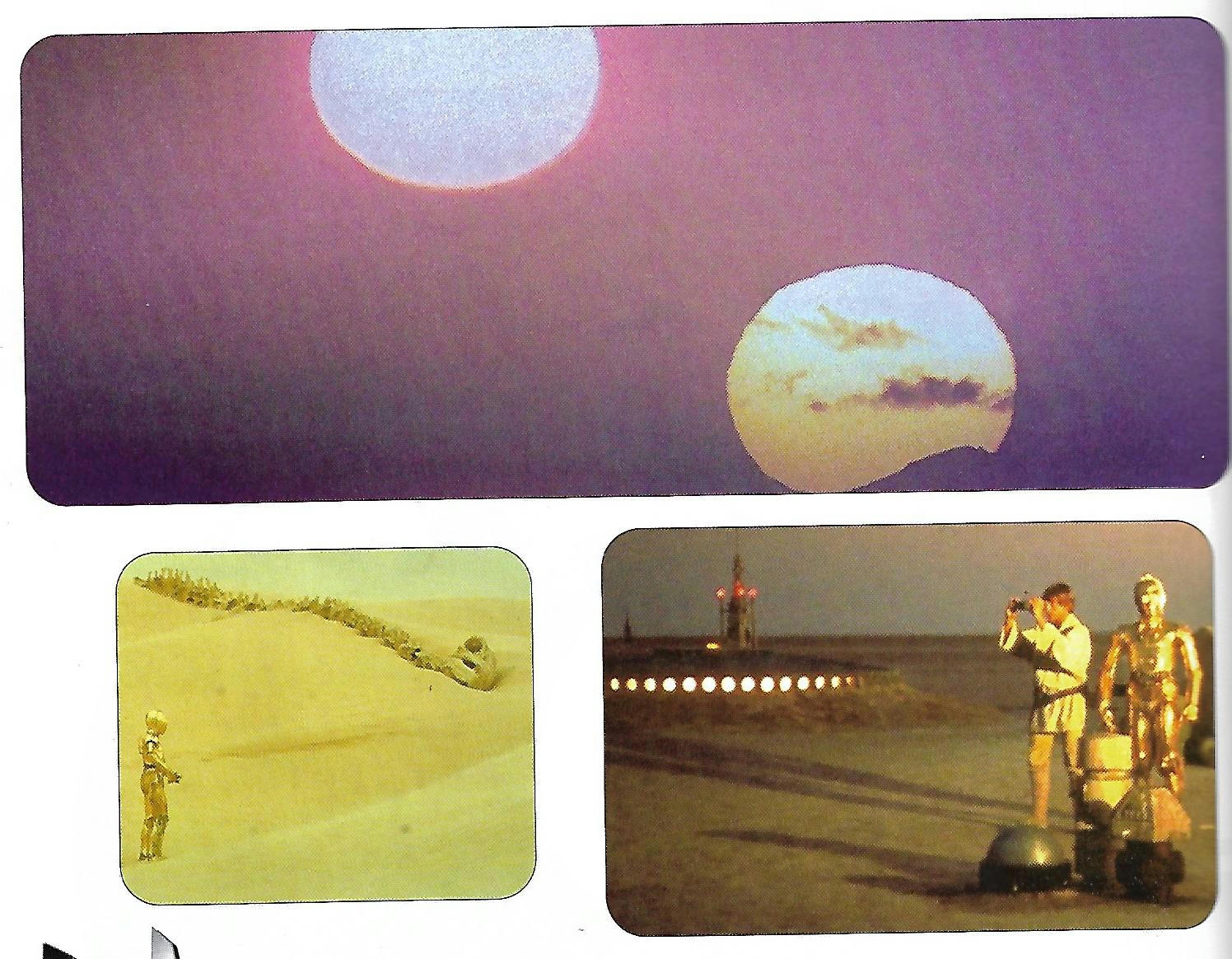
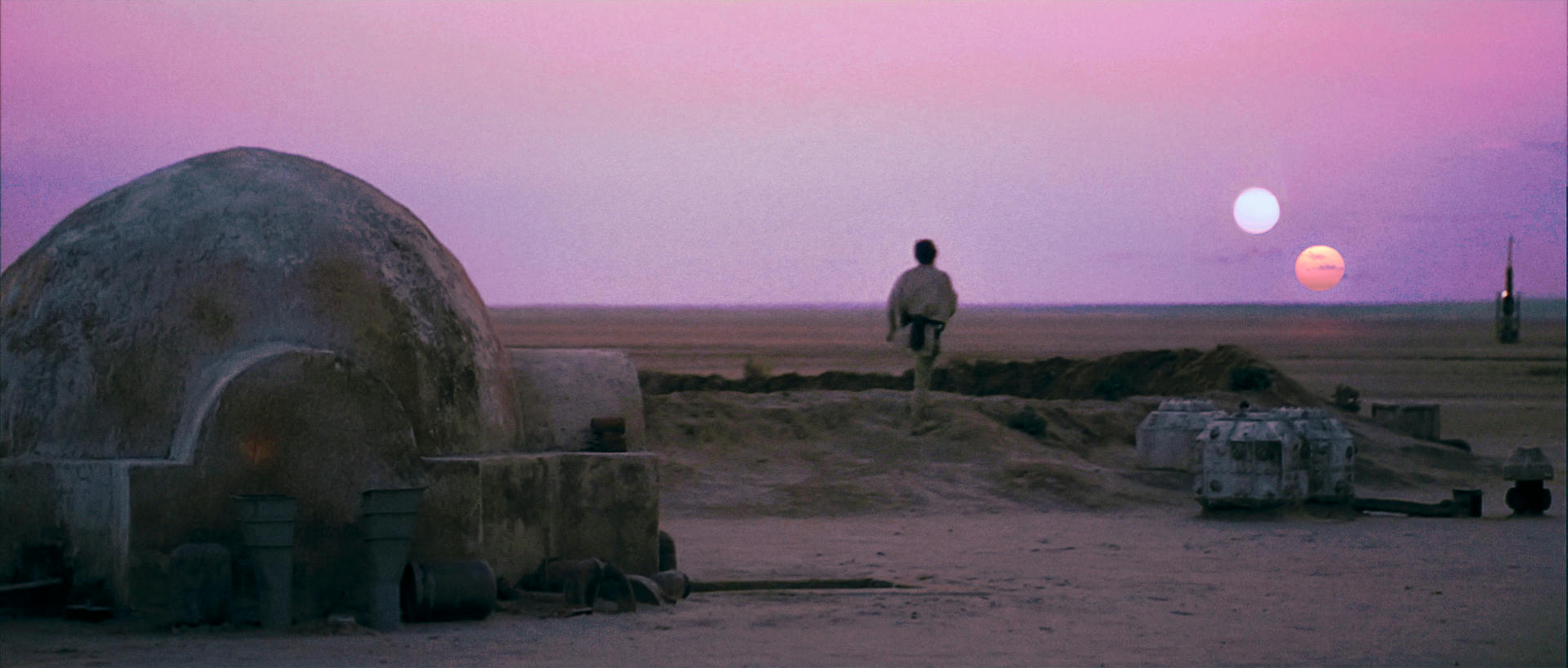
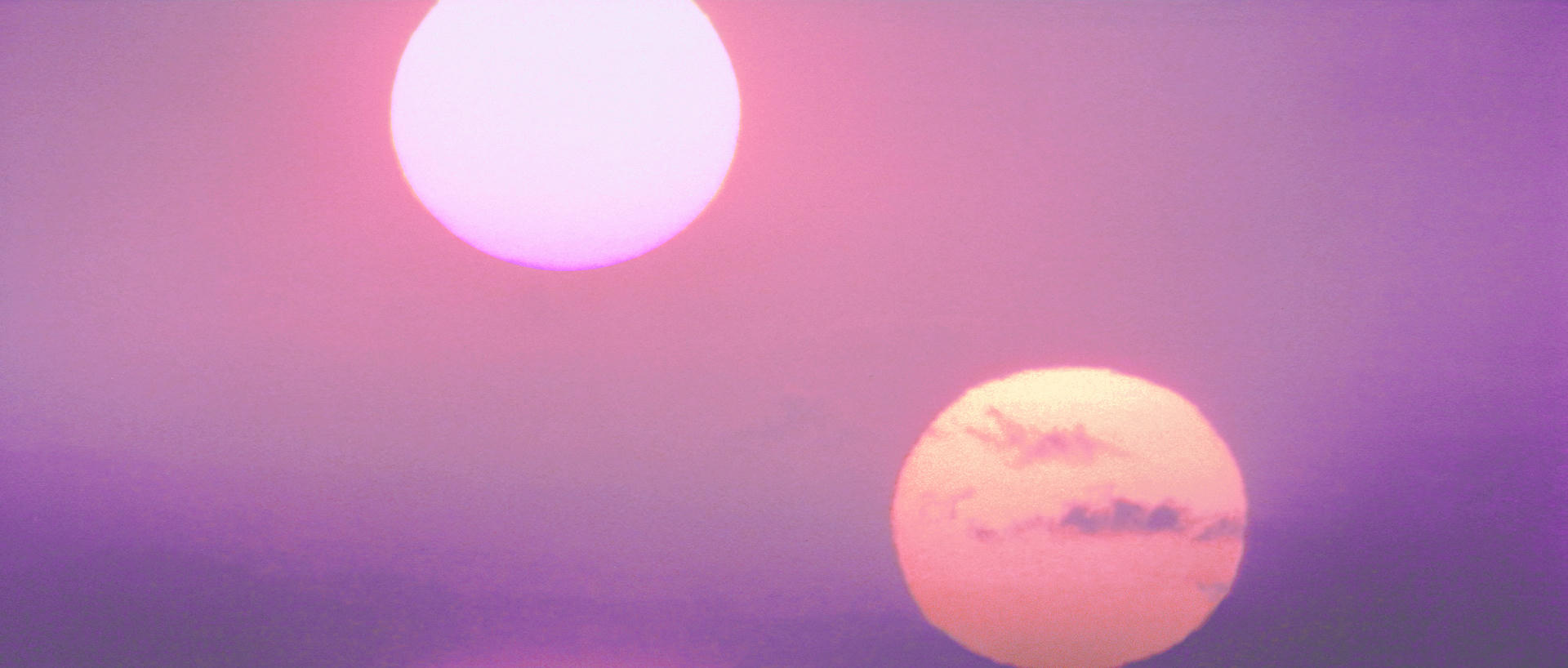
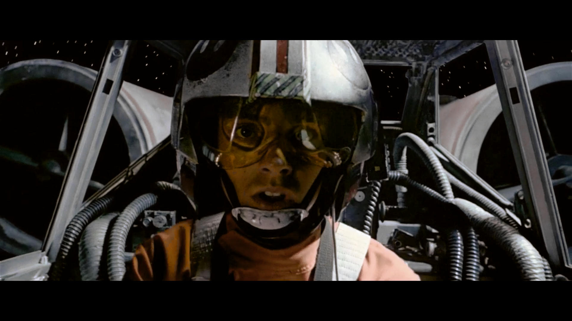
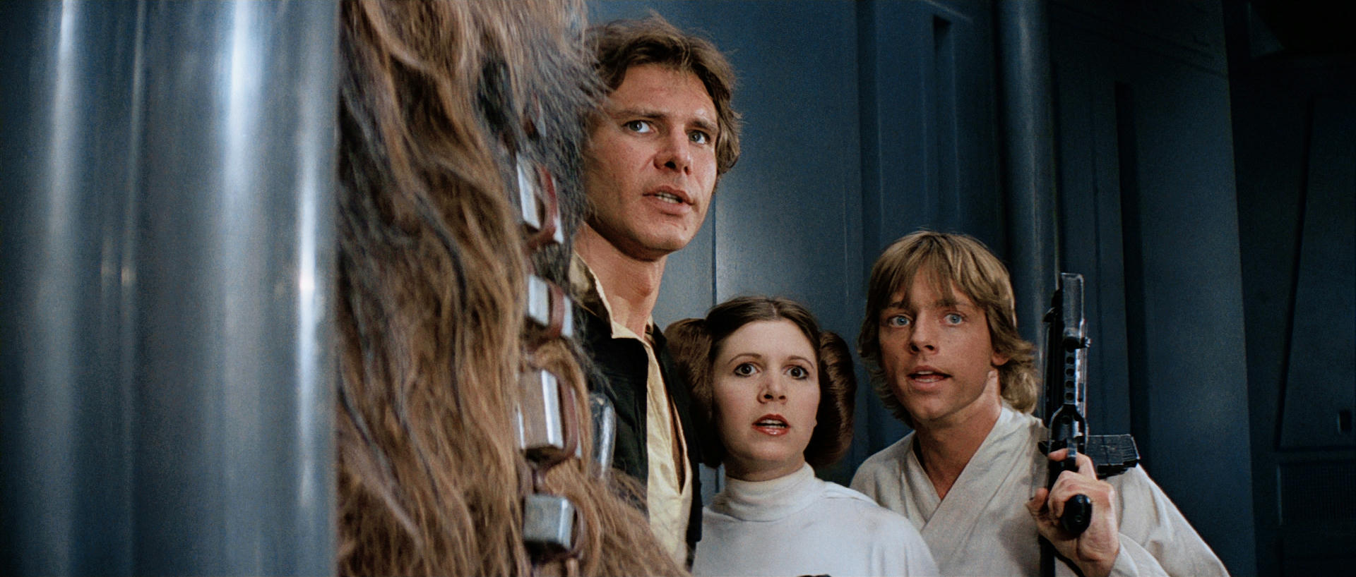
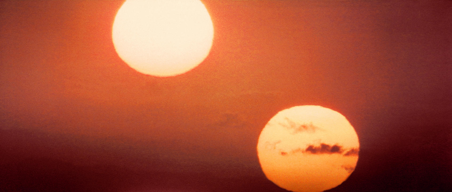
Star Wars was on a very tight budget, both in money and time, there wasn’t much time for grading, plus it was shot very quickly, all over the place, and on a multitude of different stocks, and then the composites… in short, the grade is all over the place, and often varies from shot to shot.

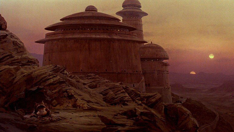
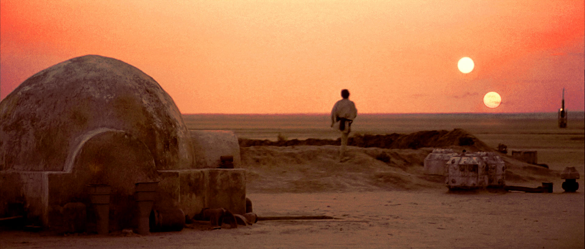
So yeah, in the sunset scene, each shot is not correctly balanced to each other shot, this is the case in a lot of scenes in Star Wars, less so in Empire and much less so in Jedi (apart from the comps).

This is the way the film was.

When it came to home releases, the VHS release was colour timed by the telecine operator, quite possibly with no input from anyone, and their main aim would have been keeping the exposure within legal video limits, and making sure you can see what is going on. They look radically different to the film in some places.

When it came to DVD and then later Blu-ray, digital grading was possible, so isolating parts of the image to achieve a different look became possible, and the grade was completely removed from the original film.

As to what is ‘true’, well that is the original film, warts and all. It may not have been exactly what Lucas ‘wanted’, but it is what he signed off on, and what the world saw.

As for intent, that is a slippery slope. They all no doubt intended for the creatures in the Cantina to be fully articulated and way more realistic. They probably wanted everything to look a lot better than it did.
Chasing intent is impossible, the intent would have changed between shooting it and seeing it in dailies. The intent would change with hindsight, with life experience, with the changing world and society and technology.

There is no real way to gauge intent, only what was actually done, i.e. what is on the film.

Everything else is a revisionist version. Personally I would prefer to watch a better colour balanced version than what is on the original Star Wars, with consistent black levels, consistent colour shot to shot, and some of the colour glitches fixed. But I also know the need to preserve the film as it was, and the importance of that.
Which is why I personally make an archival version, then an ‘adjusted’ version that is more like the aesthetic that pleases my 2018 self, and lets me watch the film the way I remember it, without 70s glitchiness that pulls me out of the experience, and lets me enjoy the wonder again, safe in the knowledge that the original is preserved, to be studied and enjoyed in all its warty glory 😃

TLDR: Yes, the grade is all over the place, every different version will have different colour.

Donations welcome: paypal.me/poit
bitcoin:13QDjXjt7w7BFiQc4Q7wpRGPtYKYchnm8x
Help get The Original Trilogy preserved!

Author
Time

I think that your policy of preserve original and make more aesthetically pleasing version is the way it should be done because of the nature of the “rush job” as you put it.

The process sounds quite interesting of making notes for how the film should look and how to present it and all done on the fly. I imagine there were stalling points on things, over analysis and then coupled with vagueness perhaps. Actually sounds like a bit of a process where you need to be the guy in the room who does not say much but then also command explaination and jump in or butt in to clear up or fully understand what is being asked if things start spinning too vague.

I also a bit of a firm believer in what the “Special Edition” attempted in some ways but I think they kind of failed on quite a few of the ideas, But in essence i am not opposed to revamping something for say a new generation of people, or making minor adjustments for good reason. I agree intent can be a slippery slope, but with a film like Star Wars there is a bit of a re-gurgitation of content for which these can be simply explained easily. I would like to see all the mattes fixed and any missing optical elements put in, missing audio and couple that with a pseudo special edition that also saves more of the original miniature work whilst retaining some “updates”. So I kind of think 2 versions would do me but just not the special edition we got.

I am actually not convincdd people can still understand when a film “Color shifts” and travels off. when i get time i will post an example here.

Author
Time

There was never any vagueness in the room. Everyone was an expert in their field really, and the communication was clear and concise. If there was every any question, you would clarify immediately.
On a good film, everyone is expected to know their job, and do it efficiently, and ask for clarification if needed. There is way too much money at stake for people to make assumptions or not be on their game.
It can seem brutal from the outside, but it is collaboration on a huge scale.

Donations welcome: paypal.me/poit
bitcoin:13QDjXjt7w7BFiQc4Q7wpRGPtYKYchnm8x
Help get The Original Trilogy preserved!

Author
Time
 (Edited)

got this out of the Star Wars Annual 1999. The Sun on the left as I said might be supposed to be more blue than white also notice the more pink flare around the blueish sun.

So I adjusted the shot I did as a rough reference for the shot and the fixed version.


Example of Major Red Hue Shift (Red is in the total wrong shade of red)

Example of brilliant color grading but minor Red Hue shift (wrong shade of red) affecting skin tones

Color Grade and Hue Shift Result for Major Issue. All hues were shifted on this occasion the same amount.

Hue Shift Only no Color added or taken away Result 2 from Red and Blue shift only.

Author
Time

I have to mention that I went down the same road you did and in the end I concluded that there has been no color shift. The colors are out of balance, but that is an easy fix. Also, you have to try both ways of removing red. You can’t just assume it is the magenta/green channel that is off. I have found it is not. That is the most solid channel. It is the cyan/red channel and the yellow/blue channel that are both off. It is tempting to shift the colors, but that really just makes the problems worse. If you rebalance the colors you will get a much nicer result.

Author
Time

Also, you should never use pictures printed in books or magazines as definitive. I have really not found any such pictures from ANH that really provide true colors. So matching the film to them is kind of silly, especially with the 4k77 project available and the GOUT on hand. In the sunset scene you have brought out the magenta at the expense of the yellow and cyan and they need to be more in balance. If there is a color for those shots, it is variations of purple, not magenta. You’ve washed out all the blues and it needs to have a touch of gray to it (as all sunsets should when filmed on this planet). So not only have you used questionable sources, but you haven’t used any common sense or the far better sources available to us to arrive at descent color pallet for that shot. And you should really follow what Poita and DrDre have to say. I don’t always agree with them 100%, but they know what they are talking about when it comes to restoring color to films.

Author
Time

That is interesting yotsuya that you also went down this path.

Please can you show me how you have the luke in cockpit shot, if you have attempted that bit?

Yes I agree it’s not about trusting a picture book exactly. But things are relative to one another in some ways perhaps. I feel that the part that is magenta in the sky could be another color… But then what color?

I think the theatrical version lacks the greeny blue in the shadow. This i feel is correct. When it comes to the mid tones bringing out enough red to see the red on the sand is correct. But I do agree I am not sure about that tone of magenta in the sky. I like the Red Version better for the glow but I am not sure what color the glow should be. I don’t trust the prints a lot of the time and especially not for special effects and optical printers the trust is very low in most cases. I am trying to figure out what it is meant to look like not what any version looks like because they are all a bit weird on that part especially.

Author
Time

Just about every shot in ANH has some unique issues to it. This is one that was never recomposited (or done so exactly that you can’t tell) so it has remained unchanged from the 77 premier. In my work on the blu-ray, this is one of the shots that looks the best. But getting the right color to match requires a lot of fiddling. So while my correction doesn’t look a whole lot different from the uncorrected one you shared, it is.

I had done a rough correction previously (I went through and picked out the scenes that my global correction didn’t fix) and I did a finer level of color correction.

Author
Time
 (Edited)

I will give you that it looks better… But I don’t think it quite hit’s the same mark as shifting the Hues to bring it more in line with other shots we see that are not so badly affected.

It’s things like this shot that destroy trust completely, trust in what the print displays come to a low point. That is not to say I don’t think you did a bad job of trying to tackle the issue but you did not go far enough.

It’s like a medical surgeon, our perception of a surgeon is someone that is quite careful which is true, but the reality can be very different that in order to do their job they pull people about and have to be quite rough with something to fix a major problem. Out come the Hammers and Saws to fix some things and it’s not so clinical but quite a rough and brutal process.

My process always starts out Brutal and then I reign it back in until I find the right amount of Brutal or how Brutal I should be. You said before that I over do it, which is correct, I do until I reign it back in to about the right amount.

In terms of the whole Binary Sunset I think perhaps Jabbas Palace from ROTJ might hold some answers for us.

This may mean the glow is that yellowish color and the Bottom of the sky is more Magenta which would make sense almost inverted.

If we followed this image as a guide we probably would end up with something in between the Red and the Purple Version rather than 2 very different looking versions.

So Yavin is actually Tattooine tinted more Red / Orange and Kashykk from the Holiday special was the same planet tinted green 😃

Author
Time

Ronster said:

It’s like a medical surgeon, our perception of a surgeon is someone that is quite careful which is true, but the reality can be very different that in order to do their job they pull people about and have to be quite rough with something to fix a major problem. Out come the Hammers and Saws to fix some things and it’s not so clinical but quite a rough and brutal process.

My process always starts out Brutal and then I reign it back in until I find the right amount of Brutal or how Brutal I should be. You said before that I over do it, which is correct, I do until I reign it back in to about the right amount.

I hope I will never be operated on by you 😃

Seriously, what you made here is not surgery, it is butchery…

Author
Time

Ronster said:

I will give you that it looks better… But I don’t think it quite hit’s the same mark as shifting the Hues to bring it more in line with other shots we see that are not so badly affected.

Dude, yours looks like you just overlaid a magenta cast and called it a day. Everyone else’s actually has color variation throughout the image.

Author
Time
 (Edited)

It is not a competition of who’s is best at all by any means and If you think what I did looks crap then fine.

I think you actually need to find out who butchered it originally. Perhaps Luke flew back and got changed because he shat himself in his orange jumpsuit 😃 he even changed his x-wing to one with a turqoise paint job.

But that is how it looks to me and yeah it’s butchered alright. You should do a cosplay with those Pink Jumpsuit and green goggles. You will get loads of attention 😃.

Nah but seriously, It is something I would love to see fixed and at least Yotsuya had a go, and at least I had a go at it also. Perhaps there is a way to fix it perhaps there is not but all I can say is I had a go at it, I tried, and if you keep trying eventually you will get it right. Both mine and Yotsya look better than the original for doing something about it. I think Yotsuya needed to use a heavier hand though because the issue is severe.

In terms of binary Sunset this is the best I can do with it and I think it’s the only way this shot makes any sense. The purple version in the theatrical cut has serious issues. I wanted to believe there was only something small wrong with it but the Hammer has fallen and I have written it off as an error.

If there was any doubts about George Lucus intention we see it in ROTS also look nothing like in ANH and also ROTJ it looks similar in ROTJ and ROTS making Star Wars ANH the odd one out.

Author
Time

Well, Luke’s face seems to be orange on your corrected shot, while it has a real skin tone on Yostuya’s shot.
Also on your shot, reactor hoods are pink, even the sky contains pink tones.

But I see your point: Luke’s jumpsuit is maybe not supposed to be as pink/purple as in the BR. Unfortunately, while trying to correct his jumpsuit, you probably introduce other errors.
(Should I mention that this kind of subtile correction needs a calibrated screen?)

Author
Time

ZigZig said:

Well, Luke’s face seems to be orange on your corrected shot, while it has a real skin tone on Yostuya’s shot.
Also on your shot, reactor hoods are pink, even the sky contains pink tones.

But I see your point: Luke’s jumpsuit is maybe not supposed to be as pink/purple as in the BR. Unfortunately, while trying to correct his jumpsuit, you probably introduce other errors.
(Should I mention that this kind of subtile correction needs a calibrated screen?)

That is honestly fine perhaps this is a bit better?

The Point is the Hue Alteration at the end of the day and not the Color Grading. Seeing as so many people on here are doing projects, It strikes me as obvious issues that can somehow be fixed yet nobody does, because as someone else previously stated “We don’t really touch the Hue Shift”. And that is why you will always have Luke in his pink pajamas. I don’t mind that much but the point is there is something to it and I feel I have proved the point enough please stop going on about Calibrated monitors, If everyone has these calibrated monitors and Luke still Has a pink Jumpsuit in all the Color Corrections then something must be wrong with your Calibrated monitors.

Author
Time

Ronster said:

please stop going on about Calibrated monitors, If everyone has these calibrated monitors and Luke still Has a pink Jumpsuit in all the Color Corrections then something must be wrong with your Calibrated monitors.

Oh my God.

Author
Time

Do you think maybe there might be a reason why people keep going on about calibrating your monitor? Or why professional colorists don’t touch hue?

Author
Time
 (Edited)

ChainsawAsh said:

Ronster said:

please stop going on about Calibrated monitors, If everyone has these calibrated monitors and Luke still Has a pink Jumpsuit in all the Color Corrections then something must be wrong with your Calibrated monitors.

Do you think maybe there might be a reason why people keep going on about calibrating your monitor? Or why professional colorists don’t touch hue?

It has probably more to do with people not wanting to alter any hues TBH but I think it may be the only way to fix some parts. That is not a critique I just think it’s probably the only way some things can be fixed.

Author
Time

Because some parts of the film have drifted away from what it was supposed to look like. Various Reasons but typically It has problems and It would be nice to try and get it looking the best it can look.

Author
Time
 (Edited)

But why do you think hue adjustment is the only way to fix it and not curves or levels adjustments?

Author
Time
 (Edited)

because it is very, very far from what other shots look like and if you say push on a particular color it is not perhaps going to bring it back to the right shade. The Hues are separated or out of kilter and it would be something that could probably be done as a final stage in varying degrees.

Why is Using Hue Alteration seen as something to not touch?

Author
Time

Because it shifts everything, not just individual color channels, which you can do easily with levels or curves adjustments on individual RGB channels.