logo Sign In

Info: Star Wars - What is wrong and what is right... Goodbye Magenta — Page 3

Author
Time
 (Edited)

It’s a normal video player with shader support and Luts / effects but it’s also a game engine the big obstacle for me using that Is I don’t know any C++ but I was looking at it when I searched for CRT emulation.

Then the idea struck me that assuming you could program in C++ which I can not, You would only need the video assets and this could be strung together and as I said default version for instance technicolor Theatrical version. Assuming if you wanted to then watch the special edition the Program would add the indexed asset footage and Luts and choice of sound mix so on depending on your choices. Basically it would be a better way to handle Multi-version releases with different color timings alternate footage and so on… Rather than 7 disc set or something. Like BLaderunner would also work well in this format or perhaps Close encounters of the third kind.

Basically the idea was based around the video assets and an engine doing real-time rendering for either Luts and perhaps light emulation.

Funnily after looking at the software on the internet I ended up on a job where a touch screen presentation demo was using Unity3D in 4K for a Medial company. This consisted of an idle video loop and content that could be selected via the touchscreen that would give you various information. It was quite effects heavy and I did notice some stuttering issues but that could be in the code not the actual player but The point is it’s not so much branching but providing you have the video assets you can basically combine your video assets in a different way to branching you could just have a config I would assume for your video assets and then depending on your selection it would then add Luts effects and video assets you selected say from a programmed in menu selection for the film. It is all theoretical but yes it is possible and like I said perhaps a peek into the future?

as soon as 50GB SD cards show up it’s only a matter of time…

Can you lock Framerate?
https://docs.unity3d.com/ScriptReference/Video.VideoPlayer-frameRate.html

Seems to be read only so assuming you prepare the video assets to be conformed this should I assume eliminate frame rate differences.

I read also you can play video in Retroarch but it’s a bit clunky…

Anyway It’s too complicated for me, but an idea none the less. Here are some screens of trying to emulate a more Home video & CRT look in Lightworks LNR I used a box blur and a glow.

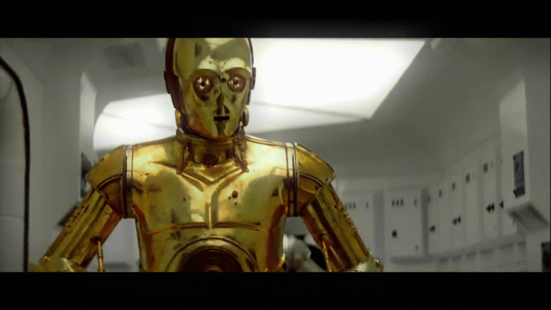
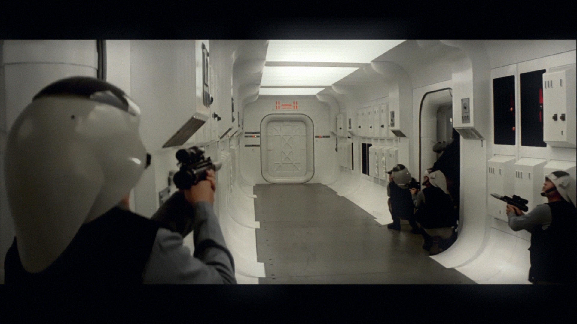
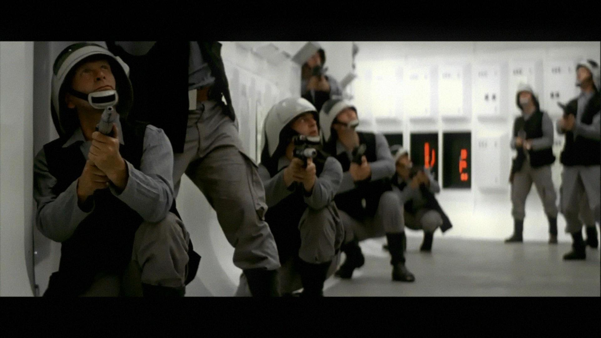
So anyway that is the experiment so far. One on the Later widescreen CRT TV’s will do hey? I think that the box blur and glow make it far less flat and add more luminosity so yeah any suggestions?

Author
Time

Very interesting.
My only suggestion is to calibrate your screen with some test patterns or with a calibration meter, as everything you post is really quite dark overall.

The images do look CRT-like, but the gamma is way off (too dark).

Donations welcome: paypal.me/poit
bitcoin:13QDjXjt7w7BFiQc4Q7wpRGPtYKYchnm8x
Help get The Original Trilogy preserved!

Author
Time
 (Edited)

poita said:

Very interesting.
My only suggestion is to calibrate your screen with some test patterns or with a calibration meter, as everything you post is really quite dark overall.

The images do look CRT-like, but the gamma is way off (too dark).

It’s actually deliberate to make it darker because it’s too bright or bright in the wrong way and also I have been looking at giving the image more range and color depth where I can… But I agree so I have now gone from 1.13 Gamma to 1.26 Gamma but I will not go higher than this unless a certain shot demands it. (actually a shot of storm troopers went to 1.51)

I am being cautious about not losing the depth I am trying to create so It has been a creative decision but like I said I agree and you hit the nail what was missing so It’s going to have more Gamma now but only 13 points more or unless a shot demands more.

Trying to get that home video feel but a bit better than it was sort of.

Hopefully I will finish this now tomorrow and I will load it up on Vimeo and well that will be the end of this experiment…

also I figured something out…

We are definitely missing missing two shots of the booster detaching and the nose capsule re-entry but the shot of the escape pod flying towards Tattoine was the one that was meant to get blown up. 😃

The external view of the escape pod flying away from underbelly (DVD Menu Version Full shot) and the shot flying towards Tattooine go together but it get’s blown up by laser fire.

If the guy on the turret actually had got a shot off and the booster part detached it might have been a dupe to make you think it was destroyed? But anyway it’s all educated guesses and it’s something like this in the version you never saw before…

Anyway alternate footage that replaces the shots for the first Pod destroyed.

Author
Time

BTW, if anyone is interested in Test Patterns, and has netflix, if you fire up netflix and hit “search” and type in “Test Patterns”, they have a really great test pattern channel.

Donations welcome: paypal.me/poit
bitcoin:13QDjXjt7w7BFiQc4Q7wpRGPtYKYchnm8x
Help get The Original Trilogy preserved!

Author
Time

Here is my final go at this it’s not perfect and I know I can do this a bit better but I don’t have the time. It was a rough experiment any way. Not that there is not, any good stuff about it.

Nobody posted any stills from the Technidisc so I had no idea what color the flashes were in that release only what they looked like (the flashes) in other home video so I just changed all of them to how I sort of remember it. At the end of the day it’s not that important… But it was fairly good fun. Watch out for the corrected hues again small but noticeable. If I made any mistakes I am over it the experiment is done.

Hope you Enjoy my take on home video Star Wars first 5 minutes. with a lot less magenta 😃

https://vimeo.com/274577416

Author
Time

It certainly has that old home video look about it. The skin tones are a bit yellow. but I enjoy the lush look of threepio.

It was fun watching along with the experiment!

Donations welcome: paypal.me/poit
bitcoin:13QDjXjt7w7BFiQc4Q7wpRGPtYKYchnm8x
Help get The Original Trilogy preserved!

Author
Time

poita said:

It certainly has that old home video look about it. The skin tones are a bit yellow. but I enjoy the lush look of threepio.

It was fun watching along with the experiment!

Then I succeeded! Because that was the main goal try to re-create the home video feel but a bit better.

Probably pushed to hard on yellow highlights… anyway I learned something thanks for your input 😃

The whole corridor part at the start give me a headache… The walls are really hard to color match.

Author
Time
 (Edited)

Been looking at the Binary sunset shot for quite a while and I could not make up my mind about it so anyway… Hello Magenta!

Here is my take on it. Although I did a small edit on the sun’s this is my color grade effort of what I think it was meant to look like in a perfect world 😃

Hope you like it as a guess at how it was supposed to look.

And this one for the shear fun of it 😉

you can call me a silly idiot for doing that 😃

Author
Time
 (Edited)

😃

Ok Red Version then.

Should we trust in this image?

I think the red version wins between Purple and Red in terms of aesthetics and realism but it would seem if they color tinted it to make it say more alien like they forgot to do certain shots or in the process of adding the fake sun something went wrong and we have color issues.

I can not change the settings on my monitor unlesd it has 4k signal pumping in which i do not. It comes calibrated from Samsung and I can not adjust it with normal HD it has a default setting which you can choose different modes like dynamic cool and warm or natural. Unless you put 4k on HDMI 2.0 in.

Author
Time

If you can’t calibrate your monitor, you shouldn’t be doing any color work or commenting on anyone else’s.

Author
Time
 (Edited)

ChainsawAsh said:

If you can’t calibrate your monitor, you shouldn’t be doing any color work or commenting on anyone else’s.

I have followed these instructions, and It would seem that my panel is very Bright compared to my old TV for HDR content. So I have adjusted this now.

https://www.rtings.com/tv/reviews/samsung/mu6100/settings

I have copied the white balance in this but I can not change hardly anything because it’s running a PC and this will not allow you to have Movie mode because it only allows Standard or Dynamic modes.

This is something you should take up with Samsung to be honest.

So the original Matte has no Blue moon…

and looks nothing like the film…

Author
Time
 (Edited)

I think this one is pretty close to the original real colors.
Anyway, I found a coloring book from 1977 (I was three) and it looks like this:

Author
Time

ZigZig said:

I think this one is pretty close to the original real colors.
Anyway, I found a coloring book from 1977 (I was three) and it looks like this:

ALLOL

Author
Time

I hope the LSD Edition will soon be released. It looks fine !

Author
Time
 (Edited)

Well it’s not easy to understand what the film is “Meant to look like” especially when special effects are involved as it introduces quite a lot of color that is perhaps not meant to be there, as this process was not in it’s infancy but it was still fairly new and perhaps more so the amount of layers that were being put through an optical printer.

I do have a feeling about that part being red at least the original cinematography it was. But seeing that certain parts are un-tinted it’s a bit of a patchwork quilt unless the sky should change color very differently between shots. I was exploring the possibility that it could be consistent and remain plausible light source (the Sun).

Laterally sometimes you have to understand what something looked like before special effects to understand how it has been altered after the effects process and what may have been introduced that is unintended.

Film footage is not that difficult to figure out, special effects shots are, especially this era of effects.

The only way of keeping the original matte color would be a re-composite it won’t go back and is lost in the effects process. The binary sunset is perhaps recoverable because it’s probably only one layer.

Author
Time

Ronster said:

ChainsawAsh said:

If you can’t calibrate your monitor, you shouldn’t be doing any color work or commenting on anyone else’s.

I have followed these instructions, and It would seem that my panel is very Bright compared to my old TV for HDR content. So I have adjusted this now.

https://www.rtings.com/tv/reviews/samsung/mu6100/settings

That’s not how you calibrate a TV. You need to use industry standard test patterns in the lighting conditions you’ll be working under.

I have copied the white balance in this but I can not change hardly anything because it’s running a PC and this will not allow you to have Movie mode because it only allows Standard or Dynamic modes.

This is something you should take up with Samsung to be honest.

No. Just no. Let me rephrase my earlier statement:

If you can’t calibrate your monitor using industry standard test patterns, you shouldn’t be doing any color work or commenting on anyone else’s until you own a monitor that can be accurately calibrated and have done so.

Until then, none of your “corrections” have any value.

Sorry to be so blunt about it, but it’s the absolute truth. And your lack of ability to properly calibrate your equipment means statements like…

So the original Matte has no Blue moon…

…are completely useless because you’re not looking at it at the same baseline everyone else that has calibrated monitors is.

Author
Time
 (Edited)

oh so is the moon blue on your screen?

I am not talking about intricate or precision things though, I am talking about things that look very different from one another also.

Mainly Special effects.

Author
Time
 (Edited)

Ronster said:

oh so is the moon blue on your screen?

That’s very much not my point.

I am not talking about intricate or precision things though

Except that 99% of the time you are, down to criticizing very subtle “hue” differences in people’s corrections, many of which no one else sees and can easily be explained by looking at it through an uncalibrated monitor.

I am talking about things that look very different from one another also.

What? What does this mean?

Mainly Special effects.

Still don’t get what you’re trying to say.

Author
Time

And oh hey, look, over a month ago in this very thread, a film restoration professional was telling you exactly what I’m saying now:

poita said:

Very interesting.
My only suggestion is to calibrate your screen with some test patterns or with a calibration meter, as everything you post is really quite dark overall.

The images do look CRT-like, but the gamma is way off (too dark).

poita said:

BTW, if anyone is interested in Test Patterns, and has netflix, if you fire up netflix and hit “search” and type in “Test Patterns”, they have a really great test pattern channel.

And the same professional, just yesterday:

poita said:

I still feel like your monitor calibration is slightly off

Any and all color work is useless without proper calibration. Full stop.

Author
Time
 (Edited)

Well as I said there is not much I can do about it unless I get a completely new system running on HDMI 2.0 and even then If the Screen Detects it’s a PC and not a DVD player or something else who is to say it won’t grey the options out like it does now. I am sorry that my screen only allows me to do white balancing, it’s not something that is my fault, I can’t do anything to change it. But I did run eizo test and it’s not throwing up any really obvious faults.

I do feel that although there are professionals here, I am not talking about say anything particularly precise. Perhaps this is where a confusion is coming from if I say try something and post an image, I am not saying this is exactly how it should look, or that anyone should take anything I am doing literally as gospel but what I would be trying to do and when I can see that it is plainly obvious is trying to understand a bit about how this film looks quite a bit different from other films of this era actually right the way through it. On top of that you have some weird things with effects shots.

If you will poke fun at me for when films shift out on color in to a different hue. check these out off the top of my head.

1.Terminator - Tunnel Chase and end Warehouse Chase many shots Shift out this was fixed later for the special edition

2.Aliens - During our initial introduction to the “Power Loader” walking Forklift a guy is carrying a missile and put’s it in the ship. This shifted in the original transfer again this was again fixed later on in the special edition version.

3.Platoon - Straight off the opening scenes in the Jungle is a magenta mess (I don’t know if this was fixed for any recent releases but the green has probably shifted)

4.Enter the Dragon - Plenty of that going on in the original transfer which was all over the shop

I can’t think of anymore at the moment, but to think Star Wars is somehow exempt from this issue, and if you have a problem understanding that sometimes hues shift and that is why a color tool was created to actually fix these problems.

So anything I am doing I am saying “yeah, there abouts” I am not trying to come to some kind of conclusive Holy Grail of how much red and blue and green Star Wars should Have. I Just enjoy having a look at stuff and pondering things and I a fun person, I like a laugh and I can take a joke 😃

This is the original image spot the difference.

That matte element of the moon is used for the falcon approaching Yavin IV also and the two look very different this brings it closer to the better looking version assuming more correct version earlier on.

I actually also find it concerning that for all the expertise these moments are not brought up and these things are not discussed how the same thing can be so different.