
- Time
- Post link
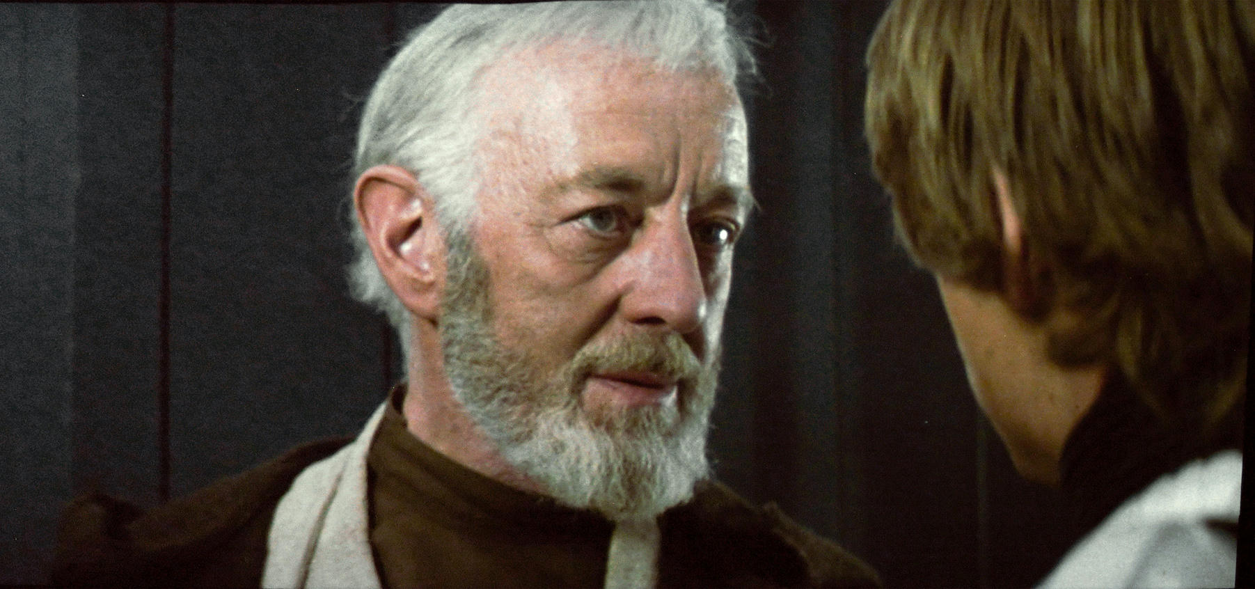
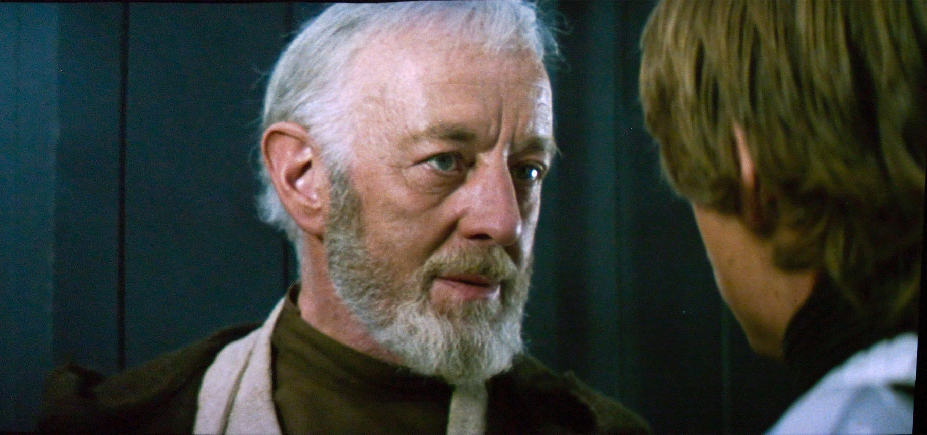
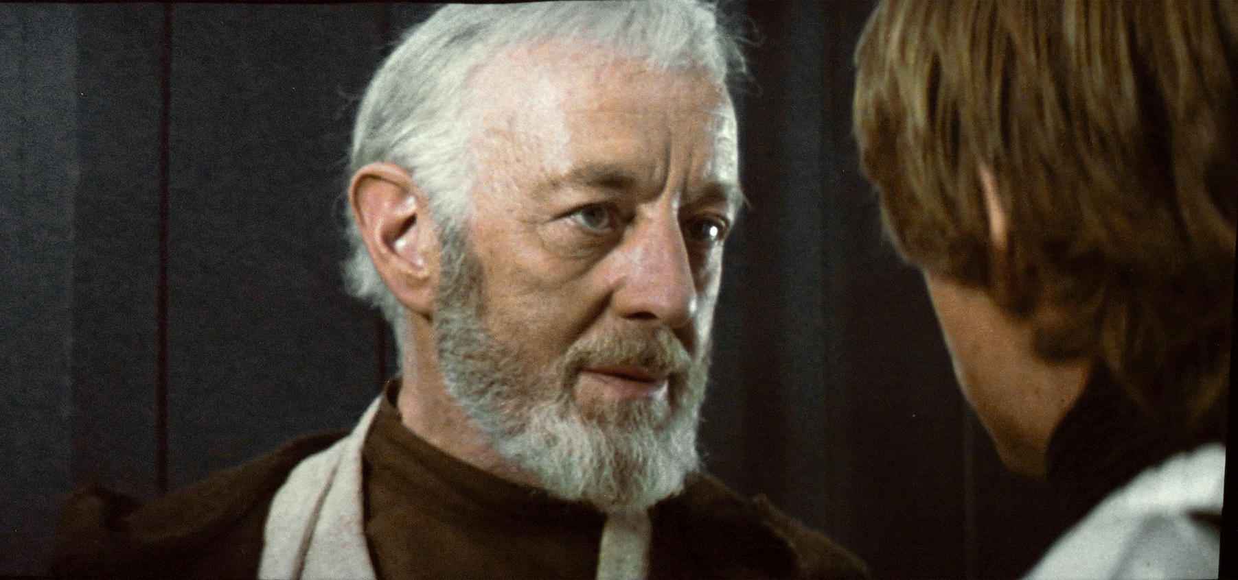
Yes, excellent flesh tones for one of the scenes that can look the worst if it isn’t just right. Outstanding as always.
Yes, excellent flesh tones for one of the scenes that can look the worst if it isn’t just right. Outstanding as always.

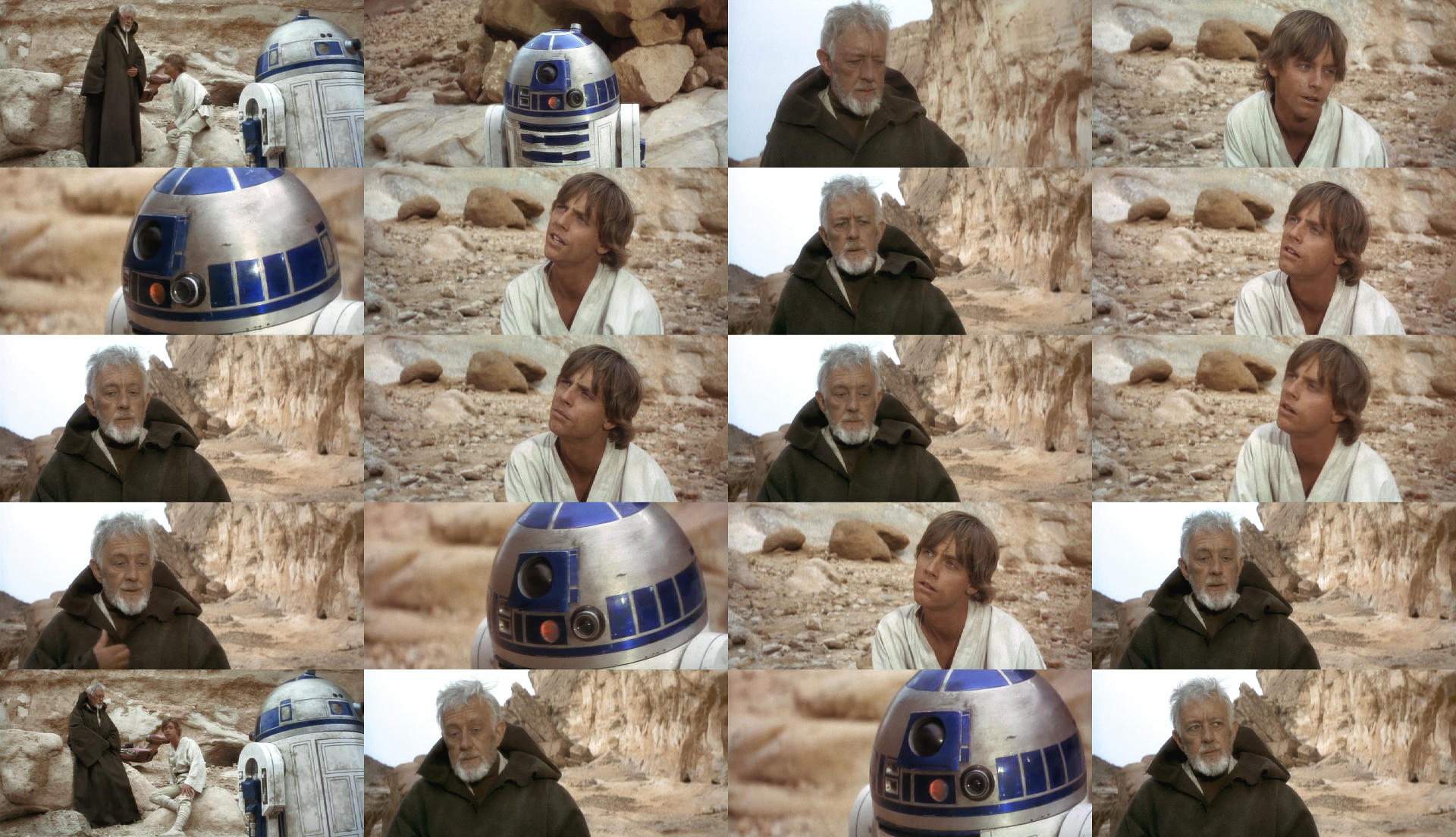
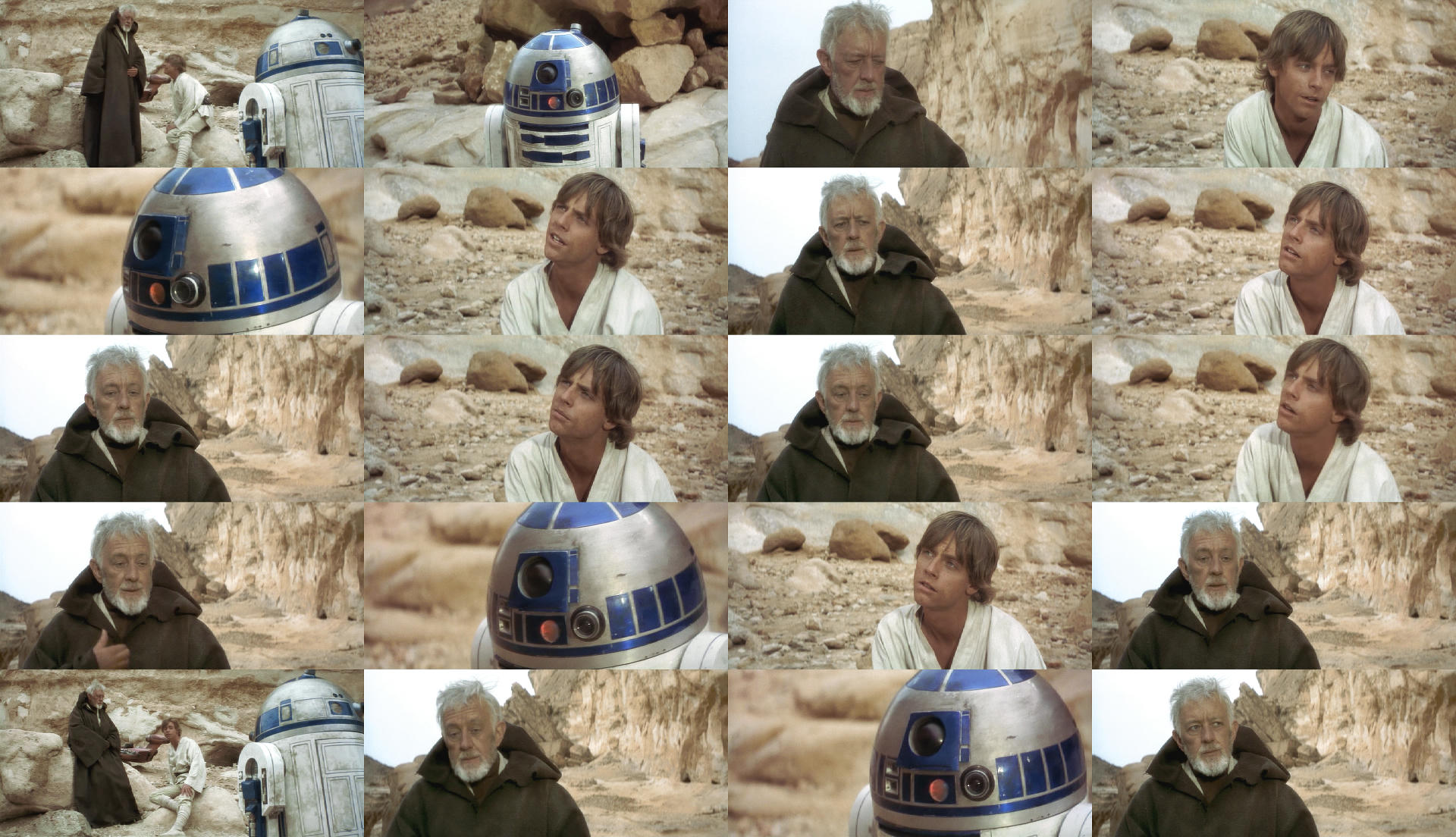
Bens cloak is looking a touch green in a few shots Dre. Otherwise phenomenal work as always.

Bens cloak is looking a touch green in a few shots Dre. Otherwise phenomenal work as always.
Yeah, I noticed it too. Here’s an update for these shots (including a few more tiny tweeks):

I think the green comes from the dust. It has a similar color in a lot of the behind the scenes photos.

Keep up the amazing work Dre. Everything is looking incredible.

Bens cloak is looking a touch green in a few shots Dre. Otherwise phenomenal work as always.
Yeah, I noticed it too. Here’s an update for these shots (including a few more tiny tweeks):
I like the way this looks, but I thought about it and I noticed something is perhaps wrong and I admire you to sticking with things and trying to get it right.
This was a quick test… And it may prove that separation masters were actually used albeit in slightly different hues.
Red was Hued one way all the other colors were hued the opposite direction. I am not telling you it should be this way and this is how it should look or anything like that, but it’s interesting to think that different “parts” of the colors are in the wrong hue in the same direction.
I understand you are trying to recreate the print color but if indeed the different colors are in the wrong hue in the same direction it will never look like a new film but also laterally you may have to shift the colors out in the same direction slightly where they may have been adjusted if you were using say another source as the Blu-ray? I would say the film is on the wonk to put it mildly. It’s a bit of a headache and if you can understand that Red Shift perhaps more than the rest weather that is part of the print I doubt the camera shot it like that when filming… I myself don’t crave some old knackered print that is all skew whiff but I do like the look of film and a bit of dirt, although I do not understand how different parts of the color spectrum can decide to shift together in the same direction?
Anyway Keep at it, it’s a challenge and perhaps I have shed a tiny bit of light on it although it is not meant to look like a print it does perhaps help to understand a bit better what might be going on if colors are shifting together in this instance like a cuddle.
R2 in the cave seems to be having color cuddle… The Binoculars part looks spot on it’s not affected like these later parts.
The Saturation is varying also a bit.
2nd attempt further Blue Hue separation and hued red back over a bit yellow added for another test.
Work to match this if you can… It looks the best.

actually thinking if I am pulling the colors further apart does this mean that it is gradually mixing hues to become something more monochrome eventually as this is where it is heading.
So applying a hue tug o war on it if you like. I can see the sand people on the cliff is travelling a bit pink also.
Ronster, R2 is supposed to be very purple/cobalt. And you have taken most of the red out. Your two postings are very bland and grayed out. The film should be vibrant and colorful and in the desert scenes the skin tones should lean to the pink side. I think DrDre is pretty much on the nose with his colors. I’d pull it a touch to the yellow, and if you do that right it does not reduce the saturation. This shot is tricky because it was done in a canyon on a cloudy day so the colors are pretty muted to start with. If you don’t do it right, the entire scene looks off.
I turned the saturation down just saturate it (2nd attempt) apart from R2 facing camera. But I don’t mind what Dre has done at all but I don’t think it looks the same as the bunch of stills for the Binoculars part. It’s got quite a bit of Red and the Sand people on the cliff are a bit more pinkish. But I don’t think it’s something Dre is doing wrong… It’s the film shifting hues more than it has to do with his settings.
I dis-agree about R2 as purple though. Look at the first stills posted on this thread.
Yellow and Cyan shifted and increase saturation

This is now starting to look more normal. apart obi-wan skin caught a bit of red in the yellow shift.

ok I done a similar shift on the first attempt and I was wrong to add yellow in mid tones on 2nd attempt should be cyan… But that is pretty much a good demo of when the hues go wrong they go badly wrong and It’s not always easy to identify but this one because the big red face it gives itself away. This last one I think I am happy with but It’s not like disagreeing with what Dre is doing just pointing out it is shifting and it’s not fixable unless you change the hues. But that probably is not the purpose of the thread? Anyway I wish someone would go about fixing these moments. I can also see that some shift more than others but that is the way of things.
Well, according to the R2 Builder’s group, who have extensively researched the paint colors and who have had access to the original R2 costumes and remote controlled props, the blue color for the ANH R2 had a purple base that made the blue color more cobalt blue than royal blue. That somewhat changed for the TESB and ROTJ, but the color only changed slightly, keeping a touch of the reddish hue.
These two reference photos reveal that there was a lot of red in the rocks, skin tones, and how dark R2 was on set.


Compare that to DrDre’s correction:
it’s the same canyon from raiders of the lost ark. it does not look red in that film and it matters not what a set photo looks like it depends how the camera was set up that actually shot the footage. All I was doing was showing you the hues had shifted. Which you can clearly see the rocks are not pink which is how the hues are conforming towards pink. I have old photo’s at home from the 70’s that shall we say don’t reflect reality.
Also ask yourself why re-paint R2D2 probably because the paint had faded in that still it again pinkish compared to the still below. Both stills look like they are photographed in a different place because of the way things were back then.
Remember I said I am not saying it should look like this… It is merely showing how the hues shifted. Dre will need to decide if he agrees how much or how little the hues should change if at all. But i think otherwise he may aswelk make the whole canyon the sameish color and i think the binocular set is the best but perhaps he will want to make those pink.
Yes, but like so many attempts to fix a small issue, you have overdone it. Your corrections are far to yellow.
And as for R2 - are you aware of how many of them were made and that they had to make new ones for each film? They were able to improve them greatly for TESB. So it isn’t a matter of repainting the old ones (they didn’t), it is making new ones for each film. For the first film the blue was more purple. For the rest it was more of the dark cobalt. So removing the purple hue from R2 is a mistake.
And since you mention Raiders… how about these…


are those from the blu-ray? i seem to recall the first dvd release to have the best colors for raiders.
I have been working for 3 years to figure out how to correct ANH from the Blu-ray and I only hit on the solution a couple of months ago. They need more yellow. Not a shift in the hue, but an added hue. There is not enough yellow while there is plenty of red. The results for both the skin tones and the rocks (at least in this sequence) is that both should be peachy/orangy. Trying to make it either red or yellow can only be done by removing color that is supposed to be there. You have to balance it. I’ve bugged DrDre about this before and his has refined his tools to come closest to the original colors as he can. I think some of the shots need a touch more yellow, but definitely no desaturation or removing other colors. Definitely not a shift to the yellow or anything.
And you have to look at skin tones, costume colors (especially compared to how the costume appears in controlled lighting), set lighting, set colors (mostly lost but in the case of natural features we can go visit them and photograph them with modern cameras and see them with our own eyes), etc. Some of my scene corrections in TESB are almost imperceptible while others really stand out. You have to make final corrections with a light hand. I have learned this from being far too heavy handed myself. I’ve had to undo a great many corrections because they went too far the other way.
are those from the blu-ray? i seem to recall the first dvd release to have the best colors for raiders.
Not sure. I just google them and pulled a couple of high-res examples.
This is where I have the color correction for the Blu-ray…


Ladies…ladies…
It doesn’t hurt to offer help, but it always hurts to disregard those that do.

I tend to attribute these differences to different monitors and viewing conditions/surrounding. A few years back I spent hours on a sequence tweaking things with the room dark to wake up the next day and realize I’d desaturated it to an almost laughable amount.

I’d like you to do an HDR regrade test shot.

I’d like you to do an HDR regrade test shot.
I believe HDR was tested around the time the no-DNR version was finished and they ran into so many problems they tabled it for the time being.

Seriously, no one should go near HDR without the proper monitoring equipment. And even then, I wouldn’t advise anyone to do it without the proper training and experience, especially working with such degraded materials. HDR is dependant on extreme precision, you can’t just try it.
Sorry that sounds a litte extreme, I just don’t want to see time wasted on a crummy HDR grade.
This is where I have the color correction for the Blu-ray…
R2-D2 looks too purple but I like this too. Check the art of star wars the reference Pic clearly shows he is Blue darker parts look more blue purple not when light hit’s it. With that said I doubt it’s fixable with the Blu-ray source probably.
I do have a habit of over doing it you are right but let’s remember I am simply having a quick look, and It’s more the obi-wan shots facing camera that require the Hue shift this was the main concentration I was focusing on with red face. It’s difficult to grade an image of 16 images or what ever and none of them actually match.
Essentially I stick by the binoculars part Dre did looks the best this part does not quite match that part and I would like to see it match by any means neccessary 😃 Apologise for over doing it I am not going for precision.
I’ll leave this here for that Technicolor Still that looks weird also.
Technicolor
I know it’s not right but it’s an indicator. Sans psychedelic hair do 😃
Red hued one way yellow the other direction.
Open the technicolor in new tab first then the first attempt in new tab then the hue alteration in new tab and you have the process I did in sequential order, click between to see the differences to end result.
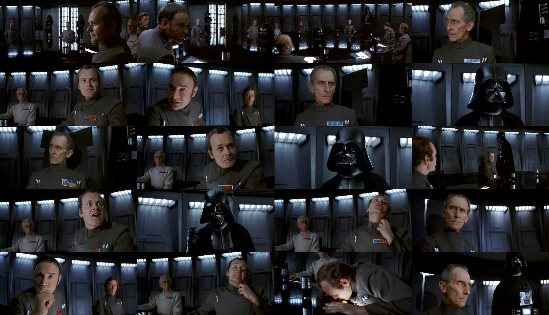
I think the stills for the conference look fantastic I did however experiment with red and blue shift reduce magenta and matched Vader as he is the odd one out by selecting him separately… It’s much of a muchness but it all depends what you are going for obviously the Technicolor has quite a bit green in it, but not in the canyon. I honestly think there is something in the Red and Blue shift though.
At the end of the day I don’t really care about this because what you did looks great but for an experiment, that is about it really.
Different Saturation level.
I personally feel some of your corrections look a little washed out, as if colors are missing. I also think you might elaborate a bit on the concept of “the wrong hue”. You have used this phrase more often in the past, and it makes it seem like there’s some clear definition of what is the “right hue”. In principle there can be any number of hues, and not one of them is wrong or right. However, I would say in the type of correction I’m going for the most important considerations are the colors of the original photography, and whatever effects may have been added to get to the original color timing was as seen in cinemas.

Do you mean this kind of adjustment Yotsuya ?
http://www.framecompare.com/image-compare/screenshotcomparison/FC2JNNNU
This is where I have the color correction for the Blu-ray…
Looking good! Mine would look something like this:

Both look great, but I slightly prefer the flesh tones in yours, Dre.