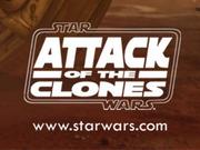
I like your prequel logos, especially TPM. I was never entirely satisfied with how mine came out. And your take on the “middle” of the AOTC logo is interesting.
Thanks! Ive been tinkering with them for a while now. AOTC certainly still needs some work, if you have any suggestions I’m all ears.
Here are the official AOTC and ROTS logos:

TPM never had one without the E1 on it, this is a revisionist used in some toys these days:


