logo Sign In

Help Wanted: a bitmap of the original green 'Lucasfilm Limited' logo?

Author
Time
 (Edited)

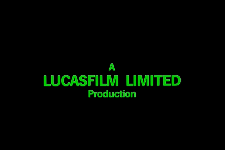
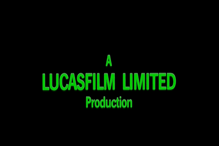
Hello! I was wondering if any of you know where to find a large bitmap of the original green Lucasfilm Limited logo at the start of all three films in the trilogy. Or, perhaps it could be grabbed from the beginning of “Caravan of Courage”. I ask because in my prequel edits, I intend to use the original logo. I would rather not just rip it from the OT because it is somewhat blurry and shakes around a bit. This way, I could have the logo in high-res and stable as well, for DVD quality.

Does anyone know of such an image?

Episode II: Shroud of the Dark Side

Emperor Jar-Jar
“Back when we made Star Wars, we just couldn’t make Palpatine as evil as we intended. Now, thanks to the miracles of technology, it is finally possible. Finally, I’ve created the movies that I originally imagined.” -George Lucas on the 2007 Extra Extra Special HD-DVD Edition

Author
Time
Oh...I just checked that as well and he implies that the font doesn't exist commercially and that he had to modify individual characters one at a time.

Episode II: Shroud of the Dark Side

Emperor Jar-Jar
“Back when we made Star Wars, we just couldn’t make Palpatine as evil as we intended. Now, thanks to the miracles of technology, it is finally possible. Finally, I’ve created the movies that I originally imagined.” -George Lucas on the 2007 Extra Extra Special HD-DVD Edition

Author
Time
Caravan of Courage was shot in 1.33:1, since it was a tv movie.
Author
Time
Citizen, I love your sig, thats classic

-Darth Simon
Why Anakin really turned to the dark side:
"Anakin, You're father I am" - Yoda
"No. No. That's not true! That's impossible!" - Anakin

0100111001101001011011100110101001100001

*touchy people disclaimer*
some or all of the above comments are partially exaggerated to convey a point, none of the comments are meant as personal attacks on anyone mentioned or reference in the above post
Author
Time
So now the thing to do is to load it into illustrator as a background image, and vectorise it.
You can then clean it up and scale it to any size without degadation, (and make a font out of it if you were really bored)
Author
Time
Make a font out of it? You mean Arial?? That's about as budget a logo as I've ever seen. Probably did it with some Letraset Helvetica...
Author
Time
Originally posted by: Karyudo
Make a font out of it? You mean Arial?? That's about as budget a logo as I've ever seen. Probably did it with some Letraset Helvetica...


While I know you were just joking, it definitely isn't Arial, the 't' instantly gives that away, plus of course Arial didn't exist back then! It possibly could be Helvetica, though I'm leaning towards News Gothic or a similar variant.

http://www.kineticpast.com/starwars/thecheatlaserdisc.gif
Ooh, a laserdisc. The Cheat's playin' something on a laserdisc.
Everything is better on a laserdisc. Whatever happened to the laserdisc? Laserdisc!

Author
Time
While I was kidding about Arial, I'm serious about Helvetica. Not that it'll definitely be Helvetica, but that it'll probably almost exactly match some commercial font available in the mid-1970's. Pick something close, break out Illustrator or CorelDRAW, and you're done...
Author
Time
Those logos are on the right track, but they seem alittle 'soft' to me. Of course, they match the way they looked on screen back in the day, but I always thought that if we are putting them back in, better clean them up and make them look sharp.
The Jedi are all but extinct.......
Author
Time
It sure aint Helvetica on the LUCASFILM LIMITED text, the D and C are all wrong, the C appears to flare at the ends, and the curved letters are not a constant width in these pics. Plus the weights are all wrong.
It is from a similar family I'd wager, but I'd put money on it not being Helvetica.
Author
Time
It is extreme kerning on that too now that I look at it.
Damnit, this is going to bug me now.
Normally I'd start from scratch in Illustrator, and just trace the bitmap, my guess is that they created the typeface for the company.

I doubt that Rice did it, as I'm pretty sure that was only the STAR WARS type (which was a new typeface based on Helvetica as George wanted a "facist" typeface for the opening credits)
Author
Time
Originally posted by: Laserman
It sure aint Helvetica on the LUCASFILM LIMITED text, the D and C are all wrong, the C appears to flare at the ends, and the curved letters are not a constant width in these pics. Plus the weights are all wrong.
It is from a similar family I'd wager, but I'd put money on it not being Helvetica.


I agree, I hadn't bothered comparing the capital letters before. So I'm moving more in the direction of News Gothic.

Can any SW historians tell me if that Lucasfilm logotype had been used on prior Lucasfilm projects or was this the first instance? If it was the first instance then I think it would definitely be based off News Gothic or Trade Gothic.

http://www.kineticpast.com/starwars/thecheatlaserdisc.gif
Ooh, a laserdisc. The Cheat's playin' something on a laserdisc.
Everything is better on a laserdisc. Whatever happened to the laserdisc? Laserdisc!

Author
Time
They're actually talking about the subtitles in that example. ^

However, the closest font I can find is Franklin Gothic Demi. It's very close for "Lucasfilm Limited" but a little off for "Production." But they could be two different fonts.
Greedo shoots first? Not in my DVD player.
Author
Time
Yeah, I had also dismissed ITC Franklin Gothic because I knew whoever did the type for the prequels got it wrong in the places they were using it (eg. it is now used for 'A long time ago...', but it definitely wasn't what was used on the OOT, I presume it is the same thing with the subtitles). But now I'm wondering if there was just some confusion in the communication and the typeface identifier was simply IDing the Lucasfilm logo as it is rather close.

Funny that I've already mentioned that typeface today in another thread here (SW Fonts)!

http://www.kineticpast.com/starwars/thecheatlaserdisc.gif
Ooh, a laserdisc. The Cheat's playin' something on a laserdisc.
Everything is better on a laserdisc. Whatever happened to the laserdisc? Laserdisc!

Author
Time
You are never, ever going to find a perfect match. Just think about how the titles were made: they were almost certainly done up with Letraset or a Linotronic (or something like that), possibly shot with a process camera to make a 'negative' PMT, and then filmed with a Dykstraflex camera. Any one of these steps could change the kerning, the weight of the type, and introduce spherical (or anamorphic?) abberations.

So, the best way to get an exact match is to start with something damn close -- the aforementioned Franklin Gothic, say -- drop everything into Illustrator or CorelDRAW (as I mentioned before), and adjust nodes by hand. Not difficult at all. Just a bit time-consuming. Assuming you've got Franklin Gothic, of course.
Author
Time
^ Exactly. All of which only adds to the wonderful experience of watching the original films. Unlike the sterile 'perfection' of the prequel titles - they just don't feel the same.

Here's an example of Franklin Gothic Demi.

http://home.austin.rr.com/chevymetal/LucasfilmLimited.jpg
Greedo shoots first? Not in my DVD player.
Author
Time
You guys are great-thanks!

So the consensus is that the font does not actually exist, but that Franklin Gothic Demi Bold is a very close match and is a good starting point. When you say Franklin Gothic Demi Bold, do you mean Franklin Gothic Demi (on the bold setting), or is it a completely different font? Either way, can it be download from the net, do you think? (or must it be purchased?)

Here's my first stab at cleaning up the logo a bit:

http://img202.imageshack.us/img202/8773/lucasfilmlimitedfixeda8cb.png

Actually- I just had another thought: I believe that the original version of THX-1138 has the original green logo as well. Does anyone with the "Special Edition" DVD know if that was still retained? Perhaps that transfer would have the highest quality of all.

Episode II: Shroud of the Dark Side

Emperor Jar-Jar
“Back when we made Star Wars, we just couldn’t make Palpatine as evil as we intended. Now, thanks to the miracles of technology, it is finally possible. Finally, I’ve created the movies that I originally imagined.” -George Lucas on the 2007 Extra Extra Special HD-DVD Edition

Author
Time
Originally posted by: Trooperman
So the consensus is that the font does not actually exist, but that Franklin Gothic Demi Bold is a very close match and is a good starting point. When you say Franklin Gothic Demi Bold, do you mean Franklin Gothic Demi (on the bold setting), or is it a completely different font? Either way, can it be download from the net, do you think? (or must it be purchased?)


Well, the Demi in typeface names is actually short for Demi Bold, demi meaning half. So Demi Bold isn't a different font, they either meant Demi on the bold setting or (and I think more likely) they just used the long form of the name and just mean plain Franklin Gothic Demi.

The specific version mentioned is the ITC one, and that definitely isn't available for free. You can very easily purchase it from several font sites though.

http://www.kineticpast.com/starwars/thecheatlaserdisc.gif
Ooh, a laserdisc. The Cheat's playin' something on a laserdisc.
Everything is better on a laserdisc. Whatever happened to the laserdisc? Laserdisc!