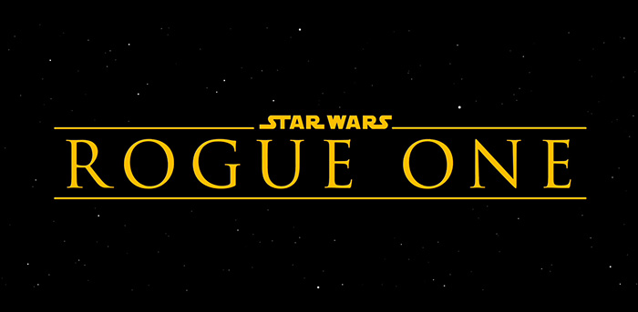
Does anyone else miss …
There are more important things missing.
Title crawl discussion aside, why didn’t we get the STAR WARS logo itself?
This film deserves it more than anything filmed during the previous ~20 years…
The other thing about the opening logo is that it’s not very appealing to the eye. The letters are too thin. It would help if they where filled with the yellow color instead of just outlines.
I think they didn’t have anything set for this new title format because they probably assumed they were going to go with the basic logo – crawl combo. Then pretty late into production it was decided to omit the traditional opening so they had to throw something together in half a day. And that logo can be done in half a day using After Effects (and some vector work in Illustrator), there is a tutorial easily found on youtube.
Using the tutorial I managed to change the logo into this which I think works a lot better but is still it’s own title style:
