Re the last two examples. This isn’t the awesome coverart thread.
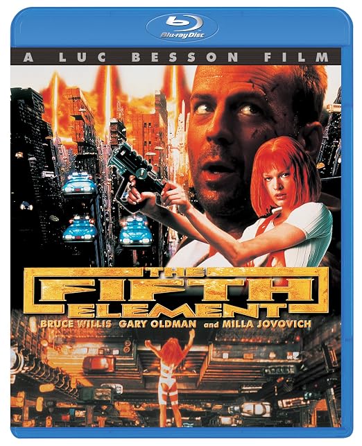
Considering the many, many lame photoshooped covers that the 5thE has had, that one is neat tidy, thought out (a consistent square motif) and colourful like the movie. You might not personally like it but it’s a good piece of design work.
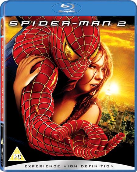
The Spiderman one is supposed to look like a kid (Peter) drew it on his text book. True that the design idea has arguably been ruined by slapping the real title at the top and a drop shadow, instead of “Peter drawing it on” with a marker pen or something.
These are true related photo-shop nightmares…
+(Custom).jpg)
(Holy hell that 4K Kwai cover is terrible)