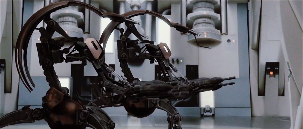
I really like the filmic contrast, and most of the shots look wonderful in terms of color. There’s only one real issue for me, and that is in the blues. The holograms and Obi-wan’s saber have too little luminosity, leading to strange gradients with the surrounding colors. The Federation ship interior also takes on a strange blueish green tint. Here’s an example of a shot that doesn’t benefit from this grading in my opinion:
It also seems like the reds are unnaturally dark.Some shots look phenomenal though, such as this one:
The soft pinkish gray walls with blue panels really works.That’s the main thing I’ve noticed too, going over it again. As I was trying to render a longer version of the first preview, my computer crashed, so I had to redo some work and the new color settings and decided to go back to the start of the movie and that’s thrown me off a little. If anyone can tell me their opinion what looks good and what doesn’t, I’d greatly appreciate that
The biggest problem to me is shown here:
http://imgur.com/NDgaD2S
I’ve watched the same scene from VHS, VCD, Laserdisc (two different captures), DVD and Adywan’s recontruction and the contrast isn’t that radical in any of them. You probably used the Z bootleg as a reference in that one?
You definitely need to tone it down. It almost looks like someone is shining a flashlight at Qui-Gon.

