- Time
- Post link
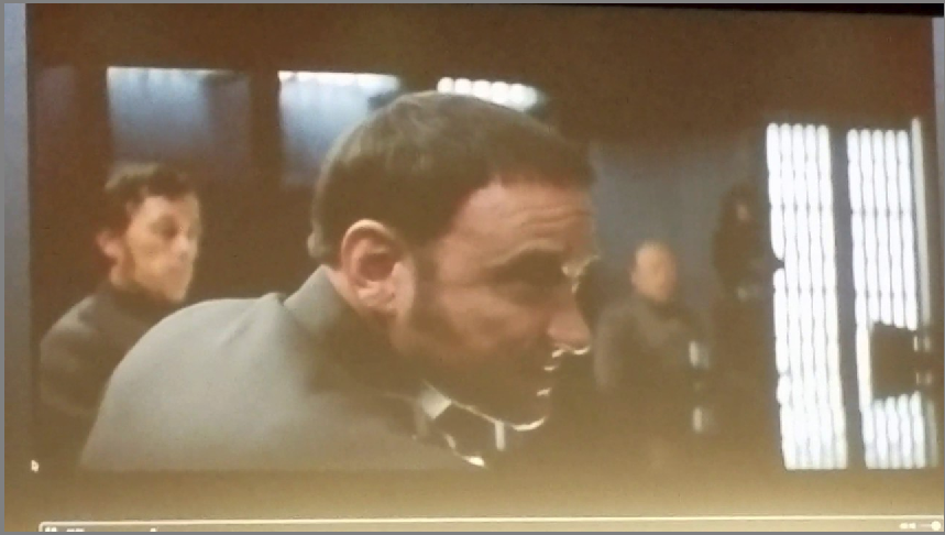
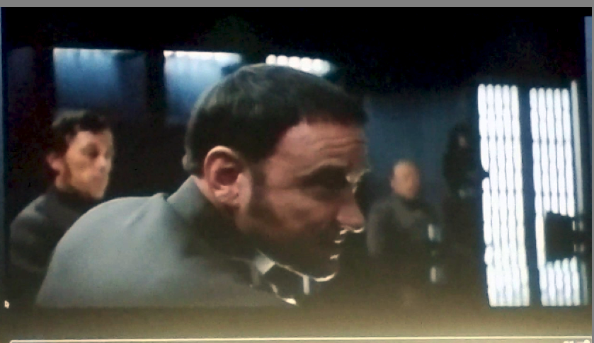
Contrast is one hard thing to get right when scanning film. You want the darks properly dark and the lights properly bright, but if you go too far it is too much and if you don’t go far enough it gets dull. As our number of sources increases I have noticed that the theatrical prints tend to have more contrast than what we are used to in scans and telecines from the negative and interpositives (the blu-ray and GOUT). I think the garbage mattes are a good key. If you see them, the contrast isn’t high enough and the darks are not dark enough. I think this amount of contrast is pretty close. I can’t wait to see the calibrated scans to see if they are any different.