The bootleg seems to have a noticeable green shift, and a very slight yellow shift. I double checked in Photoshop by blurring the images so that I got the average color for the ‘black’ bars. Here are the images with a curves adjustment to return the bars to neutral gray:
http://screenshotcomparison.com/comparison/204846
This gets the shot closer to Mike’s preliminary grade, with the purple shadows becoming noticeable. This is one of the shots for which I have Tech frames, and the shot is definitely green on that source, to the point that Mike commented that it looked bad. It’s green to the eye, green when scanned.
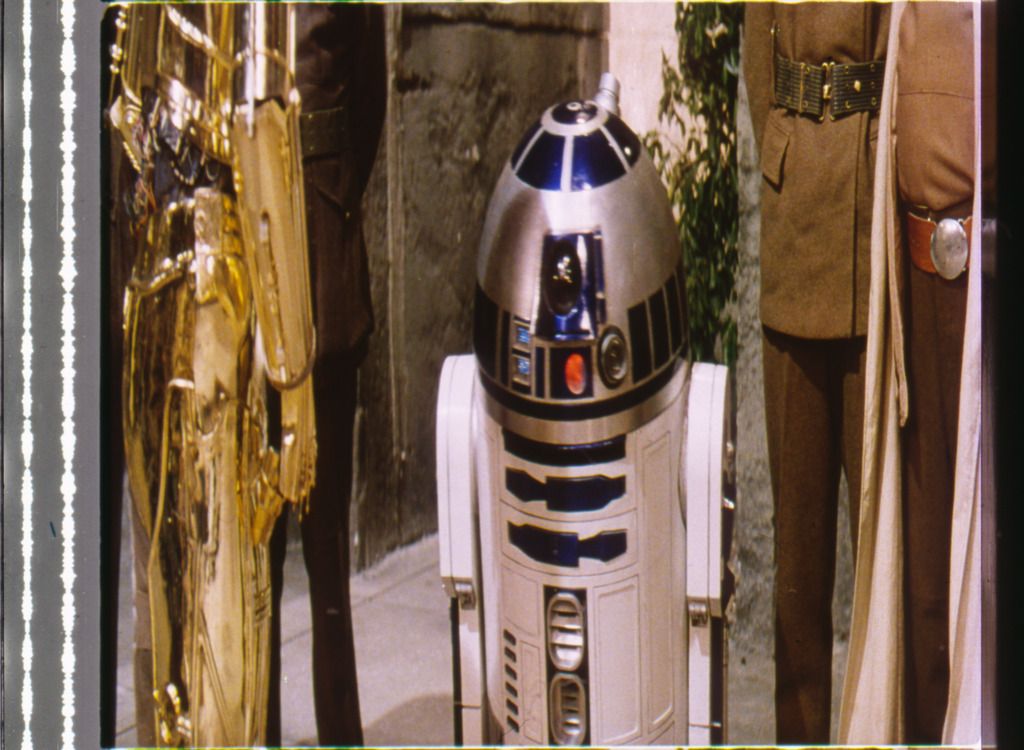
Also, R2 is extremely blue in the bootleg compared to Mike’s photo.
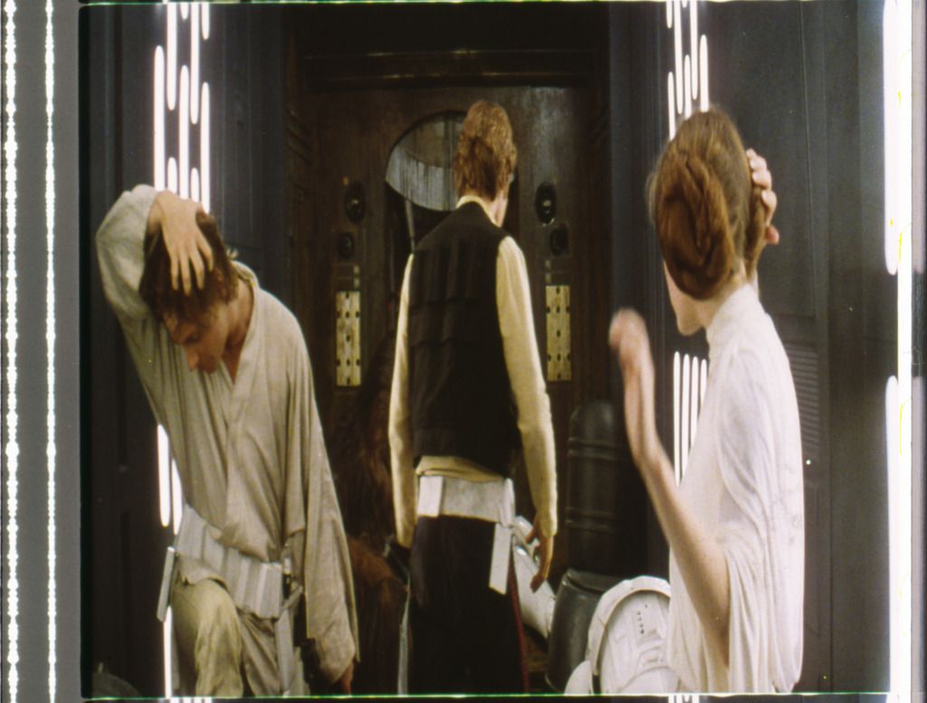
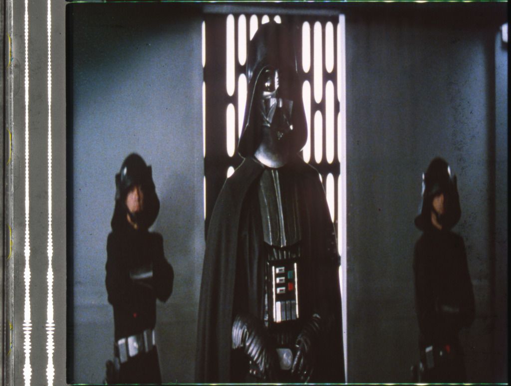
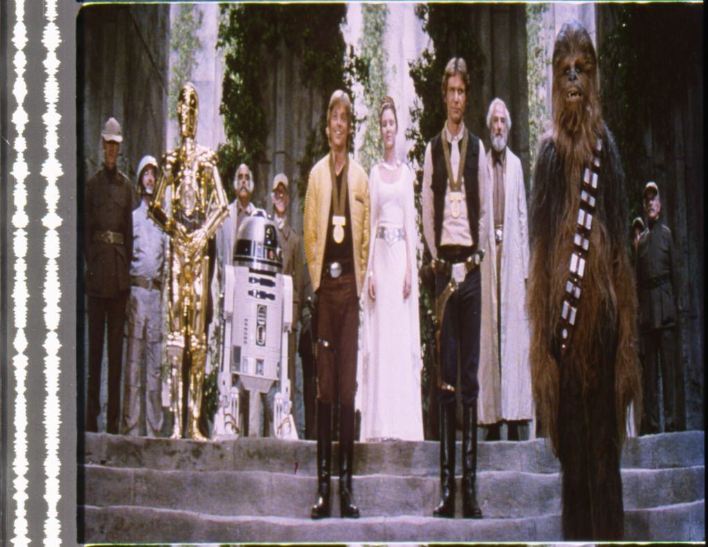
From what I see, the Tech is notoriously inconsistent. For instance, all 4 of these scans were done at once:
The Death Star hallways are way too green and the skin tones too yellow in the first one, but they get much more blue with Vader.
The R2 shot has nice colors, but the final scene is notorious for being too red in the highlights, a problem that is much more noticeable without the luma correction.
The final shot is much more blue than the previous shots.Also, notice that the audio strip which should be neutral gray has turned green in the hallway shot.


Here’s the thing though. I too have a number of frames from these sequences, and to my eyes the colors of the scans you posted look substantially different from the frames themselves (even compared to the photos I posted of some of the other frames, these scans look pretty lifeless to be honest). This is not surprising, as the colors of a raw scan always look different from the source. In principle each color can come out looking substantially different. For example, greens may be more blue in reality, while blues remain blue. So, it’s very difficult to draw conclusions about the extent of the color imbalances in these frames based on a scan, unless the scanner has been color calibrated. They may be smaller or they may be larger, but viewing the frames I believe them to be smaller in reality and on the big screen. If there’s one thing I’ve learned, it’s that scans are notoriously unreliable in their color reproduction, and need continuous color calibration to be considered useful as a color reference. It’s also interesting to note, that the skin tones in the 1977 bootleg contain more green and the walls less blue for the first frame.
However, even assuming these imbalances are accurate, I don’t see how this changes the conclusion, that the Tatooine sequences have a warm yellow grading, which can be seen on the actual technicolor frames themselves, and also on the 1977 bootleg, even if you account for the yellow/green shift you discussed, which only results in a slight color balance adjustment. Secondly, the question remains whether any color imbalances are unique to the print itself, to technicolor prints in general, or to the original color grading? I’m still a proponent of preserving the original color grading blemishes and all. While creating an idealized color grading is a worthy objective in of itself, IMO it deviates substantially from preserving or recreating the original theatrical color timing, and does not replicate the experience of watching an original 1977 print on the big screen. It would be a color grading inspired by a technicolor look, but optimized to suit modern tastes, and expectations.