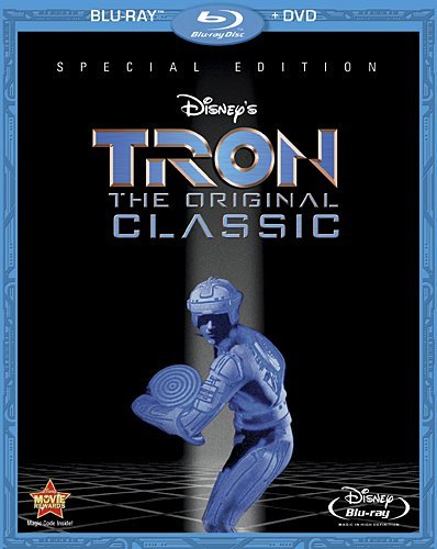
This design isn’t terrible, I just hate that they placed “THE ORIGINAL CLASSIC” in the middle. It’s a stupid, somewhat redundant thing to call it, and to have that subtitle so prominent on the cover is just ridiculous.
This design isn’t terrible, I just hate that they placed “THE ORIGINAL CLASSIC” in the middle. It’s a stupid, somewhat redundant thing to call it, and to have that subtitle so prominent on the cover is just ridiculous.