kk650 said:
Of course I would never use a shot like that to judge correct fleshtones because they are too many unknown factors in play like lighting and the grading GL and co chose to apply to that scene. That said, to my eyes the second shot, that uses my current settings, look fairly accurate to me. C3PO looks gold, R2D2 looks blue, the sky looks the correct shade of blue, so it would follow that the fleshtones should be fairly accurate as well.
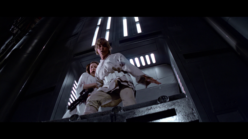
It was these shots between leia and darth vader on tantive IV though where I really decided what settings I would most likely use for overall fleshtones. These screencaps below are using my current settings, just like the second screencap you posted above:

\
To me R2 is far too blue, 3PO too yellowy-gold, and too much yellow in the entire scene. (The method is also bit backwards, if you get the skintone right, then the other colours usually fall into place, but, if the other colours are in place, it often doesn't automatically equate that the skintones are okay. See youtube link at the end for a demo).
The colour looks too saturated in the leia scene on the Blurays, we shouldn't be able to make out her rouge so clearly. Working on films from that time, we used to have to overdo the makeup as it was done *knowing* that the saturation would be lost by the time you went from Negative to IP to print and projection. The idea was that by the time a print was struck, the clownish makeup would tone down to a natural look. The official BD hasn't taken that into account.
But anyway, that is the thing really, everyone has their own opinion.
Just as a general thing (not specific to this project), when I was a wee lad being schooled by the senior colourist, the rule of thumb, regardless of the scene, is to get the skintones right, unless they are specifically lit not to be (under-water, standing under a red light etc.). It will rarely be the director's or colourist's intent to have the skintones not look right, without a pretty clear reason (sickness, zombie etc.) . Skintones always lie in pretty much the same point on the scopes, whether you are black, white, yellow or anything inbetween, there is only a small amount of variation. So the I-Bar on the scope is a good guide when in doubt.
There is a great talk on this here: https://www.youtube.com/watch?v=jX45Yi1spY4 for anyone interested. Now I'll stop clogging up this thread and get back to work.
(skintone section of talk starts at 23:40, and is worth watching, the rest is too, but that part is invaluable. Plus Larry Jordan looks a bit like Obi-Wan). Also good chapters in Hurkman's books on this.