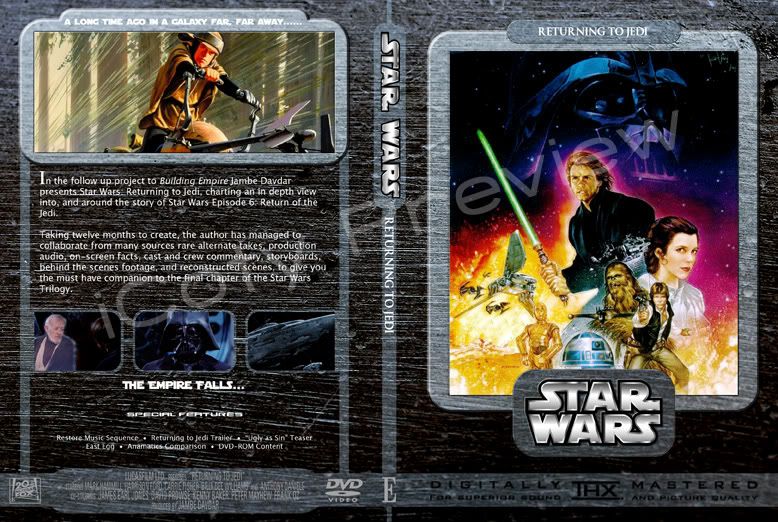
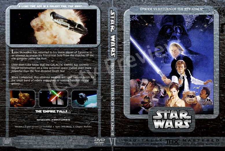
The template looks like one i've seen before (urm, corrme? perhaps?) somewhere. It also looks like you've disected my Returning To Jedi cover there to fit in with the template, which does look kinda good. I agree, though, the titles on the spine need to be emphasised on that background to make them more readable, perhaps with a black outline or a drop-shadow or something.
Yeah, i took elements of existing templates that I liked and made it to fit what I needed.
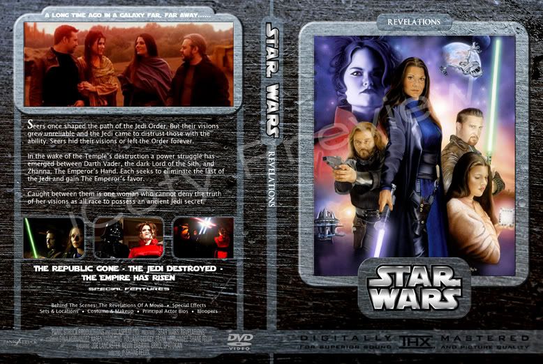
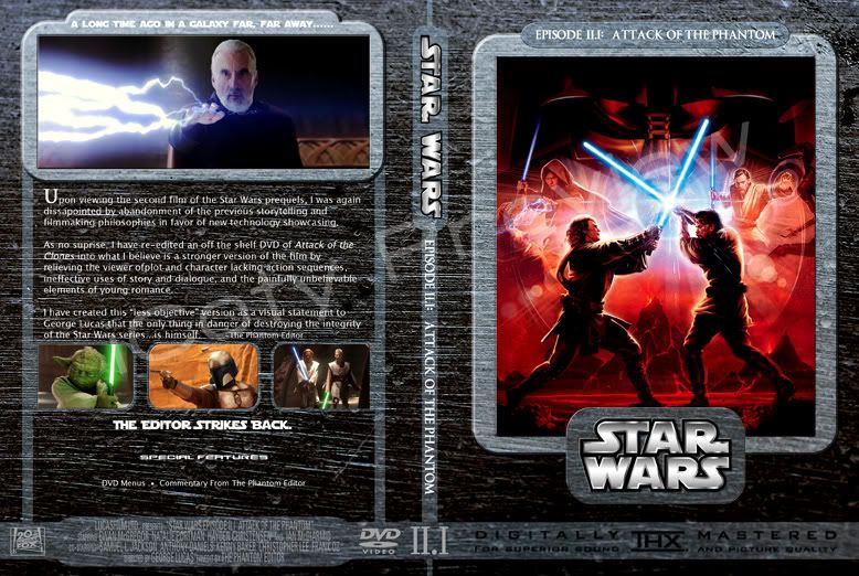
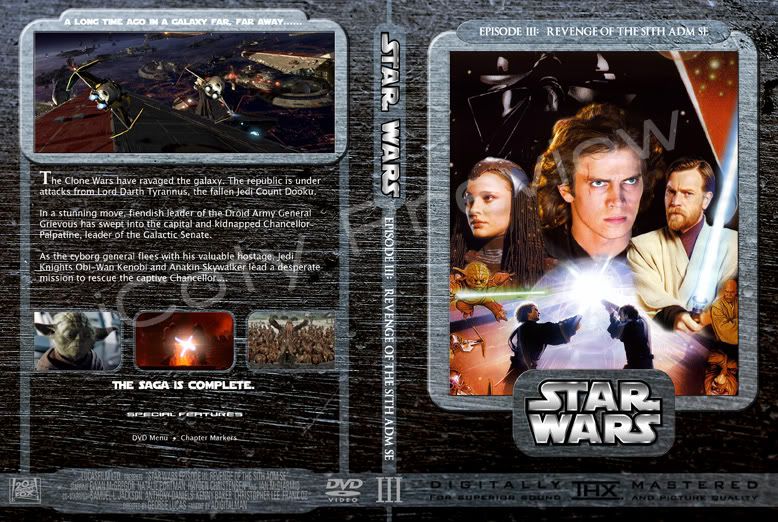
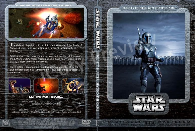
Attack of the Editor front is from the RotS Video game...
other than that awesome covers.
Yes, will change to something more appropriate, that was just a placeholder that I had there.
Also, I realised I know your screenname from one of the cover sites. I think I may have some of your covers on my hard drive somewhere.
Yep, I belong to most of the major cover sites...been in the cover scene since about 2003...
Loved your Michael Bay cover set (now the penny has dropped).
Hehe....where'd you see that, i think i may have previewed it but I never released it...
1) Assuming you are using Photoshop, move the brushed metal layer to the bottom. The way you have it between the text layer and the borders is kind of strange looking.
Not too sure what you mean here, Cassidy. And yeah I am using photoshop.
2) Get a better brushed metal texture. The one you're using looks like a small jpg stretched to fit the cover template, and you're losing some detail in the top of the image. If you can't find a higher resolution one, it's easy as hell to make your own using Photoshop's native filters, and using some simple brushing techniques to make it look all destroyed like that.