logo Sign In

Star Wars: The Trilogy **PROJECT STALLED DUE TO HARD DRIVE FAILURE**

Author
Time
 (Edited)

---NOTE---
While this project is now dead, I decided to leave this first post up in case anyone got an idea for something to do in an edit from this post.

Details on why this project is now dead can be found in my January 31, 2010 post.
---END NOTE---

Star Wars - The Trilogy

This is my first full-on fan editing project (though I'm no stranger to film/video editing).  I announced it back in February (it's now almost July), but it's since evolved beyond what it once was.

The goal for this project is to present the original Star Wars Trilogy as just that - a Star Wars trilogy.  For the purposes of this project, the prequels don't exist.  The EU doesn't exist.  Nothing except the original three films exist.

The genesis of this idea came when I was watching the GOUT copy of Star Wars and realized that I really wished they hadn't added the "Episode IV: A New Hope" subtitle, and that I was glad the GOUT didn't include it.  Then I watched Empire, and thought of how much better it would have been to not include "Episode V."  How much easier would it be to pretend the prequels didn't exist!

Then I watched Jedi, and was struck by how much I really don't like it anymore.  A fantastic series with an incredibly disappointing ending - but not one that is beyond saving (like Spider-Man 3 is ... ugh).

So, without further ado, here's my brand-new, current-as-can-be edit list for this project:

Star Wars
- Will use Adywan's Revisited NTSC DVD-9 as a base, with portions using Dark_Jedi's cleaned-up GOUT
- Theatrical mono mix where possible (where it isn't, the existing audio will be "downgraded" to match)
- New opening crawl created to match the GOUT Pre-ANH crawl (done to be consistent with ESB and ROTJ)
- Original shot of escape pod heading for Tatooine (no suns)
- Added battle droid in Revisited will be removed
- Original edit of Ben's hut scene
- SE additions to Mos Eisley removed where practical
- On the fence about whether to leave Ady's Cantina alterations or not (the hand will stay, though)
- Death Star reveals shortened to match original pacing, with original music/audio if possible (may return them to pre-Revisited state entirely)
- No PT music at all
- Electric-Torture-Needle-Thing from Revisited will be going.  I'm going to try to replace the needle itself with the original, but keep the erasure of the syringe markings if possible.
- Will attempt to restore pre-SE "dead end" for Han, to replace the SE hangar full of stormtroopers
- No more extra-slow-motion when Ben dies (added to Revisited)
- Added TIE reveal in Revisited will be replaced with the original
- Battle of Yavin in general will be edited to be somewhere between the admittedly more exciting Revisited version and the original pre-SE cut
- Last shot of Tarkin will be restored
- Brand new end credits (no starfield - this will be consistent with all 3 films in my series)
- New DVD menus

The Empire Strikes Back
- New opening crawl (only changes to the crawl itself will be the de-capitalization of "rebellion")
- Film is simply The Empire Strikes Back - no Star Wars, no Episodde V.
- Adywan's ESB:R will be the basis for this edit, with secondary footage from Dark_Jedi's cleaned-up GOUT
- Specific edits to be announced when ESB:R is released so I know what I'm keeping.
- Will use theatrical stereo sound as the basis for the audio.
- Brand new end credits (no starfield)
- New DVD menus

To perhaps better illustrate how this will work, here's a mockup of the new ESB opening logo (letterboxed like a 2.39:1 film on a 16:9 frame with a starfield for atmosphere) - this is what you would see immediately after "A long time ago in a galaxy far, far away"):
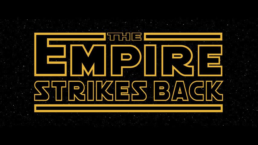
It still needs work, but that's just a mockup.

Return of the Jedi
- New opening crawl
- Film is simply Return of the Jedi (though I may change the name) - no Star Wars, no Episodde VI.
- Adywan's ROTJ:R will be the basis for this edit, with secondary footage from Dark_Jedi's cleaned-up GOUT
- Specific edits to be announced when ROTJ:R is released so I know what I'm keeping.  Yeah, I know ... it'll be a while.
- Will use theatrical stereo (if possible) as the basis for the audio.
- Brand new end credits (no starfield)
- New DVD menus
- Radical re-edit of film

This will be the most drastically different.  The edits I plan to make reflect the "ROTJ Fan-O-Matic" thread quite a bit ("SomethingStarWarsRelated," you will be credited for your ideas in my edit, even if I don't distribute it widely), such as:

- The film will either open on Tatooine with Chewbacca being brought in, then Vader arriving at DSII, or vice-versa
- I'm toying with the idea that Leia is already there, and Han has long been unfrozen and is in the dungeon already, but this may not happen
- Luke is already on Dagobah, Yoda dies, Luke/R2 leave
- R2 and 3PO go to deliver the message, but get put to use as slave labor instead
- Luke comes to the palace at night, is captured (possible Rancor removal, not sure yet)
- BOBA FETT WILL NOT BE IN MY ROTJ AT ALL
- Sarlacc fight will be edited for silliness reduction
- Emperor arrives at DSII
- Rebel briefing, Luke may just not be present at all
- HEAVY editing on Endor to reduce Ewok silliness
- The rest of the movie will basically play out as before, but there will be no mention of Luke/Leia as siblings, and general silliness/cheesiness will be removed
- Hopefully a new/restructured ending to bring the trilogy to a more satisfying end

This is, of course, contingent upon what comes out of Ady's Return of the Jedi: Revisited.  It's quite possible that a lot of my problems with the film will be addressed by Ady, but then again he's said he won't kill any major characters, and I just might.

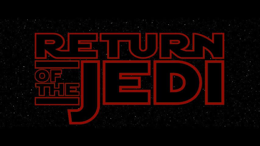
Mockup for the new ROTJ opening logo:
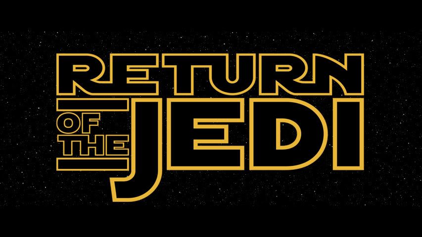
I debated going with the original (Times New Roman-style) logo, but it just doesn't look right, so I based it on the SE logo.

Release date for Star Wars is sometime before the end of this year.  ESB would hopefully be done sometime before the end of 2010, depending upon when Ady releases ESB:RROTJ is another story - it'll be started on when Ady releases ROTJ:R, which he hasn't even started on yet.  So it will, sadly, be a while before the entire set is available.

I may - may - do a preliminary ROTJ edit using Dark_Jedi's cleaned-up GOUT, and then do a "Final Cut" with the better source (ROTJ:R).  But that's up in the air.

Any suggestions - and help - is greatly appreciated!

7/9/09 - MOS EISLEY CLIP

Here's the (I hope) finished version of my Mos Eisley sequence - check the YouTube description for details on it:

http://www.youtube.com/watch?v=7yZp5hNjoIQ

10/31/09 - BATTLE OF YAVIN CLIP

This one is in progress.  I'd like you guys to focus on the audio, and let me know what you think I should do to make it flow as seamlessly as possible (remember that I mixed this on laptop speakers):
http://www.youtube.com/watch?v=lnuO9EVUlQQ

Author
Time

I'm probably not so much interested in the end product but definitely interested in the development.

Author
Time

I would love to see that ROTJ edit

Author
Time
 (Edited)

ive alway been curious about the logo thing. they look excellent! thought about recolouring them? i remember the original esb trailer having a blue logo.

Author
Time

I'd definitely be interested in this.

I like the idea of removing the Leia Skywalker angle. However, what whould cause Luke to turn on Vader in the lightsaber fight?

Any plans to make the Ewok battle more mature, maybe using additional footage from the Ewok films?

You know of the rebellion against the Empire?

Author
Time
 (Edited)
ben_danger said:

ive alway been curious about the logo thing. they look excellent! thought about recolouring them? i remember the original esb trailer having a blue logo.


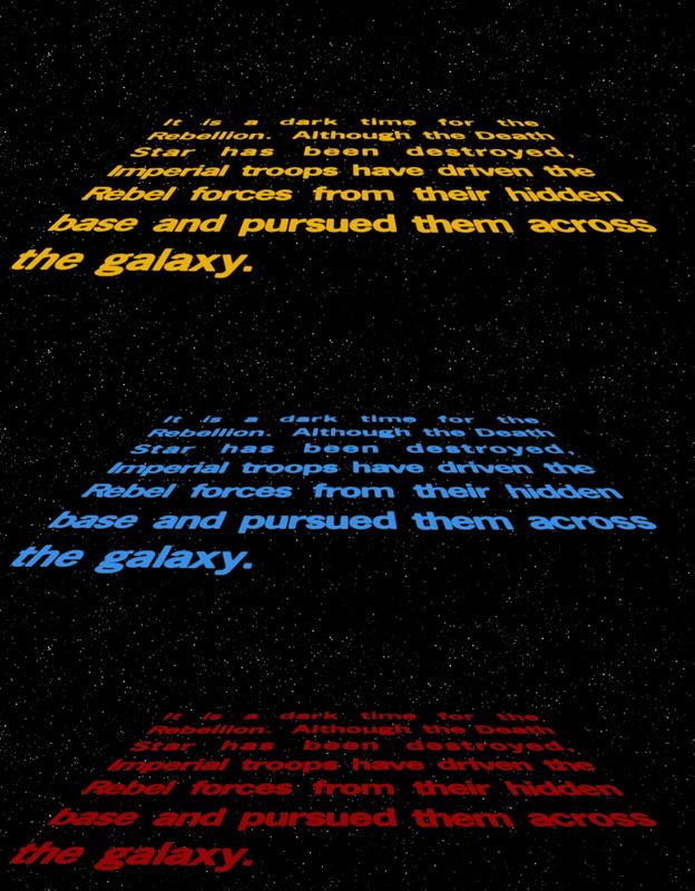
That's a great idea.  Keep SW yellow, but change ESB's title and crawl to blue and RotJ's title and crawl to red, since those seem to be the "official" colors for each movie.  Since you have to redo RotJ's crawl, you might as well redo ESB so you can change the colors.

I'd love to see the redone crawls, at the very least.

EDIT: I threw together examples using the title cards posted.

Star Wars Revisited Wordpress

Star Wars Visual Comparisons WordPress

Author
Time

I'd like to know where you got those fonts. The project is interesting. Will you be using any of Adywan's work?

Author
Time

those logos look awesome in colours, though a lighter shade of red would be better. i know you said you were going to pretend the prequels didnt happen, but does anyone know of any prequel title cards in a similar style?

Author
Time

I considered doing the crawls in those colors, and might still do it that way.  I haven't decided either way, this is still in the planning stages.

The font is the "official" Star Wars font called 'Astro,' used by Lucasfilm, designed based on the original logos (and updated based on the SE logos) by David Occhino.  It costs $20 for a license, which I paid since I gave up trying to find "good" Star Wars fonts.  It comes with an outline version, and I recreated the logos that way (using a lot of rearranging to get it to match as best I could).

I figure that Vader taunting Luke could be accomplished by changing his line to "If you will not be turned, then perhaps THEY will" instead of 'she,' referring to his friends.  If that doesn't work, I'll try to figure something out.

And I might actually use Adywan's edits as a basis for this, but I almost wanted to try it with the OOT first.  I'm not entirely sure.  At any rate, if I used Ady's edits, it'd be a long while before I got to ROTJ.

If I can figure out how to convert AVCHD on a Mac, I might just use his color-corrected SE as a base, assuming he finishes ROTJ by the time I get to it.

Author
Time
ben_danger said:

those logos look awesome in colours, though a lighter shade of red would be better. i know you said you were going to pretend the prequels didnt happen, but does anyone know of any prequel title cards in a similar style?

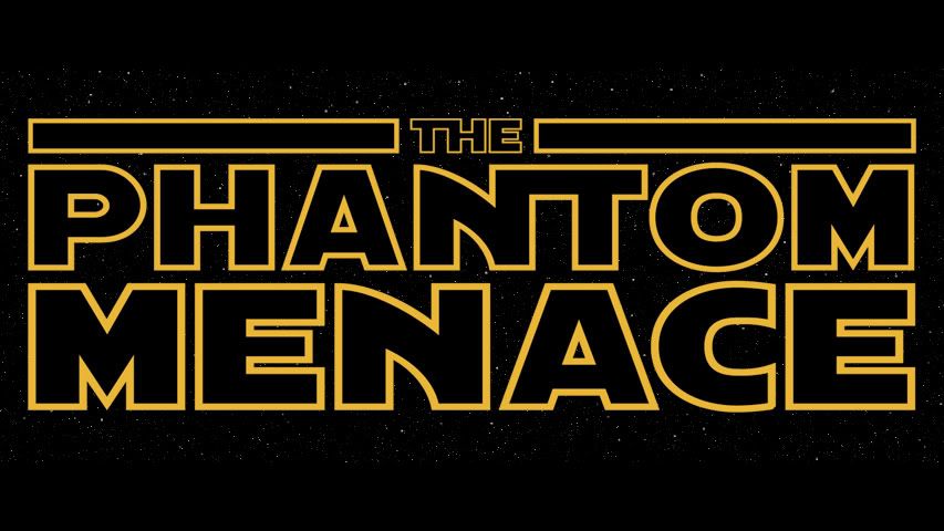
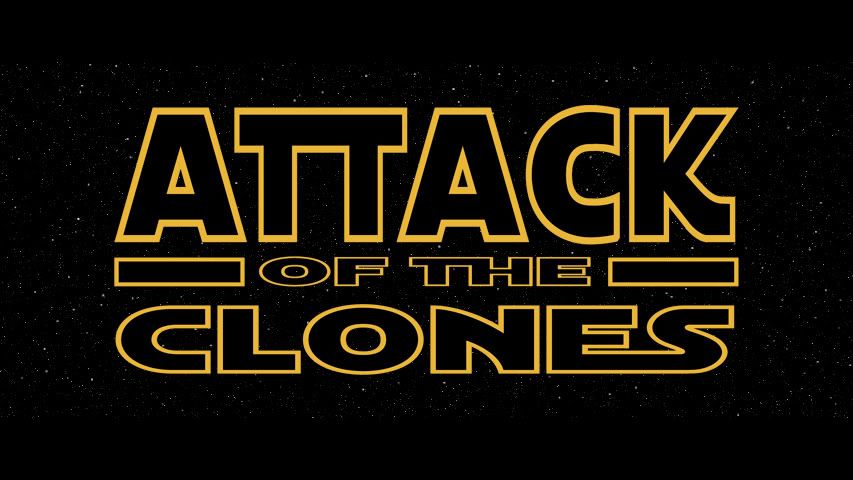
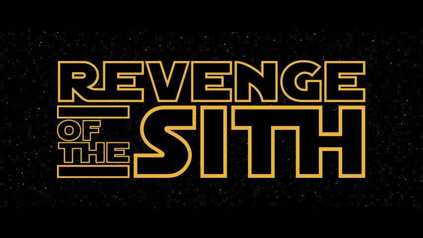
Officially, there is no alternative logo for TPM (just the one with the big "EPISODE I")

AOTC has one:

As does ROTS:

I'll see what I can do about making similar PT opening logos for anyone who might want to use them.

I'm also willing to make similar opening logos for any "alternative" title (i.e. fan edit titles like "Balance of the Force" or non-canon titles like "THE CLONE WARS") that anyone wants.

Author
Time

the thing i like about the opening title cards is that it could reduce the saga down to a 5 episode saga, so AOTC and ROTS could just be 1 and 2 effectively. of course they would need to be fan edits, with this concept in mind.


thanks for finding those logos, retrofying the PT logos in your style would really help standardize the whole franchise.

Author
Time

Alright, here they are.  Interestingly, AOTC, which I think is the weakest-looking of the logos I made, was the only one made directly from an official logo.


I, naturally, have the full-res PSD files with no background on my computer.  If anyone wants them, shoot me a PM and I'll email them to you (if enough people request them I might just throw 'em on Rapidshare).

And if anyone has requests for a specific title to be done in this style, just ask and I'll take care of it.

Author
Time

wow! they look great! especially tpm! i guess using a new hope as a title would defeat the point i guess!

Author
Time

It's hard to make a similar title work out of such short words, but I guess if there's demand for an ANH title I'll make one.  I, however, won't be using it.

Author
Time

I made mock-ups of what the crawls would look like in colors.  The top is Ady's color corrected ESB.

Recreating them from scratch would be my choice, but this matte isn't bad.

I for one would love to see a A New Hope logo.  I could swear I saw one in that vain somewhere...

Star Wars Revisited Wordpress

Star Wars Visual Comparisons WordPress

Author
Time
doubleofive said:

I for one would love to see a A New Hope logo.  I could swear I saw one in that vain somewhere...

Yeah, it was on the cut of ANH that had the Biggs scene included. Also, Luke had to throw his grappling hook twice. ;-P

Every 27th customer will get a ball-peen hammer, free!

Author
Time
Akwat Kbrana said:
doubleofive said:

I for one would love to see a A New Hope logo.  I could swear I saw one in that vain somewhere...

Yeah, it was on the cut of ANH that had the Biggs scene included. Also, Luke had to throw his grappling hook twice. ;-P


Very funny. :-P

Star Wars Revisited Wordpress

Star Wars Visual Comparisons WordPress

Author
Time

Sounds like a great idea for a set of fan edits. Maybe not in every little detail, but I like the idea of an isolated "trilogy" set. Even just removing the "Episode X" from the title crawls would be enough for a barebones approach.

My stance on revising fan edits.

Author
Time

The logo designs look a treat.

I can't wait to see what the crawls would finally look like.

Author
Time

I've been fiddling around in After Effects with this, but I based my crawl text on a "flattened" version of the ESB crawl that included "Episode V THE EMPIRE STRIKES BACK."  As such, it seems that the text isn't long enough to work without the episode tag/title.

Also, I'm doing this using Adywan's ANH as a guide, as my GOUT copy isn't on me at the moment.  This might also be part of the problem.

Here's my request/question:  Does anyone have a perspective-corrected version of the pre-ANH opening crawl?  It would look something like this one, but, obviously, pre-ANH:

http://www.theforce.net/fanfilms/postproduction/crawl/crawl-04-anh.gif

My other question:  How do I make the crawl "disappear" the way it does in the films in After Effects (I'm using CS4)?  I figured out how to get the main logo to dissolve, but it appears that the crawl itself doesn't dissolve uniformly (that is, the upper portions fade earlier than the lower portions).  How would I do that in After Effects, for anyone knowledgeable in that subject area?

Author
Time
 (Edited)

TLSO posted some great versions of the title logos in the DVD Covers thread (link goes right to the post).  He has a decent "A New Hope" logo I'd love to see outlined.  I also like how his "S" in RotS goes under the logo in his version.

Star Wars Revisited Wordpress

Star Wars Visual Comparisons WordPress

Author
Time

Hmm ... looks a little weird with the top bar being a different size.  Maybe if you get rid of the top bar entirely it'd look better?

Author
Time

Interesting what you're doing with the logos, but I find the varying line weights distracting. I think the outlines of the bigger letters should be the same as the smaller letters, while the smallest words, like "the" and "of" should just be solid.

I think it's interesting using different colors for the opening crawls, but Jedi needs to be lighter  (nothing really wrong with Empire,but  the blue crawl does remind me of Spaceballs. :P)