zombie84 said:
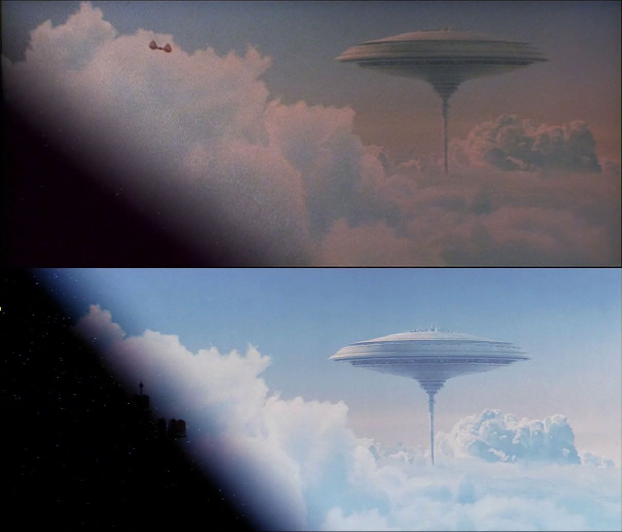
What is interesting about the 1977 vs 1981 matte painting is that in the 1977 version for some unclear reason the painting was stretched vertically. Which is why the moons are slightly eliptical. The 1981 composited the matte normally, and slightly more blue shifted from the video transfers.
This caused some people to think it was a whole new painting, because the moon looked different. But its just because it was stretched, slighly re-coloured (the 1977 composite has it green shifted), and the composite was moved ever so slightly so its not a perfect alignment. In fact, in either the 1977 or 1981 composite the moons were isolated and re-positioned slightly.
I remember doing a really detailed analysis of this back when the GOUT came up. Then I found the original matte painting and realized how much it had been manipulated. So, for 1977, they stretched it, and then I think moved around the moons and printed them slightly greenish. Probably this was for compositional reasons.
Yeah, I remember that thread but I cannot seem to find it now. In the comparison pictures I posted in your thread, http://originaltrilogy.com/forum/topic.cfm/Save-Star-Wars-Dot-Com/topic/11771/page/7/ you can clearly see the different '81 composite with a slightly smaller second moon and the Stardestroyer's slightly different position.
About the faster receding SW logo, it was an alteration made in '97 for the SE and is still that way in the '04 DVD. I keep hearing people think it was a DVD change when it's clearly not. The '97 opening crawl is unchanged on the DVD.
The musical crash that reveals Tatooine have been out of sync since the introduction of the '81 version, I'll try to check the timings for the pan down in the '81 for you, doubleofive.
EDIT: Also there was never a third moon on the '81 opening shot.