Nah I didn’t listen to that piece of shit, just wanted to add to “Worst Album Covers” list.
I’ve literally made better album covers than that using MS Paint.
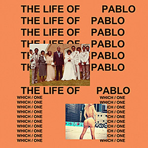
It looks absolutely horrible. The worst thing about it isn’t even how horrible it looks, but rather, it looks cheap. It’s like Times New Roman Font on a solid background with low-res jpg files.
Looks like Arial font. Honestly, I don’t think it would look nearly as bad (yet still almost equally as cheap) if the images weren’t there and it was just the text.
Arial is always a bad choice compared to most other fonts. It’s a cheap knock-off of Helvetica. If you need something that looks like Helvetica, spring for Helvetica.