Ahhhh My internet is on the blink and now windows just crashed I prepared a post and I lost it so I’ll try again.
Ady I have used revisited as a source I am not trying to hide anything please do not feel I am trying to jump on the back of your great work and claim any sort of reward. It might look that way but it’s not. With color correction you have to put a number in or slide a bar but the real nuts and bolts of color correction are in ones brain.
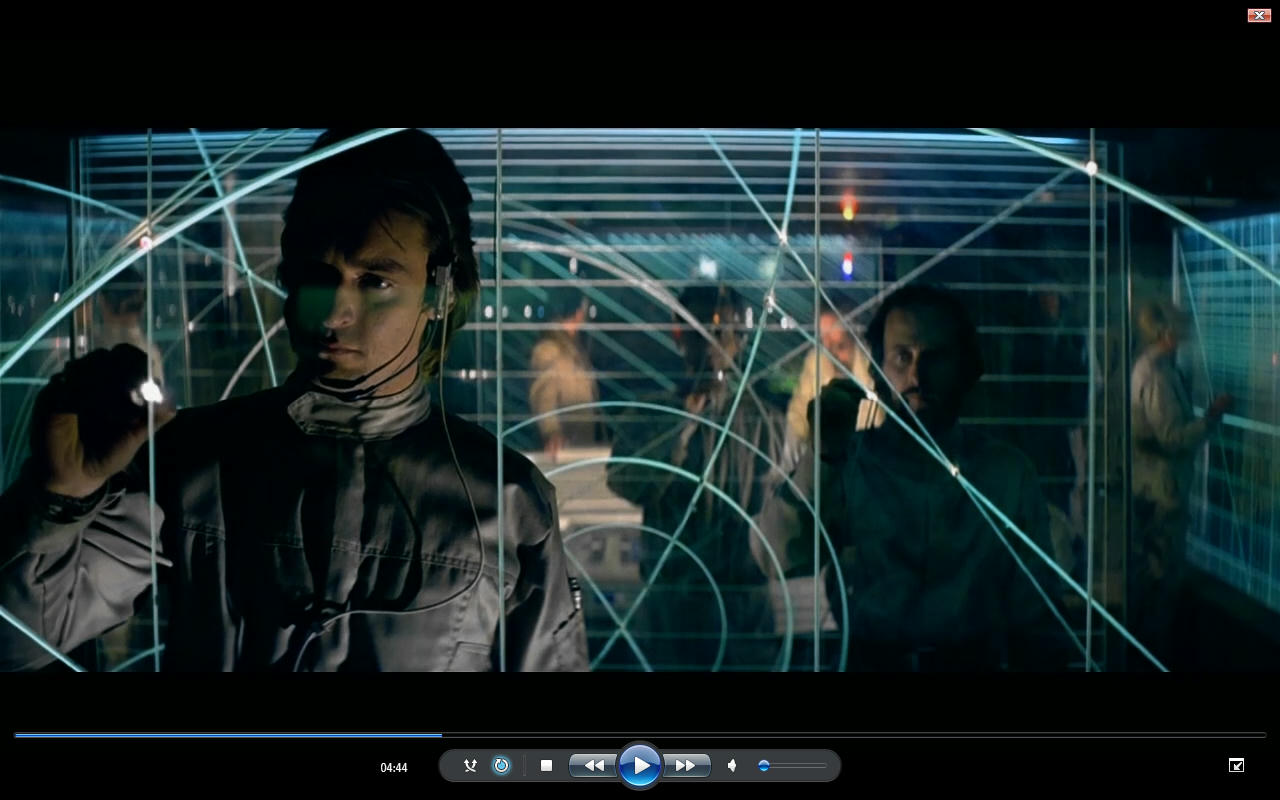
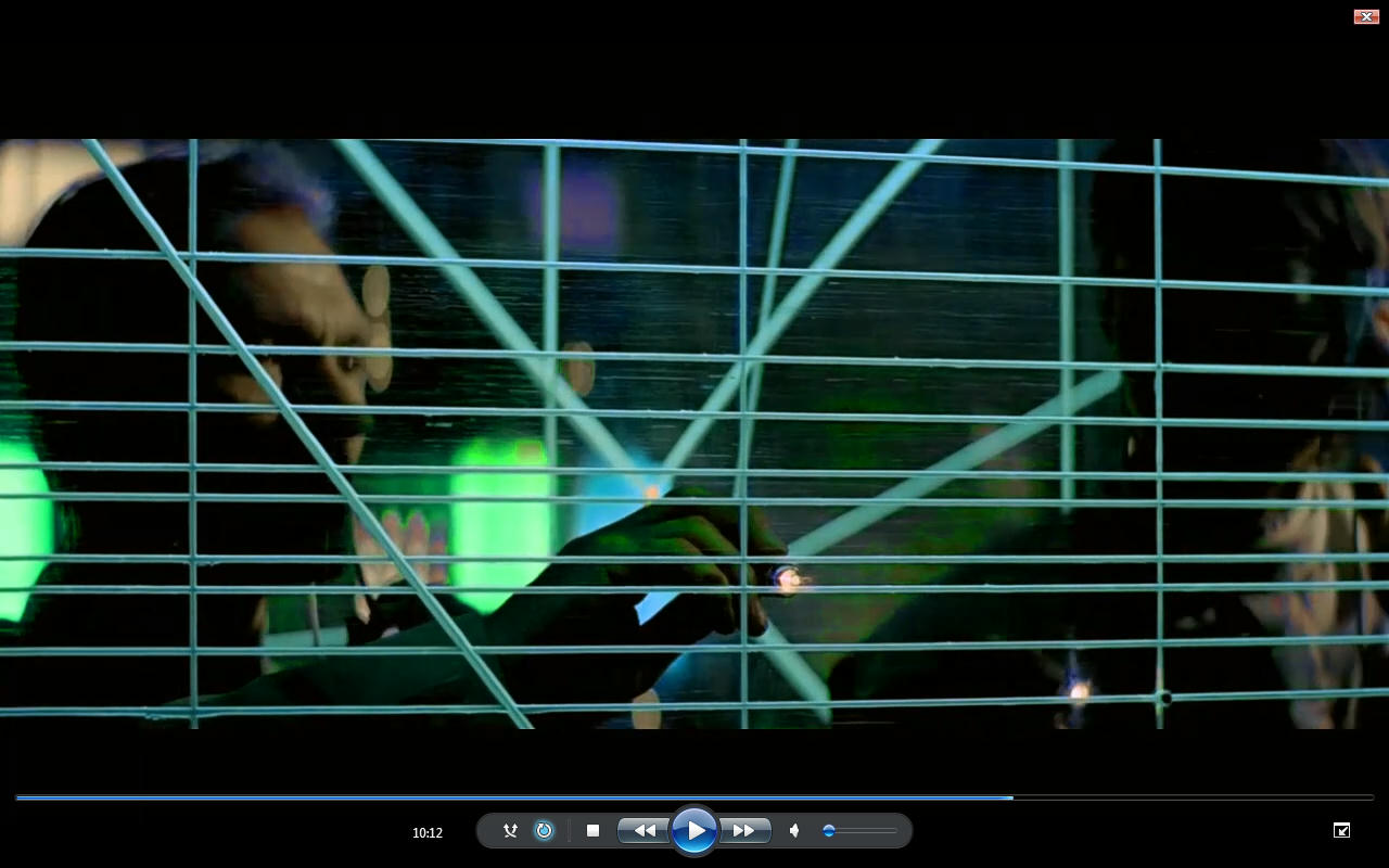
Those cockpit shots yeah some have had very little some have had quite a lot it matters not which version of the film you watch they all have this annoying hue fluctuation on the cockpit shots including your version. That of course is of no detriment to you because you still made it look a hell of a lot better.
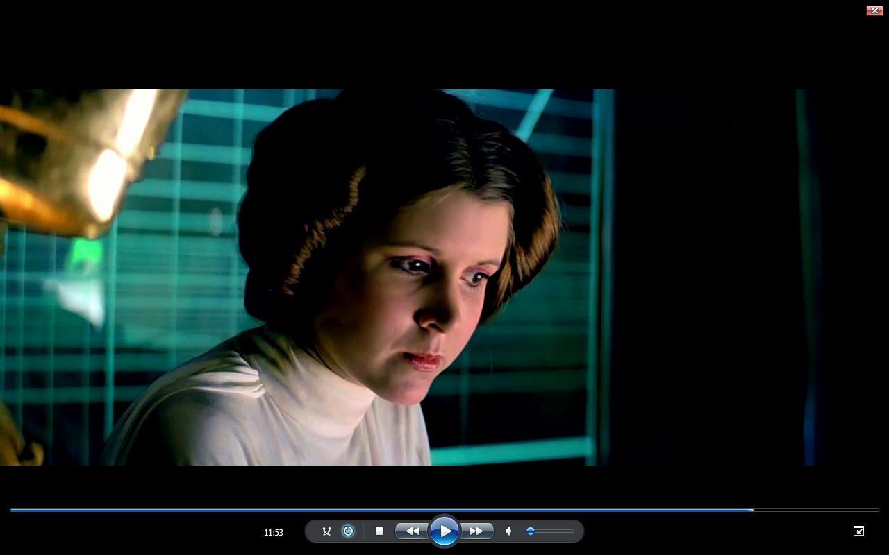
The focus is on the Hue alteration not your color grading but I agree by and large with your color grading if that makes sense. But I have had to do a lot of color correction across the whole 15 minutes or what ever it is. A lot of contrast Value and Hue balancing.
Yes the beginning shot was from revisited I assumed it was the same as the special edition either way both the special edition and your version have way too much green on that take off shot.
Basically in 3 weeks I have color corrected over 200 shots and split the whole battle individual I deliberately tried to avoid this situation and I can remove those images of the cockpits if you want?
It’s more an illustration of the hue alteration than your color grading. Not my work hands up but I have done a lot of work.
I have tried to focus more on specific discoveries rather than trying to claim on the back of your work or anyone elses work. I am talking about trying to get it right and find out what this film is really meant to look like…
Does that make for an acceptable response.
I will share it with you when it’s finished and For your eyes only… Fair? I have done a lot more than just color correction.
The whole Value and Saturation issue stems from Special Edition Shot inserted in original film shot and trying to strike the correct balance in Hue contrast and saturation which is a total muddle.


as you can see these need to align and need more work. The firs 2 images probably need color bleed? but you see what the purpose is. I think this explains the purpose quite clearly.
Also my editor does not have a red Hue alteration only Hue alteration so when I alter the hue I have to correct for the alteration. No Red Hue setting in the editor so It’s more work than you think. I think Selective correction just screws things up more often than not it best to avoid that route 99% of the time so I guess it does have the function but I have not used it in any of these.